28 December 2008

The Fabulous Peacock Parlor of Mr. Clem Labine

During our recent visit to New York, the maestro and I made a trip out to Brooklyn, to visit Mr. Clem Labine at his historic Park Slope brownstone.

Portrait of the Publisher as a Young Aesthete.
Mr. Labine is the notorious founder and former editor and publisher of the Old House Journal, Traditional Building, and Period Homes magazines, all of which sprang from his passion for preserving and improving older buildings, starting with his own spectacular manse. It's no surprise that his home boasts outstanding original as well as restored features and is decorated in high Victoriana, complete with koi pond and neoclassical statues. Clem is also a longtime Friend of Artistic License.
Clem Labine in his spectacular parlor
My favorite room is the Peacock Parlor, the formal sitting room on the grand main floor of the house, with its massive original casings and doors, high ceilings, coral walls, and crammed with art and statues. On the day we visited, an indoor bocce court (non-regulation) had been constructed on the spacious peacock feather patterned carpet. But the real story for The Ornamentalist here is the custom-painted frieze.

The hand-painted peacock frieze in Clem Labine's home in Brooklyn, NY
Unusually large at about two and a half feet high, the Peacock Frieze was designed and painted ~ 30 years ago by Austrian-trained Helmut Bucherl, ably assisted by Howard ("Howie the Grainer") Zucker, the son of a German-born decorative painter. Both artisans spent most of their professional life working for Rambusch Painting Studios of New York. The inspiration for the design was found in an old Dover Edition and embellished by Mr. Bucherl, whose Austrian roots show in the Secessionist-style elements. The ceiling has a very cool anthemion detail of stylized peacock feathers. These borders were painted using a combination of stencils, pounces, hand-shading, and gold leaf, and the entire room, including the ceiling, has been glazed. While the color are rather intense, in the intimate light of this room, they look perfectly balanced.
painted peacock and antler rosette
The peacock motif was adapted to create a four by eight foot ceiling rosette with a fabulous antler-branch spiral border and gold leaf accents which glitter above the electrified gas chandelier.

As you can see a gorgeous decorative painting job endures, like great architecture.

click on any image to view larger
anthemion is in the glossary!

Visit Clem Labine's new blog, The Preservationist

Lynne Rutter Murals + Decorative Painting

01 December 2008

Faux Volcanic Glass Mosaic Tiles

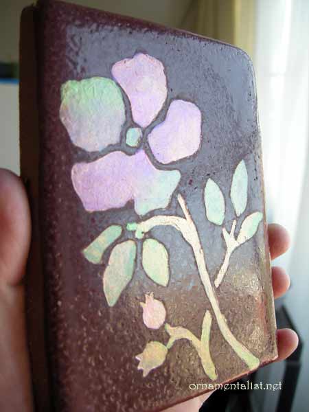
faux mosaic glass tile painted by Lynne Rutter
I had a commission earlier in the year to paint some hand-made tiles to look inlaid with volcanic glass mosaic, for an Arts and Crafts period effect. So many people asked me how this was done I recorded the process for this "How-To" post!

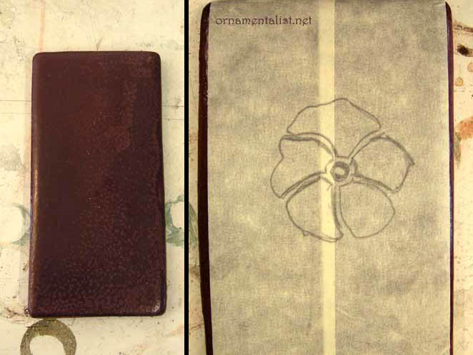
masking tape "stencil"
The plain tiles are hand-formed, with a rough burgundy colored glaze on top. The surface is uneven and not very smooth, which makes it difficult to paint. So to get paint to stick to this surface, I decided to etch it. For the initial sample, the "stencil" is just masking tape.
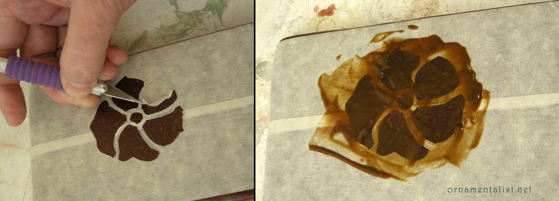
cutting out the tape stencil and etching the design
After cutting the design out, I applied Etch-All creme over the design, waited 15 minutes, then rinsed thoroughly with water. NB- nasty stuff- wear gloves and a respirator.
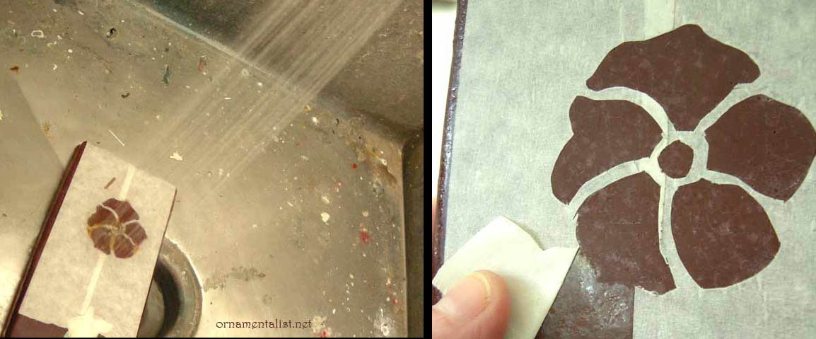
rinse off the Etch-All thoroughly, allow tile to dry overnight
After rinsing I checked to see if the etching had any effect... and it sure did! In fact, I think it would be cool to etch designs into tiles like this and not paint them! Before painting, I let this dry overnight.
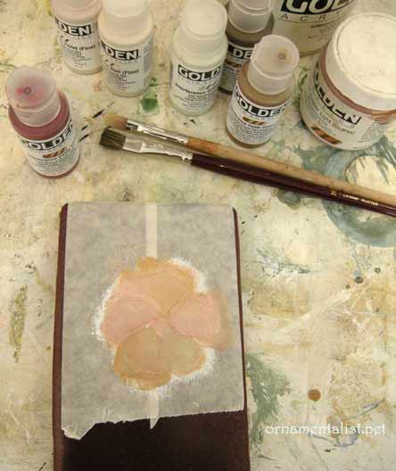
first layers of paint
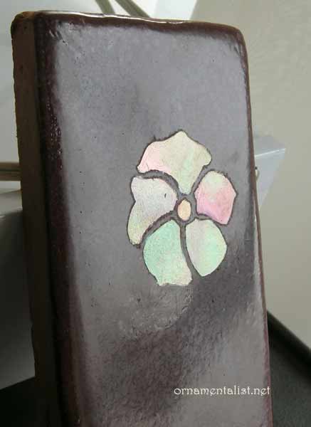
finished sample
For the painting, I started with a layer of acrylic gesso tinted to a peach color with burnt sienna acrylic. Over that I added some layers of copper and gold metallic acrylic and a selection of interference paints. To keep the surface smooth I use a soft blending brush to soften out the paint.
It's hard to get good coverage with such transparent colors, so many layers are needed and you have to be careful not to let brushstrokes build up.

To get that volcanic glass look, I apply the interference colors in a bit of rainbow- each "piece" has several colors changing from red to green to oxide, etc
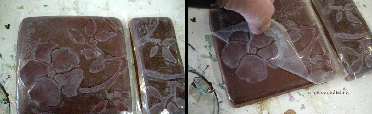
When the sample was finished, as you can see if you look very closely, the tape bled a bit during the etching process. So in the next round I used a solvent-resistant masking film from an auto-body shop.

Because the tiles are dark it was a challenge to transfer the design onto a clear film. I ended up transferring the design to the tile with bright red saral paper, then sticking the mask on them, and then cutting the design out. This whole process took only about 1 hour.

Following the steps above, the tiles were then etched.

project using hand-cut solvent-resistant film

As the tiles are not flat and the glaze has a lot of bubbles and texture, getting the masking film to stick perfectly was not possible. But on a smooth flat machine made tile, this would work like a dream. One bonus about this film- once the water dries off it, it can be re-adhered.

Now for the fun part!

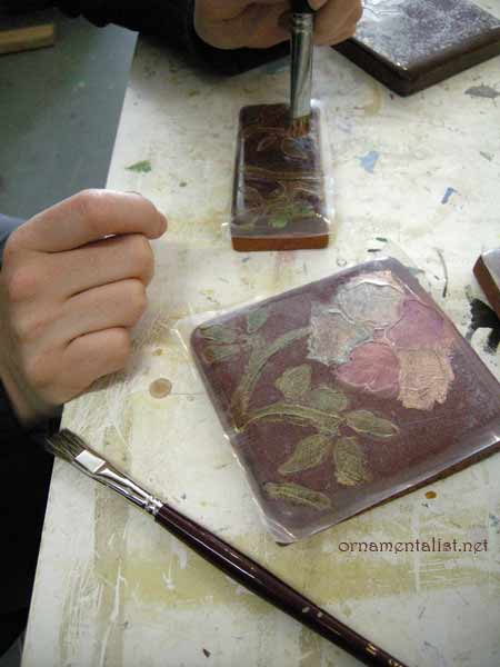
Here is Melka, painting the design with interference colors
Layers of interference and metallic acrylics blended together and softened with a black sable fitch. Important: let the paint cure hard (4 - 12 hours) and bray the edges down to break the acrylic paint film, before lifting the masking film.

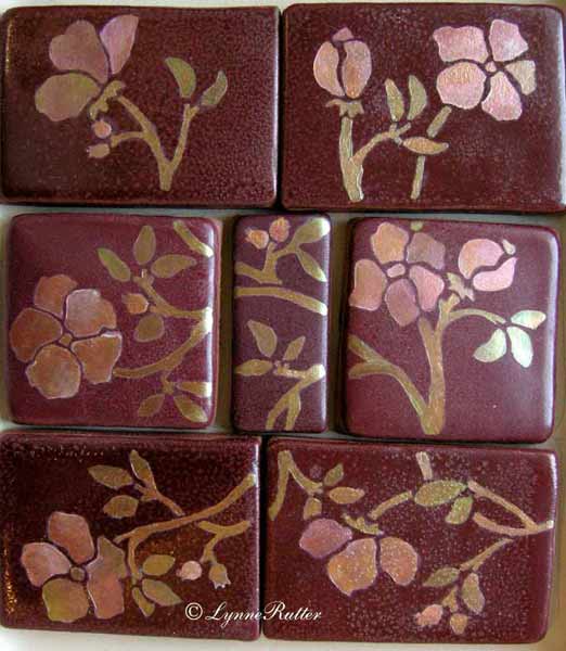
the finished project!

A finished set of tiles: pretty, water-resistant, and unique.
This process can also be used for tiles that are already installed.


30 November 2008

Cover story!


December 2008
- check out this month's California Homes magazine, whose cover story puts the spotlight our favorite new San Francisco designer, Claudia Juestel of Adeeni Design.


The cover article features a historically significant Victorian country house in Diablo, California, to which I have previously contributed a fair amount of work, including restoring and recreating the faux bois for the baseboards and doors in the main parlors and entry, the entry floor, and the ornamental overdoor panels in the living room.


Above: The panels over the windows and doors in the Living Room were painted by Lynne Rutter.
Artistic License associate Brian Kovac created a weathered wood finish for the beams in the newly built wine cellar.


I am so happy to see this work used in Claudia's fresh design, which is an eclectic, worldly mix, and celebration of the Victorian house's original features.


<-- The entry with its painted checkerboard floor and restored faux bois baseboards and casings.


Here is proof positive that you can live,
really live in a period home, with all its "dark" wood and traditional proportions, and still have a joyful, current interior.


click on images to view larger.
images 1 and 2 © California Homes Magazine
image 3 photo by Bernardo Grijalva


24 November 2008

Language of Cloth Textile Show and Sale

Attention fashionistas and fans of color and fabric!
It's time once again for the Language of Cloth textile sale.

Fridays, Saturdays, and Sundays
from November 28 - December 21, 2008
650-B Guerrero St San Francisco
415-431-7761

the blue: hand woven silk with a kotak-kotak pattern (grid) The issen-issen (batik filler patterns) fill in areas defined by the textured pattern of the weave. This design was inspired by an antique obi.

Every year my good friend Daniel Gundlach brings home a fabulous collection of handmade textiles of cotton and silk from Indonesia, Laos, Vietnam, Cambodia, and Thailand. Unusual one of a kind pieces blending traditional techniques with modern eclectic style. Wonderful for wearing, for decor, and with many affordable choices for gifts.


the orange:
hand -drawn batik tulis on Korean silk jacquard, in a flowing basket weave. The batik follows the pattern of the weave in some areas.


Each piece is unique, hand-made using a very labor intensive process, and the sale of this work supports the artists, and the communities in which they were created.


21 October 2008

Library Children's Room Mural completed!

Sierra as Melisande
We recently completed a sizable  mural for the Children's Room in the Burlingame Public Library. I am so thrilled with the transformation of this space!
The mural was commissioned by the Burlingame Library Foundation to commemorate the centennial celebration of the Library.
My goal was to create a look that appears original to the room, as though it's always been there. Indeed it is hard to imagine the room without the paintings.
the entire room was treated as part of the mural
The North "main" mural wall is about 37 feet wide and the ceilings are 20 feet high. The first 5 feet of the walls are filled with bookcases, so all of the murals had to be painted with perspective from below eye-level.
There is a large metal grate and a little maintenance door in this wall, that I worked into the design, so the architecture became part of the composition of the mural.
small maintenance door transformed into a secret castle entrance
I had a lot of fun re-imagining this little door area, to make it an entrance to a castle, or possibly, another world.
Faraway Castles, approx. 9 feet wide
mice and faeries among the poppies
We added images all around the room, so the room becomes a story, its walls the pages of a favorite book.  Details like tiny faeries, mice, and California poppies become more noticeable when you get up close.
read a book!

Centennial Mural story in San Mateo Times
Bay Area Art Quake review by Phil Gravitt!

My thanks to:
Burlingame Library Foundation for their support and this amazing commission
the Burlingame Librarians for all their research and enthusiasm
interior design consultant Michelle Nelson
I would especially like to acknowledge the contributions of my associates Sierra Helvey and Melka Myers who were instrumental in the design and production of this project.


13 October 2008

Library Children's Room Mural- in progress

The Russian Prince brings home the Firebird

This week we will be finishing a large children's room mural for the Burlingame Public Library,

Commissioned by the Burlingame Library Foundation, the murals draw inspiration from the "Golden Age of Illustration" the great storybooks of the late 19th and early 20th centuries, like Maxfield Parrish, N.C. Wyeth, Arthur Rackham.

The Burlingame Library is a charming Spanish Revival style building was designed by architect E. L. Norberg and completed in 1931.
The children's room is a large space with soaring, beamed ceilings, textured plaster walls, and a lot of odd angles. This presented a challenge as there is no one focal point to the room, nor is there a large uninterrupted space where one might normally site a mural.
So I designed a mural that uses the architecture
, grates, doors, and arches, as part of the composition.

Work in progress on the north wall.

We painted the murals on canvas in my studio, then glued to the walls and in some areas, additional painting is done on site.
The Foreign Prince, being cut out prior to installation.

installing the castle mural in an arch
The Burlingame Library will "unveil" this mural during their Centennial celebration on Sunday, October 19, 2008.


Lynne Rutter Murals & Decorative Painting

28 September 2008

Eye Candy

A splendid miniature eye portrait from the Victoria and Albert Museum, with a diamond teardrop
In the late 18th and early 19th centuries, miniature eye portraits were all the rage. This was after the late 17th century rage for miniature portraits of any kind. They were painted most often using watercolor or gouache, on a substrate of ivory or parchment, then set into a bit of jewelry- a pin or pendant.
In Victorian times the eye portrait was often a piece of mourning jewelry, but the origin of this form was as a token of love.
I have had, for rather a long time, an obsession with eyes, used as symbols in my paintings. So naturally I am fascinated with these tiny symbolic paintings, the lover's eyes.

an assortment of lover's eyes

According to The Art of Mourning:
"Eye portraits are considered to have their genesis in the late 18th Century when the Prince of Wales (to become George IV) wanted to exchange a token of love with the Catholic widow (of Edward Weld who died 3 months into the marriage) Maria Fitzherbert. The court denounced the romance as unacceptable, though a court miniaturist developed the idea of painting the eye and the surrounding facial region as a way of keeping anonymity. The pair were married on December 15, 1785, but this was considered invalid by the Royal Marriages Act because it had not been approved by George III, but Fitzherbert’s Catholic persuasion would have tainted any chance of approval. Maria’s eye portrait was worn by George under his lapel in a locket as a memento of her love. This was the catalyst that began the popularity of lover’s eyes. From its inception, the very nature of wearing the eye is a personal one and a statement of love by the wearer. Not having marks of identification, the wearer and the piece are intrinsically linked, rather than a jewellery [sic] item which can exist without the necessity of the wearer."


I'd love to be a collector of these, or to have just one of them. Perhaps I will paint one of or for my own best beloved, as a follow-up to the maxi-eye portraits I painted a few years ago, of Erling Wold, myself, and our "adopted" daughter Laura Bohn.

Eye portraits of Erling Wold, eye self-portrait, and Laura Bohn, at 250% of life size, oil on wood panels


Treasuring the Gaze more about Georgian lover's eye portraits.
Check out the highly enviable collection of Cathy Gordon
Oeil en miniature by Le Divan Fumoir Bohémien
Even more lover's eyes from Candice Hern

The Art of Mourning more about Victorian mourning jewelry
Interested in collecting? Antiques Roadshow has some tips.


Lynne Rutter Studio

06 September 2008

Italian Hexagonal Ceiling

Hexagonal Living Room with  an Italianate painted ceiling by Lynne Rutter

Recently I completed a project three or more years in the making, for a wonderful home in Orinda, California.  Built in the style of a Landhaus-Villa, the architecture combines elements from Italian and Austrian hunting lodges, with detailed with custom polychromed ironwork, and antique handmade bricks stamped with the Hapsburg crest.
My patrons love Italy as much as I do, so for our principal design element I took inspiration from the the painted ornament of the early Renaissance Basilica of Santa Croce in Florence.
detail of the handpainted Florentine ceiling border
before- an unfinished white ceiling in a room with great bones...

This element was adapted and hand-painted 66 times - a natural, hexagonal number, also a sphenic number, adding a mathematical stability and a sense of architectural symmetry to a slightly off-center space.

The color palette was adjusted to suit the decor of the house, the bricks, the fabrics in the room, the lemon yellow walls.  Terra-cotta banding,  wasabi green, with pure red and yellow-ochre panels with trompe l'oeil,  and quatrefoils of deepest blue make up the borders. Rather than the lapis blue you might expect, the field is a deep turquoise color scattered with 22 karat gold stars. 
after - 22karat gold leaf stars and accents glitter in a colorful ceiling from which grows a polychrome iron chandelier.


photos by David Papas and Lynne Rutter


Lynne Rutter Studio

01 September 2008

Summertime

Labor Day - a day arbitrarily marked as the end of Summer. White pants? what about them? For San Francisco, it's the beginning of the Indian Summer, the warm big sister to those halcyon days to which we look forward all the year.

Balinese temple umbrella on my patio,
photo by Lynne Rutter, August 2008

09 August 2008

Agua Vista Park


Agua Vista park, with a view of San Francisco's last remaining drydock (near Pier 20) and the recently closed steelworks.

A few months ago, I started taking my lunch down the street to a nice little spot called Agua Vista Park, which is just north of my studio in the old American Can warehouse. I've all but ignored this public park for years and years, and often when I walked by its gates were locked.

Agua Vista is just next to the Ramp restaurant, which seems to have added a few tables out back to take advantage of this space.
In the last years, the city's Green Trust has made an effort to clean up some of the bay access and "parks" along the central waterfront. [This included painting over some fine graffiti art in Warm Water Cove a few blocks to the south.]

Places like these are wonderful finds, and in my neighborhood it tends to be sunny and pleasant near the water quite often. Abandoned cranes, old brick factories, and WWII-era concrete waste, has slowly turned into a haven for birds and the start of tide pools. The gritty, industrial backdrop of these little spots make for an interesting view.

I am going to enjoy them while I can.

19 July 2008

Marvelous books from Editions Vial


I seem to have amassed a considerable library, the majority (by volume) of which are design and architectural books. A large number of the most amazing and useful décor books in my library come from the French publisher, Editions H. Vial.

I have hunted these books which are, with rare exception, inexplicably unavailable via the "usual" US outlets, but I have had the good fortune of acquiring a number of them in person, at the fabulous bookstore of the Musée des Arts Décoratifs in Paris, and at the recent Chicago gathering of the International Salon of Decorative Painters, where Vial premiered the new (bilingual) book of decorative painting techniques by master trompe l'oeil artist  Michel Nadaï.

Michel was good enough to inscribe a copy of his book for me.


Michel Nadai's book as well as many others in Vial's catalogue are available in the U.S. through  Pierre Finklestein's on-line shop.


some my favorites are:

Art and Techniques of Grottesque
Identifying Marble
Decoration de Bois et Marbres
Chefs d'OEvre des Marqueteurs
Modeles de Peinture Polychrome sur Meubles
Meubles et Décors Peints
Painting the Van der Kellen WayImitations et décors à l'école Van der kelen   from the prestigious Van der Kelen Institut supérieur de peinture.


14 July 2008

Trompe l'oeil faux travertine casings

Trompe l'oeil to the rescue!
In our current project, the huge windows of the two-story living room have somewhat undersized casings.

So we enlarged them, with a faux travertine finish and some trompe l'oeil egg and dart mouldings.

<------ Samples of the faux finishes

The stone finish makes the casings feel more substantial, and the additional border helps balance the size of the large windows.


To create the travertine finish, a coat of glaze (raw umber + white) is painted over an off-white eggshell finish paint.
A piece of pleated tissue paper is laid on the wet glaze, then smoothed over with a tooth spalter, and quickly removed.
This is repeated with a lighter coloured glaze on top.
This technique gives a fairly convincing textured effect similar to a foro romano travertine limestone.


The egg-and-dart moulding is created using a stencil to block in the "shadow" areas. Additional details are painted in by hand. in this way we can make each one slightly different so they don't look too new or machine-made
Warm white highlights are added as well as some shadows on the wall around the new "casings."
Subtle trompe l'oeil "joints" in the casings help make them look more convincingly assembled from carved stone.


The finished windows have more support for their size
and lend some classic Italian atmosphere to the room.

click on any image to view larger


Lynne Rutter Murals & Decorative Painting

28 June 2008

America

click to view larger
This image has been on my mind lately.

detail from the frescoes in Sant'Ignazio Church, Rome
painted by Andrea Pozzo, circa 1698

photo by Lynne Rutter April, 2008


10 June 2008

Marouflage Ceiling in progress

Sierra touching up the canvas after install
122 hand painted ornaments, 28 canvases, 12 colors of paint, 5 rolls of 22k ribbon gold leaf...

This week we started to hang the "Italian Ceiling" which we have been painting on canvas in the studio for the last several months.


I am elated that my fabulous installer Peter Bridgman, who has been living in Florence the last year or more studying art restoration techniques, came home just in time to help me with this project.
coffers, being sized before canvasing
Each ceiling panel is pasted with clay based adhesive and allowed to dry. The back of the canvas is then moistened with water, and a second, fat coat of paste put on the ceiling just before the canvas is applied.
marouflage installation in progress

In the longest panel we found that the chandelier electrical box was not actually in the center. Bad news, since an elaborate rosette was painted for the center. This is always a danger when painting canvases for ceilings that have not yet been framed. No matter what the carpenters tell you about how perfect their measurements are, they are never, ever correct. That's why the design of this ceiling incorporated a lot of "bleed" on the outside edges.

Peter's technique is to find the "priority" edge and work from there. Sometimes the priority is the "center", and sometimes is the spot that makes the ornament line up with the ornament in the next coffer. Some pulling and adjusting and language is usually needed. Most of the panels, however, seem to smooth out like butter on bread.


trimming the canvas and adding some final touches
Once the canvases are smoothed into place they are left to rest while they tighten; they are then trimmed neatly to fit perfectly. My assistants and I paint the lighting trim, vent covers, etc. to match, and touch up or embellish wherever needed.


After today the false floor that allowed us access to this part of the 22 foot high ceiling is being removed, so we were in a crush to get that area finished.
Next week we will install the remaining 17 ceiling panels, and start working on the walls! stay tuned....


Marouflage is in the glossary!