16 December 2009

Cards of Christmas Past

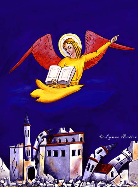
2003: " The 7th Angel of the Apocalypse" inspired by a 14th century ceiling fresco in southern Italy; the bombing of Iraq, and the capture of Saddam Hussein; and an obsession with ultramarine blue.
Since about 1971 or so, my parents have encouraged my art career (perhaps unwittingly) by asking me to do the artwork for their Christmas cards. I may post some of those early efforts here someday.
In recent years, Kit and Jet have traveled a fair bit, and it has become the tradition for me to design their Christmas card inspired by their most current trip abroad, be that Italy or Angor Wat. I paint them in gouache on paper, print the card, then frame the original artwork as their gift. I am told by my parents these cards are being collected by their friends.

So in case you are not on their mailing list, here are some selections from the last few years.

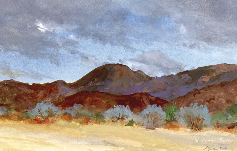
2008: I spent Thanksgiving weekend with Jet and Kit in Palm Desert, and sketched this view.


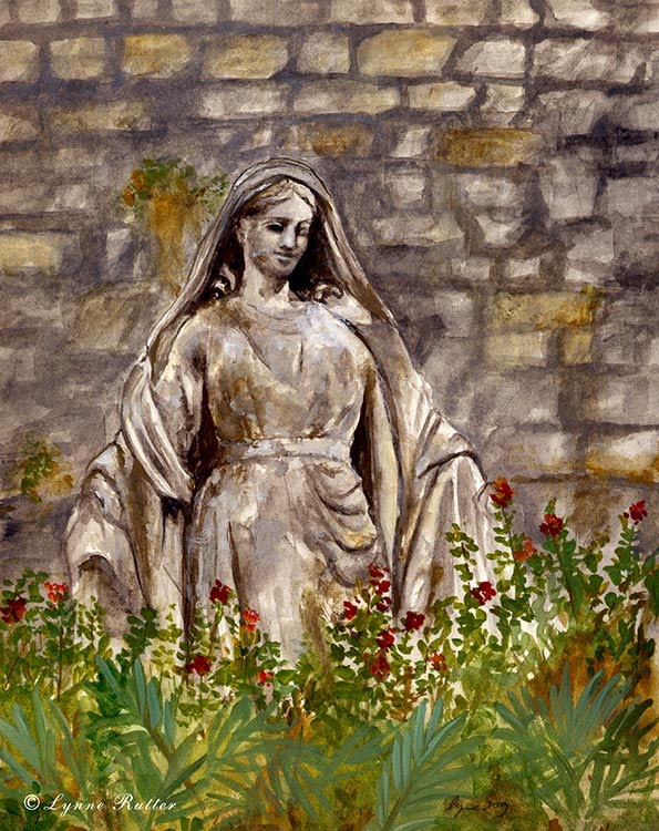
2009: A statue of the Madonna, damaged from fighting on D-Day, painted from a photo taken by my mother in Bayeux, France


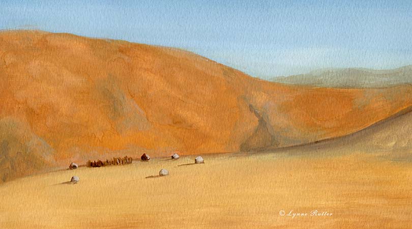
2004: I made a too-short trip to Africa with my parents in May. This card was painted from my watercolor sketch of a Himba village in the Kaokoland, Namibia.


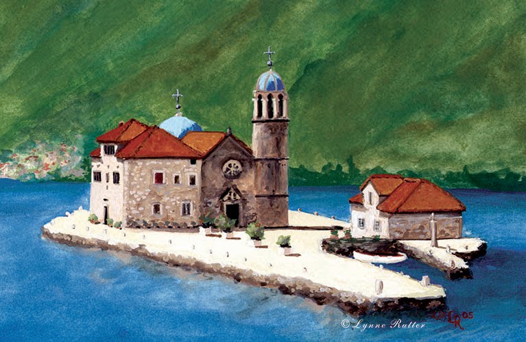
2005: Gospa od Škrpjela "Our Lady of the Rocks" painted from a photo taken by Kit in Montenegro


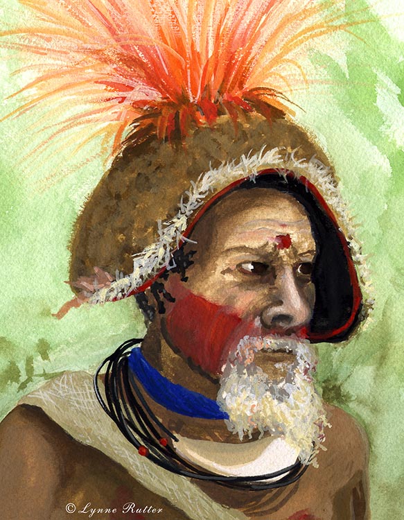
2006: from Kit's excellent photo of a Huli elder in Papua New Guinea.
I took some liberties with this portrait, aging the subject to make him look more wise and fierce.


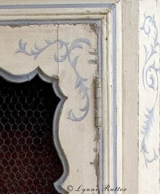
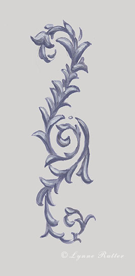
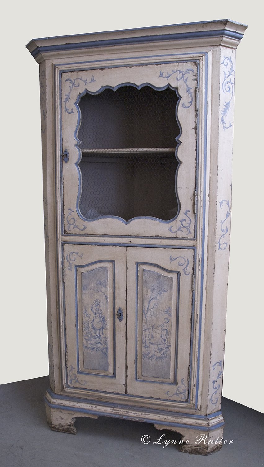
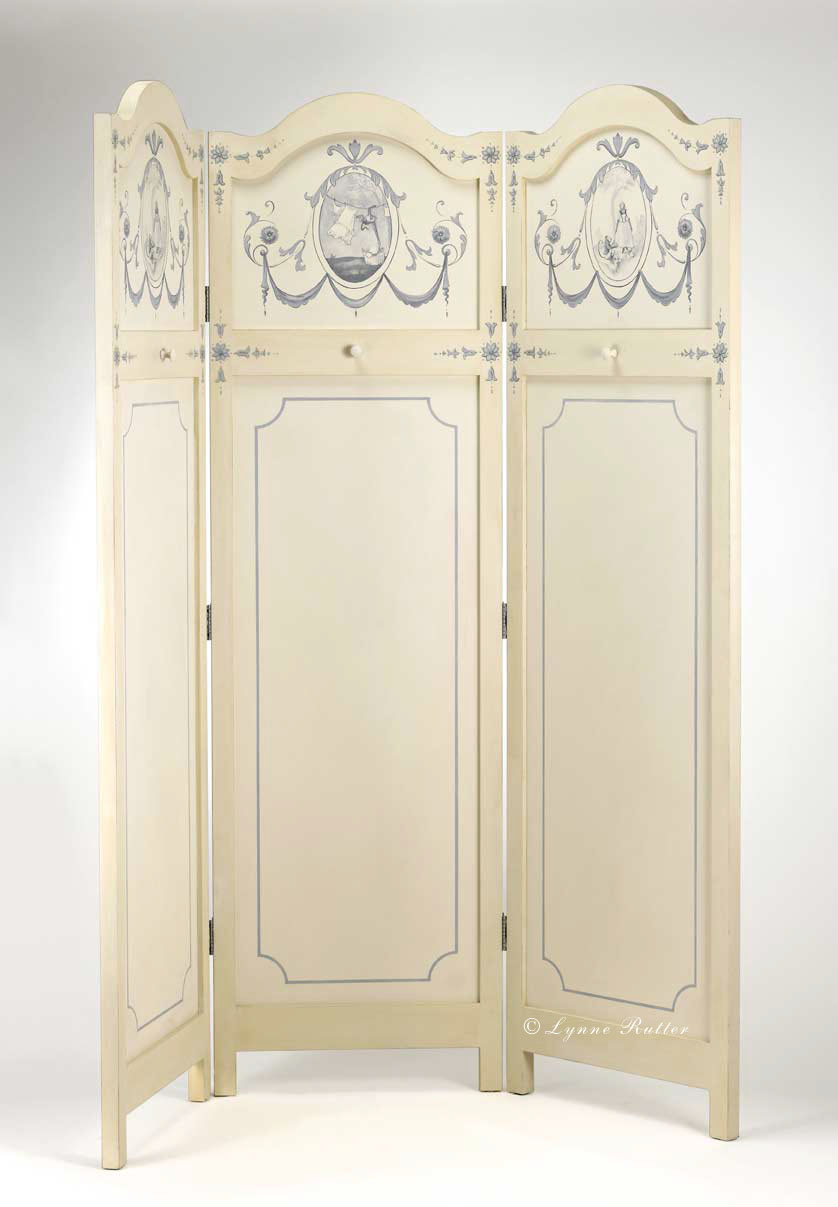
all artwork in this post © Lynne Rutter
click on images to view larger


15 December 2009

A Feast for the Eyes


If there is anything a decorative artist might love more than beautiful picture books, it's good food.
So, a group of 11 fellow painters and I have assembled a collection of inspiring images from travels and observations with the camera, as well as a few shots of our own work, and mixed them together with our favorite recipes to make a unique little cookbook called A Feast for the Eyes: Memorable Recipes and Images from Decorative Artists.

Our self-published book is a nimble little 7"x7" volume featuring 21 of our favorite recipes, and 51 inspiring color photographs collected from all over the world: from Indiana to China, from Florence, Italy to Orinda, California.
The variety of recipes and the easy preparation of each dish makes this a useful book to keep handy, and the treasury of photographs will give you a thrill even when you are not cooking.


A Feast for the Eyes is currently available through the Blurb.com Bookstore.


14 November 2009

Chrysler Ceiling Mural: a quick look!

Art Deco borders abound in the lobby of the Chrysler Building
During a recent visit to New York City, I had a short morning to take in a couple of sights with my friend Emily, visiting from England. Fortunately if you are fan of architecture, and Art Deco surface ornament in particular, there is plenty to see just walking through Grand Central Terminal and the street outside, on the way to one of my all-time favorites, the Chrysler Building.


Murals by Edward Turnbull in the Chrysler Building, NYC
At the time of its completion in 1930, the Chrysler was the tallest building in the world, and the lobby ceiling mural by Edward Turnbull, entitled Transport and Human Endeavor was the largest mural in the world, at 78 by 100 feet. Originally titled "Energy, Result, Workmanship and Transportation," an obvious sense of ambition informs the mural on other levels - it's all about achievement, hard work, accomplishment; being the biggest, best, fastest, strongest, first!


Painted on canvas and applied marouflage to the ceiling, this mural has thankfully survived age, and several renovations, including the inexplicable addition of recessed can lights, which were removed during the most recent restoration in 1999.
It is hard to appreciate the ceiling mural because the lobby is rather dark. With its rich red Moroccan marble walls and elaborate inlaid wood elevator doors, there is a lot to see without even looking up. But if you can stay long enough to get used to the cocktail lounge lighting, you will notice so much more.
The focal point in Turnbull's mural: muscles and decorative ka-pow!
What caught my eye this particular visit was all the great decorative elements of the mural. Along with Art Deco borders, there are transitions, and patterns, with a nod to the Vienna Secession.


Look closely and you will see colors, patterns, and pistons! Machines are cool!

The artist's initials as seen at the end of a level in this detail

Metal leaf is used throughout this painting to great effect. I love this scene, which is painted with pattern, figures, color, and even one figure which is only sketched in. Note the artist's initials "E.T." on the level.


photos by Lynne Rutter, November 2009
click on the images to view larger


18 October 2009

blue and ivory


I was talking with one of my fellow painters about what to do when you are stumped. I said "try some blue." I seem to remember one of my mentors telling me that it was one of the rules of good design, that there needs to be a bit of blue in every well dressed room. This advice has never failed me!
Think about it, does your great grandmother's flow blue platter ever look bad anywhere?

Likewise when I was asked to add a bit of ornament and color to an antique ivory-colored corner hutch, for a Provinçal-style room designed by Claudia Juestal of Adeeni Design, I turned to blue. How perfect for a room with lots of red and yellow!

The enhancement of this piece started with a loosely painted wedgewood-blue scroll. On the cabinet doors, scenes from a favorite toile de jouy pattern are a nod to the French country tradition.

Another blue and ivory piece I painted recently is this large folding screen, which was custom built for the Vintage Laundry room I designed in the San Francisco Decorator Showcase.

The screen is painted with some neoclassical motifs and lighthearted singerie scenes, with monkeys sewing and doing laundry. This restrained hint of color added just right amount of the blue finesse to dress up the room.

Click on images to view larger


Okay but what about other colors? Have a look in the gallery on my website, to see some more colorful painted furniture.


All work in this post ©Lynne Rutter
screen photos by David Papas


26 September 2009

Overlooked Ornament in the Salette Borgia

detail of Pinturiccio's  ceiling in the Borgia Apartments, Vatican
Visitors to the Vatican Museums have enough to take in without looking at all the painted borders and ornament that encrust nearly every square foot of the place. However, on my last visit, that is precisely what I was doing!

---- in the Salette Borgia: splendidly painted in jewel tones, and blissfully empty of visitors.


After bidding my companions not to wait for me, and after further hours of careful ceiling-gazing, I was still stopped in my tracks by two small chambers of the Salette Borgia, whose early Renaissance ornamentation is noticeably different in style than the majority of the palace. Ironically these rooms are the entrance to what is now the Collection of Modern Religious Art, which many visitors nearly run through on their way to the Sistine Chapel.

These and other parts of the Borgia Apartments were decorated with wonderful frescoes and ornament including some stylish grottesche, and fresco murals, painted in 1493, by renown artist Pinturicchio and his sizable atelier of assistants. 
These are some of the earliest grottesca paintings done in the Vatican.

painted drapery with the Papal coat of arms of Alexander VI
This entire suite of rooms in the Apostolic Palace was abandoned in 1503, after the death of Pope Alexander VI, because of their association with the disgraced Borgia family. Shuttered and largely disused for nearly two centuries, they escaped  redecoration by later popes.
worn tile floors: evidence of hundreds of thousands of visitors passing through.
A wall paneled with stenciled patterns, and a trompe l'oeil window.
Above it, a fresco by Pinturicchio depicting the Annunciation.
Another detail of the ceiling- note the jewel tone color scheme


In 1891 the rooms and the artwork in them were restored under Pope Leo XIII and opened to the public. Now they seem to be treated as a mere passageway between the more famous parts of the museum... except by those of us who stop to look up.


Click on any image to view much larger


photos in this post by Lynne Rutter, Vatican City, 2008


21 September 2009

Hartono! Batik Workshop and Exhibition

The Language of Cloth and Lynne Rutter Studio are thrilled to be hosting Javanese batik artist Hartono, visiting the U.S. for the first time, for a workshop on traditional Javanese batik technique, as well as a trunk show and sale of one-of-a-kind batik textiles.

Hartono is a talented young artist of the newest generation of batik-makers from Solo, Central Java, a center for batik-making for over 150 years. Hartono’s designs incorporate Japanese and European motifs which he blends with traditional Javanese patterns.

Saturday, October 24 from 9am - 5pm
Hands-on batik workshop
* 6 to 8 pm Reception for the Artist

Sunday October 25th from 10am to 6pm
Exhibition and Trunk Sale with batik demonstrations

at Lynne Rutter Studio
2325 3rd St. #207, San Francisco, CA

The Saturday workshop will be an intensive one-day hands-on introduction to the basic techniques of Javanese batik making. Participants will complete their own batik creation on silk, with instruction from Hartono from start to finish.
The class is limited to 8 participants and the fee including all materials is $100.

Contact Daniel at The Language of Cloth to reserve your place: daniel@thelanguageofcloth.com
or call 415-613-9693


11 September 2009

The Steampunk Aquarium Mural

Giant octopus in a rusting iron aquarium
the garage before painting
I recently completed a fabulous project on a tiny detached garage in Oakland, California. My client is an avid scuba diver who loves all things Victoriana, and has a special attraction for octopi. So I devised a plan for a Jules Verne-inspired aquarium.

I designed the mural to incorporate the entire structure: the garage door became the glass "tank" and the building its "case."


The finished mural with many surprising details
In retro- steampunk fashion, trompe l'oeil rusting iron bolts and cast-iron brackets hold the aquarium tank together in a Victorian-style oak woodgrained case. The mural is completed with three portholes at the top and protected with several coats of UV varnish.


all images in this post ©Lynne Rutter

click on images to view larger


06 September 2009

Restoring a tapestry mural

My studio recently completed the restoration of an antique tapestry mural.
This is one of a pair of very nice ten foot tall panels that have hung in the lobby of a Spanish Revival apartment building in Pacific Heights since it was built in 1910. The murals are based on a 17th century Gobelins tapestry designs, and are printed on linen using the newfangled technique of silkscreen printing (invented in 1907) combined with the far more traditional printing technique of stenciling.

a major rip at the base of the mural

One of the panels suffered some major damage: a large rip at the base, followed by a six foot long tear straight up the center. Some areas of the material were missing, and the surface was laden with nearly 100 years of accumulated dust, smoke, and dirt.
To restore this mural, we needed to clean and stabilize the entire piece, repair the damage, and recreate the lost areas.
We started by removing it from its frame, and giving it a gentle cleaning front and back.

During cleaning, much of the more subtle detail emerged.

To stabilize the mural, we lightly stitched the major rips closed, then backed the entire piece with a new piece of linen. The perimeter of the panel was then sewn by hand onto the backing for added strength.

My associate Angela is a skilled conservation technician who has worked for many years restoring art for museums and collectors. We met during a large restoration project in 1993 and she has assisted me on numerous jobs since then.
Angela securing the mural to its new backing

Tears, rips and areas of fabric fatigue were painstakingly stitched to the backing, to prevent the rips from spreading, and to fill in for missing material.

Thousands of tiny stitches fill in the ripped area.

Once the sewing was finished we re-stretched the mural back onto its stretcher bars, which we had also reinforced.


I mixed up eleven different colors of paint to match the tapestry's palette, which I then lightly daubed over the stitches to help them blend in to the surrounding areas.

In some places the image was missing and had to be recreated. While not entirely flawless, the tapestry looks wonderful and its repaired sections are hardly noticeable.


The restored tapestry (left)


Click on any image to view larger


Lynne Rutter Murals and Decorative Painting

21 August 2009

Exterior Color: Noe Valley Victorian


Beautiful Victorian details celebrated with six colors and gold leaf!

Before:  Pink and Cute!
This Victorian in San Francisco's Noe Valley could not help being a bit cute. The Stick-Eastlake Cottage had been painted about 15 years ago using the pink colors from the magnificent hortensia blooming in its front entry.

When it came time to repaint, the owners asked me to design something a bit more grown-up.


Choosing a Color: I ask my clients to drive around town and photograph houses of similar style whose paint schemes appealed to them. Every one they chose was green! So we started with green. The color scheme I devised for this house uses six colors, all from from Benjamin Moore's Historic Color range, with 23 karat gold leaf on the buttons and pediment ornaments.


Managing contrast: This palette is as much about contrast as it is about color. One technique being employed here is the use of what I call a "secondary trim" color, which in this case is about 30% darker in value than the main trim color, and is used to support features like brackets and window columns, and to create a break between the main body color of the house and the more vibrant accent colors of the window sashes and insets.

after- green, gold, and ivory
Know when to say when: The custom garage door was simplified from three colors to one, and painted the same as the body color, so as not to compete for attention from the main part of the facade. The front door, which had been whimsically painted with four different colors, now sports a more European look in a solid glossy teal with polished hardware and gold leaf details, leading the eye right to the entrance.

After: the Victorian cottage as stately home

click on any image to view larger


Expert Painting by San Francisco Local Color Painting
paint:  Benjamin Moore Historic Colors

Color Consulting by Lynne Rutter 415-282-8820


Update!
This project has been featured in the June 2015 issue of Old House Journal.  After nearly  8 years, this is still one of my most talked about color designs.
At this time I can say that the basic colors for this scheme are Louisberg Green and Standish White by Benjamin Moore.  You will notice in the OHJ article several other uses of Louisberg Green and see how very different that color can look depending on the environment, orientation and accent colors.


30 July 2009

The long lost sketchbook of Jeanne Magnin

In true ornamentalist fashion, Jeanne Magnin collected borders and motifs from her travels, and documented them in beautifully drawn and composed pages.

Egyptian border, from Jeanne Magnin's Documente de Style 1916 - 1917
Tara Bradford, the creative force behind one of my favorite blogs, Paris Parfait, found a little plain brown paper bundle at a brocante, which turned out to be a sketchbook full of gorgeous designs of Egyptian, Roman, and Greek styles, collected in 1916-1917 by the French painter, collector, and art critic Jeanne Magnin.


Egyptian ornament, from Jeanne Magnin's Documente de Style 1916 - 1917


Tara was generous enough to photograph each page of her amazing find and post them to her blog, at very high resolution. With her permission I have re-posted some of them here.


Roman-style rinceau and bucrane borders, sketches by Jeanne Magnin

In true ornamentalist fashion, Magnin collected borders and motifs from her travels, and documented them in beautifully drawn and composed pages.


Greek ornament: a page of palmettes
Greek borders


 Each page is like traveling to another time and place.
Greek motifs, Jeanne Magnin's Documente de Style 1916 - 1917


Magnin was the author of Le paysage français, published in 1928 and Un cabinet d'amateur parisien en 1922. You can learn more about Jeanne Magnin by visiting Le Musee Magnin in Dijon, France.
All photos in this post by Tara Bradford- click on images to view larger.