Showing posts with label how-to. Show all posts

Monday

Studio Visit: Paolo Bellò, Sologna, Italy

In which we are greeted by the warmest of Venetian smiles

trompe l'oeil coffered ceiling by Paolo Bellò with various rosette designs 
Stucco bas-relief in Stile Liberty by Paolo Bellò


From Venice I took the regional train to Bassano del Grappa, where I was greeted by Paolo Bellò and his wife Stefania, and two of the warmest of Venetian smiles, then on to town of Sologna where Paolo's studio occupies a prominent place on the main street.

I first met Paolo at the Salon in Lecce in 2015. At that time he was shy about speaking English, mainly because he didn't speak English. Since then, he and Stefania have been taking intensive English classes in order to better communicate with their new international friends.  Among them, the Irish painter Noel Donnellan, with whom Paolo recently formed a collaborative company called Pigmentti.  While it can be argued that studying English does not always help a person understand Noel when he gets going, both of these guys can paint, and they sure get the job done. 


The Sologna, Italy studio of Paolo Bellò features several workrooms, and a mezzanine displaying samples of work. The giant mistletoe design is for a house in Switzerland and was rendered in stucco bas-relief.

In his enormous and beautifully organized studio, Paolo treated me to a comprehensive demonstration of stucco bas-relief, one of his specialties.  

After showing me the basics of  traditional marmorino, its mixing, application and finishing, as well as ways to color it, Paolo transferred a design onto the still damp plaster using a spolvero (pounce) and some charcoal.

the spolvero transfers the design onto damp plaster
special stucco carving tools, some you buy, some you hack !

While still soft the marmorino is scratched out along the design to key the surface. New white stucco is added into the ornament areas and then sculpted using special tools.

detail of stucco being built up
Paolo Bellò sculpting detail in the stucco ornament

As the stucco hardens finer detail can be added, but all of this must be timed just so and this requires a real understanding of the material and what it can do.

Paolo Belló has worked in decoration since the age of 14. He attended the European Centre for Heritage Crafts and Professions in Venice.  Then after studying with maestro Ennio Verenini in Bassano, Paolo was invited to join the Verenini decoration company, and three generations of knowledge was passed on to him over the next 20 years. He opened his own studio in 1994.

The hundreds of sketches, samples, maquettes, and tools in the studio are a testament to the the life's work of this consummate artisan.

optional designs for a doorway: on the right, Paolo pays tribute to his favorite architect, Carlo Scarpa.
Exterior Design: sketches for two possible treatments which include ornament, color and relief stucco work.


During my visit Paolo and Stefania took me on a tour of their favorite Veneto sights: the Tomba Brion of Carlo Scarpa, and the Palladian Villa Barbaro with its Veronese frescoes that make my heart sing.   Along the way we passed  houses Paolo has decorated with fresco sundials or ornament, keeping alive the tradition of the Veneto artisans. 


Noel, Lynne, and Paolo at the Salon 2018 in Leeuwarden.*
 
I look forward each year to attending the International Decorative Painters Salon, where I have met so many friends and fellow artists from around the world.   
 

See more of  Paolo Bellò's work on his website.

Tomba Brion by Carlo Scarpa
Villa Barbaro

photos in this post by Lynne Rutter, Sologna, 2018
except * by Stefania Bellò


Friday

Top 5 Policies to Make Your Blog Better

I read somewhere  on a list of top 10 blog tips, that people like numbers and lists.  Post titles such as  "12 tips for faster sewing" or "The top 7 Color Mistakes and How to Avoid Them" will attract more attention and appeal to people needing guidance on your subject. Hence the title of this post.

Self-portrait, Lower Belvedere Palace, Vienna
I have been a bit slow with my blog lately.   In addition to just being very busy with other work, I have to admit a large reason why I have not been posting more often,  is that I am feeling inhibited, after finding a staggering number of my images being used without credit or permission, in many cases being passed off as the work of another.  I found one blog using 15 of my images and claiming the work as their own (it has since been taken down you can be assured). I recently saw some of my work on a blog where the titles of the image files were something like "blogger/wp-content/uploads/2011/10/Screen-shot-2010-11-07.png"    The poster rather obviously did a screen grab of the image via an image search, and left the date of the offense right there in the image title for all to see.

It's depressing for a visual artist such as myself, that there are now so many bloggers and Pinterest pinners and Facebook sharers (and splogs!)  out there with really bad manners.  Seems like every time I talk to a photographer they are complaining about blogs and Pinterest and the users of the world wide web's lack of respect for copyright and original content. 

So in a concerted effort not to rant (too much), here is a post on simple policies on sharing content you can enact for your blog, to make it better, more relevant, and ultimately more interesting.

1. Use original content.
What is the purpose of your blog?  Assuming you want people to read  what you are publishing, think about why.   The blogosphere is too full of compiler blogs that just re-post other articles or images or entire blog posts from elsewhere without any comment or editing.  They are boring.  They make their authors look boring. Obvious gimmicks trying to drum up traffic using other people's images or writing is boring.  Please, don't be boring.  Have something to say, put your own mark on what you are doing, reveal a new insight,  say what you think!    Original content will make your blog a valued resource and garner its own, unique  following. Use your blog to express something of yourself.  Otherwise, really, what's the point? 

2. When you post your own images,  mark them.
 Whenever possible if you can add your name or blog address to your image prior to posting it, then it will be clear, wherever else it ends up, where it came from. This can take a little time to do nicely but it's worth it.  I don't think it needs to be stamped across the front obscuring the images, but just noticeable enough.  If you are concerned about not being given proper credit, insist on it, by marking your images.

3. State your sharing policy
A Creative Commons License makes it easy for you to state your policy on sharing and use of your work.  If you are publishing under a Creative Commons License, as I generally am, (see my side bar) your readers will have access to a detailed policy on sharing your work.  
If you want to retain full copyright,  and not have anything pinned or shared or copied, there is a license for that, too, or you can simply say so.  At the wonderful blog  Art and Alfalfa, the copyright notice is posted directly under the header.  I respect Gina's copyright and if I want to share her beautiful and original work with you I can ask her myself, or I can simply repeatedly link to her lovely site so you can go there and see it.

I admit I was pretty flattered to see so much of my work from both my portfolio and my blog being shared at Pinterest.  Note that all of my images are marked and that Pinterest does link back to me.  so we're cool.

4.  Please, give credit where it's due!
I  understand the enthusiastic sharing of beautiful images, but it's just bad manners not to respect a posted policy and in many cases it's also illegal.
Cite sources for images you are posting, and wherever possible the name of the designer, photographer, artist, etc. in the caption or elsewhere in the post.  Do not just swipe images, or do screen captures, to illustrate your blog.   Make some effort to give credit. Your readers might really want to know where those leopard print loafers came from, or who did that beautiful painting.   The original creator of that image was nice enough to share it;  don't be rude by not acknowledging their contribution.
Citing "via Pinterest" is not really giving credit, it's a cop-out that translates to "co-opted from someone else's research."  If you did get an image from Pinterest (or Google or Bing or Wikipedia, etc) you should at least link back to it, or better yet, go to that image and click on it and it will take you to its original site. You won't have to drill down far to find its original source.  Make the small effort to give credit and you appear knowledgeable, trustworthy, and connected.

Before posting this image on Pinterest, I researched its origin using src-img
If you cannot figure out where an image came from, try searching for it using the outstanding reverse image lookup tool called Source Image:   src-img
This is a marvelous free bookmarklet:  put it in your browser toolbar, and when you click on it, it will ask you which image you are looking for-click on the question marks (see above) and it will deliver a Google search of the image or ones similar to it to assist you in finding the original source of it. I have been able to track down the origin of an image in 10 seconds or less. Surely you can spare 10 seconds to find the author or source of an image. Don't you want to know where that wonderful image came from? The above image I traced back to Bruxelles Antiques,  a wonderful site full of gorgeous, original images,  well worth a visit. 

5.  There is no # 5. I just though 5 in the title sounded better than 4. The only no 5 that matters is Chanel No 5.


Wednesday

Ebony Cerused Oak - how to create this hip finish


ebony limed buffet, via 1stdibs

The last few years I have been getting more requests to "do something" with old furniture pieces, adding ornament, refinishing wood,  repairing gilding, etc. I love working on furniture and the special challenges each piece presents.
"before" orange varnished oak

One of the hardest things to work with is bright orange oak --- a tough one because of the assertive grain among other issues. Oh yes, you can fill it and paint it,  but why not find a way to work with it?
In this age of cheap laminate furniture, solid wood is something to be celebrated!

One project I had recently I took my inspiration from a midcentury piece of cerused oak, also known as limed oak.

Inspiration:  1943 Paul Frankl limed oak dresser, at 1stdibs.
In the sixteenth century this finish was created to help deter insects and rot in oak beams and paneling, by filling the grain with lime or lead-white and wax,  but after a while it became a fashionable way to lighten up and enhance the the look of the wood.     Cerused oak finishes  were also fashionable in Art Deco and midcentury interiors for  furniture, floors, cabinetry, and paneling, and is now once again very much on trend.
Note: I am not talking about the pickled "slimy pink" whitewash that was all the rage in the 1980s.  

A good cerused finish shows the grain in contrast to the rest of the surface.   High contrast between the wood and the grain is a really effective look.  Please note this is not a technique useful for any kind of soft wood (pine, cedar, redwood, etc.) nor do I advise trying this on any kind of plywood or veneer.

Inspiration: circa 1950 James Mont bench in ebony limed oak.


I found many instructionals for liming wood on the internet but none with pictures.  I like pictures!  So I decided to share the process of transforming this orange varnish oak piece into something more fabulous and moderne looking.

How to Make a Cerused Oak Finish:


Apply Citristrip liberally.
1.  Make samples!
Don't do this directly on a piece you care about. Always test an area or get some scrap wood to try out your materials!

2.  Strip and clean:
First, we need to strip off that varnish.  I like Citristrip for this kind of thing. Let it sit for at least  a half hour then scrub in the direction of the grain with a stiff stripping pad or brush.
raising the grain with a brass brush
Once you have removed all of the varnish,  rinse the wood thoroughly with water.

3. Raise the Grain

While the wood is still damp, scrub lightly with a brass brush. Brass will not discolor the wood nor be too rough.
If you are starting with raw wood, simply get it wet and scrub it a bit to raise the grain.   Rinse thoroughly, then let dry.

4.  Light Sanding
After the wood is dry, lightly sand to smooth out the top, and get all the dust and bits off with steel wool and/or stiff bristle brush.

You should then have a very clean oak surface with pronounced grain pattern.
Clean oak with deep grain pattern

5.  Dye the Wood Black
Make sure your wood is dry, and let's get some color on it!
Do not use "stain."  Stain will absorb into the softer  parts of the wood more than the rest of it.   Instead you want to dye it. 

Apply the dye with a brush, rag, or pad
ebonized oak
Aniline dye will soak into all the wood evenly without leaving any kind of residue.
You may get it in powder form - like raw pigment but much finer ground - to dissolve in water or denatured alcohol. Aniline dyes tend to be opaque, leave no lap marks, and dry quickly.

There are also pre-mixed "super penetrating" dyes that use acetone as a vehicle and are very effective. If you buy this kind of thing, please read the MSDS carefully, and wear the proper protection.
In some cases you need 2 applications if you want to get a good solid color.

*****Note:  In this demo I used a dye that I had on hand, but check out this tutorial on how to make your own inexpensive iron acetate  to ebonize wood. This natural option for ebonizing wood  uses a solution made from steel wool and vinegar, and is an extremely effective and affordable way to blacken the oak.******

6.  Seal the surface:
At this point what we have is an evenly dyed, fairly matte, and absorbent surface. It needs to be sealed mainly to make it a bit slicker, which will make the following steps easier. 
tinting  some amber shellac to a clear black
Shellac is perfect for this as it will not build up or fill the grain, and it dries quickly. And if the shellac is tinted with a drop of black (or the same color as the dye underneath), it will add to the depth of the finish.  In addition to keeping the color from migrating into the wax, the shellac makes it easier to lightly wipe the liming off the surface while leaving it in the grain.
Remember too much tint will slow the drying time of the shellac and add volume, so use just few drops.

Apply one or two thinned coats of shellac to your surface and allow to dry thoroughly.

 
"liming wax"  my home-made mix of wax paste and whiting
7.  Liming:
Liming wax is available pre-mixed but I made my own by mixing clear microcrystalline wax and whiting (chalk).   You can also use white powdered pigment or lime powder mixed into wax paste.    Make sure the wax paste you use is a type that will dry fairly hard, and does not turn yellow. 

filling the grain with liming wax

Rubbing the wax into the grain and removing excess
Cover the whole surface, use a liberal amount of liming wax and push it into the grain with steel wool or a soft cloth.
Immediately wipe off the excess with a soft cloth. 

Sealing the surface with clear wax
Let dry thoroughly. You can repeat the liming if needed,  or go straight to sealing. 


8.  Seal the finish

To seal this finish you need only add another layer or two of clear wax, and buff.

Microcrystalline wax is made with low odor mineral spirits and dries quickly and quite hard and impervious. 


finished surface!

Options:   I have achieved this look using paints and acrylic finishes,  but I have to say using more traditional materials makes this far easier and the finish has more depth. It  feels very smooth to the touch and is quite durable as a furniture finish, and very easy to maintain.

You may also try this finish with different colors.   And obviously, the nicer the  grain of the wood, the more appealing the finish will look.


Monday

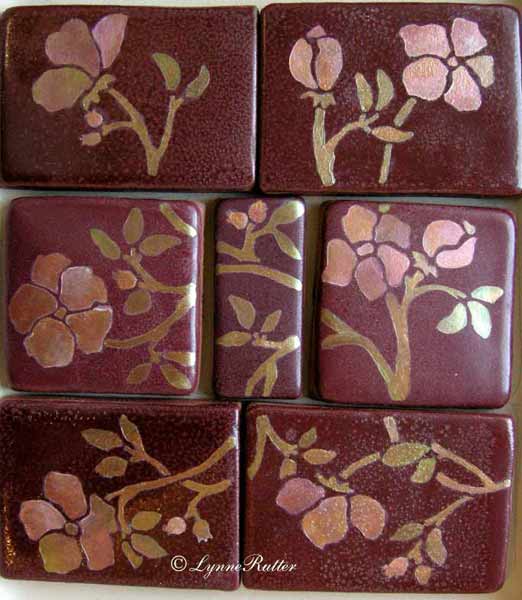
Faux Volcanic Glass Mosaic Tiles

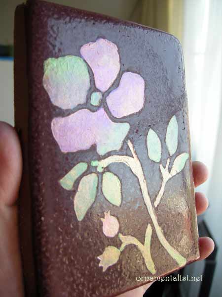
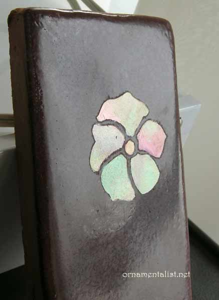
faux mosaic glass tile painted by Lynne Rutter
I had a commission earlier in the year to paint some hand-made tiles to look inlaid with volcanic glass mosaic, for an Arts and Crafts period effect. So many people asked me how this was done I recorded the process for this "How-To" post!

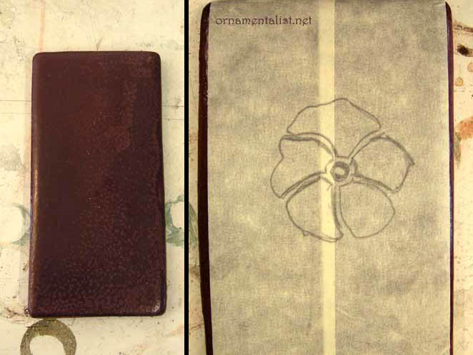
masking tape "stencil"
The plain tiles are hand-formed, with a rough burgundy colored glaze on top. The surface is uneven and not very smooth, which makes it difficult to paint. So to get paint to stick to this surface, I decided to etch it. For the initial sample, the "stencil" is just masking tape.
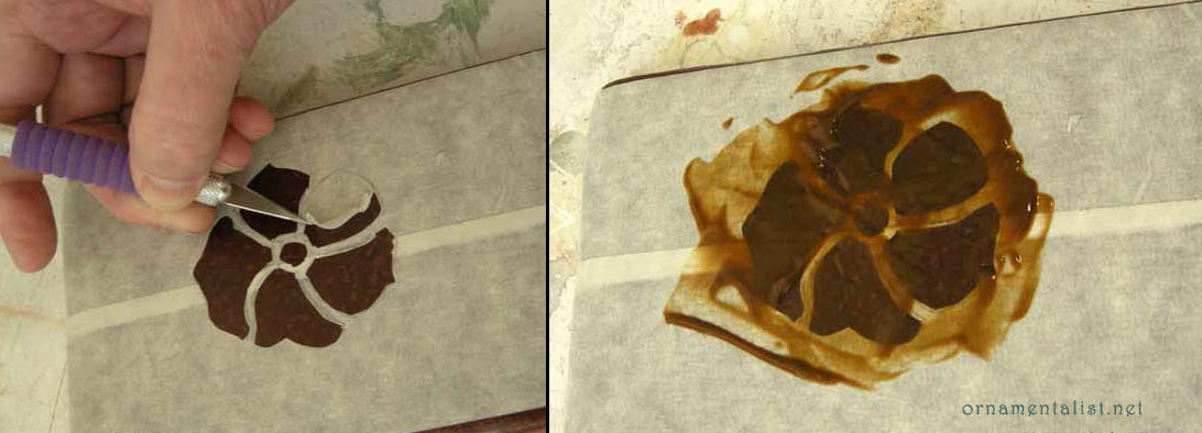
cutting out the tape stencil and etching the design
After cutting the design out, I applied Etch-All creme over the design, waited 15 minutes, then rinsed thoroughly with water. NB- nasty stuff- wear gloves and a respirator.
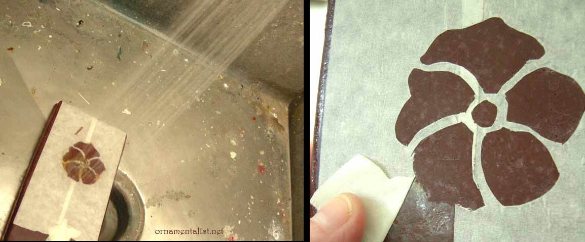
rinse off the Etch-All thoroughly, allow tile to dry overnight
After rinsing I checked to see if the etching had any effect... and it sure did! In fact, I think it would be cool to etch designs into tiles like this and not paint them! Before painting, I let this dry overnight.
first layers of paint
finished sample
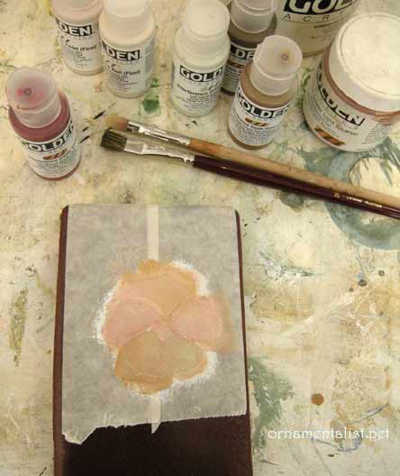
For the painting, I started with a layer of acrylic gesso tinted to a peach color with burnt sienna acrylic. Over that I added some layers of copper and gold metallic acrylic and a selection of interference paints. To keep the surface smooth I use a soft blending brush to soften out the paint.
It's hard to get good coverage with such transparent colors, so many layers are needed and you have to be careful not to let brushstrokes build up.

To get that volcanic glass look, I apply the interference colors in a bit of rainbow- each "piece" has several colors changing from red to green to oxide, etc
When the sample was finished, as you can see if you look very closely, the tape bled a bit during the etching process. So in the next round I used a solvent-resistant masking film from an auto-body shop.

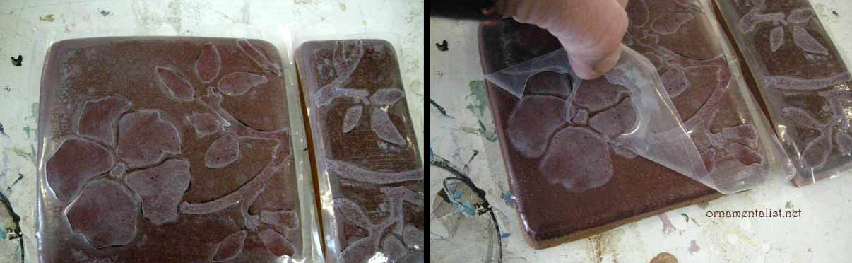
Because the tiles are dark it was a challenge to transfer the design onto a clear film. I ended up transferring the design to the tile with bright red saral paper, then sticking the mask on them, and then cutting the design out. This whole process took only about 1 hour.

Following the steps above, the tiles were then etched.

project using hand-cut solvent-resistant film

As the tiles are not flat and the glaze has a lot of bubbles and texture, getting the masking film to stick perfectly was not possible. But on a smooth flat machine made tile, this would work like a dream. One bonus about this film- once the water dries off it, it can be re-adhered.

Now for the fun part!

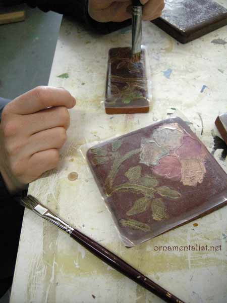
Here is Melka, painting the design with interference colors
Layers of interference and metallic acrylics blended together and softened with a black sable fitch. Important: let the paint cure hard (4 - 12 hours) and bray the edges down to break the acrylic paint film, before lifting the masking film.

the finished project!

A finished set of tiles: pretty, water-resistant, and unique.
This process can also be used for tiles that are already installed.