Showing posts with label work in progress. Show all posts

Monday

Studio Visit: Paolo Bellò, Sologna, Italy

In which we are greeted by the warmest of Venetian smiles

trompe l'oeil coffered ceiling by Paolo Bellò with various rosette designs 
Stucco bas-relief in Stile Liberty by Paolo Bellò


From Venice I took the regional train to Bassano del Grappa, where I was greeted by Paolo Bellò and his wife Stefania, and two of the warmest of Venetian smiles, then on to town of Sologna where Paolo's studio occupies a prominent place on the main street.

I first met Paolo at the Salon in Lecce in 2015. At that time he was shy about speaking English, mainly because he didn't speak English. Since then, he and Stefania have been taking intensive English classes in order to better communicate with their new international friends.  Among them, the Irish painter Noel Donnellan, with whom Paolo recently formed a collaborative company called Pigmentti.  While it can be argued that studying English does not always help a person understand Noel when he gets going, both of these guys can paint, and they sure get the job done. 


The Sologna, Italy studio of Paolo Bellò features several workrooms, and a mezzanine displaying samples of work. The giant mistletoe design is for a house in Switzerland and was rendered in stucco bas-relief.

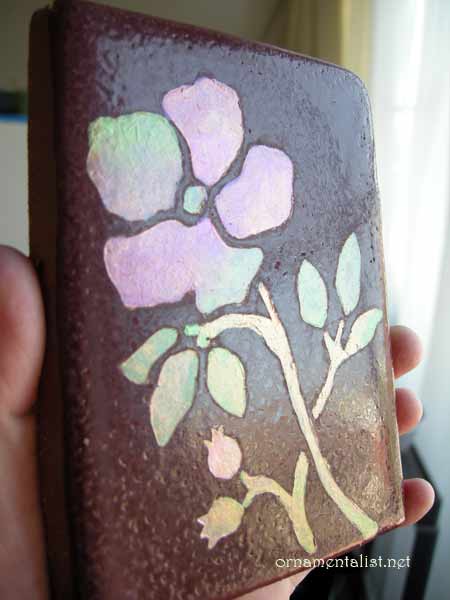
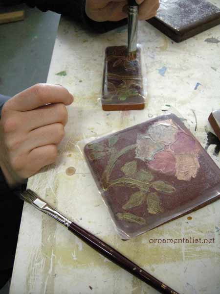
In his enormous and beautifully organized studio, Paolo treated me to a comprehensive demonstration of stucco bas-relief, one of his specialties.  

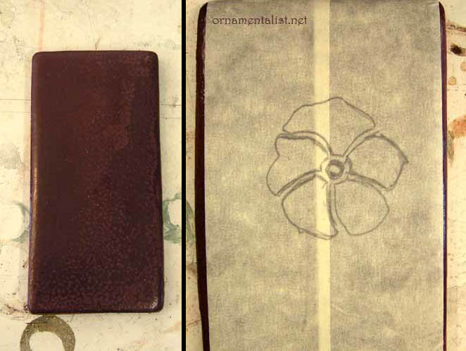
After showing me the basics of  traditional marmorino, its mixing, application and 
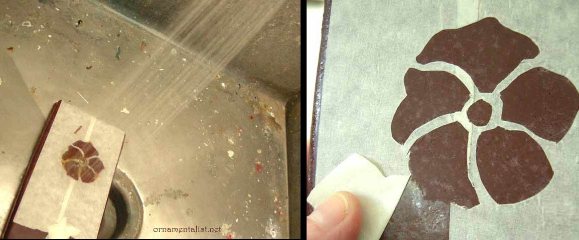
finishing, as well as ways to color it, Paolo transferred a design onto the still damp plaster using a spolvero (pounce) and some charcoal.

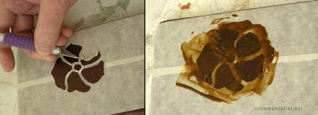
the spolvero transfers the design onto damp plaster
special stucco carving tools, some you buy, some you hack !

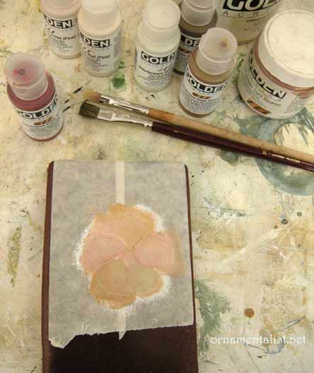
While still soft the marmorino is scratched out along the design to key the surface. New white stucco is added into the ornament areas and then sculpted using special tools.

detail of stucco being built up
Paolo Bellò sculpting detail in the stucco ornament

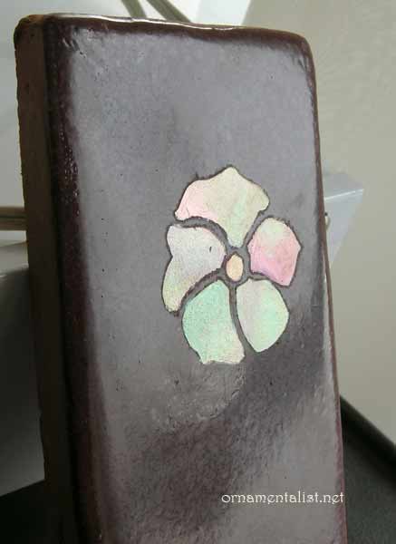
As the stucco hardens finer detail can be added, but all of this must be timed just so and this requires a real understanding of the material and what it can do.

Paolo Belló has worked in decoration since the age of 14. He attended the European Centre for Heritage Crafts and Professions in Venice.  Then after studying with maestro Ennio Verenini in Bassano, Paolo was invited to join the Verenini decoration company, and three generations of knowledge was passed on to him over the next 20 years. He opened his own studio in 1994.

The hundreds of sketches, samples, maquettes, and tools in the studio are a testament to the the life's work of this consummate artisan.

optional designs for a doorway: on the right, Paolo pays tribute to his favorite architect, Carlo Scarpa.
Exterior Design: sketches for two possible treatments which include ornament, color and relief stucco work.


During my visit Paolo and Stefania took me on a tour of their favorite Veneto sights: the Tomba Brion of Carlo Scarpa, and the Palladian Villa Barbaro with its Veronese frescoes that make my heart sing.   Along the way we passed  houses Paolo has decorated with fresco sundials or ornament, keeping alive the tradition of the Veneto artisans. 


Noel, Lynne, and Paolo at the Salon 2018 in Leeuwarden.*
 
I look forward each year to attending the International Decorative Painters Salon, where I have met so many friends and fellow artists from around the world.   
 

See more of  Paolo Bellò's work on his website.

Tomba Brion by Carlo Scarpa
Villa Barbaro

photos in this post by Lynne Rutter, Sologna, 2018
except * by Stefania Bellò


Sunday

Églomisé Rhinoceros


Allow me to introduce you to "Albert," a name that means  both "bright" and "famous."

"Albert" a six foot-wide verre églomisé rhinoceros in rose gold, by Lynne Rutter. photo by David Papas.

Approximately two meters wide, Albert is a verre églomisé mural,  etched into gold on the reverse side of glass, and based on ( and named for)  the famous rhinoceros woodblock print by Albrecht Dürer. 
This commission came about  when my client asked for a large painting with gold or copper and maybe an animal, or an imaginary creature, and then I said well you know if I did this on the back of glass, it would be way more work and so much more expensive but so totally cool!   So of course they said yes.

the enlarged master drawing in reverse
We chose the image of the rhinceros, which Dürer created having seen only a sketch of an Indian rhino.  The folds of the skin look very much like armor.  Dürer added an extra little spiral horn on the spine of his noble beast, as well as a pattern of spots over the "armor."
My first step in creating this mural was to get to know this creature very well, through a series of drawings at large size, in reverse, as this is how I needed to etch the image.

As red gold, coincidentally known as "Albertina Gold," was being used for this piece, it was essential to work on Starfire glass, which is clear and colorless, as the color of normal glass would muddy the special rosy tone of the gold leaf.

The rhino gilt with rose gold leaf on clear glass
I gilt the rhino's body with a mirror finish,  and then began etching the design through the gold. 

etching the 23 karat rose gold
Once the body of the rhino was complete, the background was gilded with the same red-gold leaf, but with a matte finishin in a broken leaf pattern.  Additional features were then etched into it. The piece was backed with a chocolate brown paint, and then mounted in a float frame of solid walnut built by Christine Lando. 

Photographer David Papas takes Albert's fashion portrait in the studio
To photograph a mirror is pretty difficult!   My photographer David Papas created a white environment to reduce reflections in order to document this piece (see  his amazing shot in the first image above.)

Albert the églomisé rhino reflects on his new surroundings
Installed in his new home Albert is the boss of the entire first floor. At first a ghostly apparition, the details of his face and body are visible from certain angles as you- and he- move about the room.  

I love that moment when the gold locks onto the glass...


Thanks to:  
Michelina and Adrian!
David Papas Photographer
Christine Lando, artist, archival framer
Farber Art Services  expert installation
W&B Gold Leaf


Friday

Creating an Heirloom Display


Miniature portrait of Marie Antoinette, gouache on ivory, in an ormolu frame.
 
Some years ago I began a journey, cleaning and restoring a large collection of miniature portraits that had belonged to my great-grandmother.  A group of these had been set aside for my niece, Elizabeth, and long after I had finished cleaning them, I was still struggling with a way to arrange them in some kind of display, to both protect and present them in a relevant way.

Miniature collection, cleaned and restored, and arranged for framing!

Enter the wonderful Christine Lando.  Christine is an artist and archival framer,  with whom I share my studio in San Francisco.  She located a vintage oval frame with convex glass in which to set the collection.  The frame had been spray over with gold-brown radiator paint and its glass had been glued in place with gobs of silicone caulk.  While Christine studied the grouping of the miniatures and devised ways to attractively mount them in a reversible, museum-quality manner, I set about cleaning and re-gilding the frame itself.

Christine Lando, framer extraordinaire, made careful notes in preparation for mounting this display of miniature portraits.

Auntie Lynne, gilding the antique oval frame
gilding in progress


The frame was re-gilded using composition leaf, on a base of casein gesso made by Sinopia. This was then shellacked, antiqued, and waxed to make a nice vintage "French" looking finish.

The finished piece makes a very sweet display for this collection,  and a nice decorative addition to my newlywed niece's new home. 


Seven beauties presented in a vintage gilt frame with convex glass.

Soon after completing this display, I decided to make a similar heirloom as a gift for my sister.   To compliment the goth aesthetic of her home, I chose three portraits out of the collection that are just a tad creepy.  Christine created a shadowbox frame out of her personal stash of Italian mouldings, this one with a verdigris guilloche pattern.

A group of three miniature portraits of Marie Antionette, mounted in a shadowbox frame by Christine Lando

Included in this trio is my favorite big-eyed portrait of Marie Antionette,  beautifully painted and set  in an ormolu frame (see first image.)  This piece had a noticeable crack in it, damage that occurred after the frame had been back-stuffed with paper and cardboard (to keep it tight or something) which then got wet and swelled, pushing the fragile ivory substrate into the pillowed crystal front until it snapped. Someone then glued it to a piece of paper and stuffed it back into its frame.  After removing all the garbage from the back of the painting, I set it in a press for a few days to flatten it, and then cleaned it and restored just a few tiny areas. It is stable and won't get any worse, and in this setting, I think the remaining fracture adds a certain je ne sais quoi. 


See this previous post for up-close photos of these miniature portraits.
Have something special needing an inventive framing solution?
Christine Lando  artist, archival framer    415.821.6485


Monday

Églomisé Cephalopod

églomisé mural (~5 feet high) by Lynne Rutter.  photo by David Papas

Allow me to introduce you to Nolan.
Commissioned for a home in Hawaii, Nolan is a very large octopus,  gilt, etched, and painted on the reverse of a 5 foot high slab of glass using a set of techniques known as verre églomisé
The body of the octopus is gilt  with aluminum leaf arranged in a random broken pattern to create the texture of the cephalopod's skin.  The thickness of this metal allowed me to etch the details  through it using a cross-hatching pattern very much like etching a printing plate. The suckers of the tentacles are gilt with 22 karat gold.

work in progress, Nolan slinking over a cart in the studio

During the process I asked our client if she'd like to give this noble  creature a name, and she immediately wrote back:  "Nolan came blazing through the ether like a shot…I was completely powerless to do anything else.  I believe he's just been waiting for his opportunity to let us know who he is…what else could I do?"   

detail showing the etching and paua shell eye

The surface of the octopus reflects the color of whatever is near it, much like the way the octopus camouflages itself in the water.  A final touch, the eye is a piece of abalone shell from New Zealand.

Nolan was packed into a very large crate last week and is now en route to a beautiful house on Oahu.  We dearly miss him in the studio and wish him well in his new home.


Saturday

Gustavian Bench

I dreamed of a little gray bench
For at least 20 years or more this small neoclassical bench has been kicked around my tiny home - I used it as a vanity stool,  and for a while as a piano bench - all the while it was begging to be reupholstered at least. With a few hours to spare in my studio, I finally got around to doing something about it.


before:  the sweet fluted legs attracted me to this piece
Dating from the 1910s, this nice little bench is blessed with carved fluted legs and is solidly built- but it had a bad break in one part of the frame and had been buried under magazines and finally wound up in my basement gathering even more neglect.  Once in my studio, I  gave my old friend a good dusting-off.


straightened and cleaned

I repaired the break with fish glue and some clamps. All of the joints tightened, the entire surface was then cleaned with fine steel wool and some alcohol.  I didn't bother repairing any dents or scratches.  A couple of layers of walnut crystal stain evened up the wood color and brought it back more to its original intent. I could have given this a nice French Polish this at this point,  but I decided that what I wanted was a simple, painted bench.


after:  the wee painted bench of my dreams

Two coats of Annie Sloan Chalk Paint gave me the perfect Gustavian look.  This is really nice, easy to use paint for furniture. The color here is "French Linen."     I decided not to "distress" or artificially age the surface any further, as I am sure dings and scrapes will appear in time, quite naturally. The painted surface was burnished and polished with two coats of micro-cyrstalline wax, and finally the seat was re-covered with a bit of Belgian linen left over from one of my artists smocks.
I'm quite please with this little project.  What do you think?


Monday

Les Monuments de Paris

Les Monuments de Paris, detail of hand-painted scenic mural by Lynne Rutter
Recently I completed work on a scenic mural  for a home in San Francisco, in the style of  a papier peint panoramique, an extraordinary wallpaper popular in the late 18th and early 19th century.

Interior Designer Gary Spain commissioned me to paint an entire room mural in grisaille, or more specifically using an eau forte palette, which has a warm gray-brown asphaltum color that would compliment his design for the home.  Our clients asked for something chic and urban, with scenes of Paris, but wanted to avoid anything too romantic or dramatic (many scenic papers depict battles and crowds of people), and that we make a personal view of Paris, rather than just the famous sights.
Dufour's Monuments de Paris, detail in color
Combing through my fabulous book French Scenic Wallpaper 1795-1865 I found the marvelous "Monuments de Paris" by Joseph Dufour et Cie. This paper was last printed in 1820, and there are few surviving examples of it.  Its design  seemed the ideal reference  for this project, all of the monuments are pre-Hausmann era buildings; some easily recognized, and some not; lined up along the banks of the Seine in no particular order (or scale for that matter) while the viewer sits on a lush, peaceful island in the center of the river.   I knew I could easily adapt this to suit the client's taste and site considerations. 
a 3d mock-up of the room helps me determine sightlines so I can fine-tune the composition of the mural

Les Invalides, in progress
In San Francsico, our City Hall has a dome that pays homage to the dome of  les Invalides in Paris.  I chose this building as the center image of the east wall.
Using some digital images of the original paper from the Victoria and Albert Museum, as well as some photos of actual structures in Paris,  I began design work, tailoring the mural composition for the room, and creating a custom palette divided into the necessary values.


The original wallpaper was block-printed, so in painting in this style, there can be no blending, and colors must be opaquely painted and repeated. To preserve a flat, regular surface, there could be no touching up, no rubbing out of errors.  Each stroke must be confident and committed. While this appears simple, it's actually far more work than using a "painterly" style. The effect is well worth the effort; the room looks rich, calm, and timeless.
Yes, this is a COLOR photograph!  the ceiling and dado were matched to colors in the mural
Dufour's paper was strangely lacking in bridges, so we designed the Pont Neuf into the mural - its architecture echos the shape of the archway in the room

While the style of the mural is faithful to the Dufour paper, the composition and many elements in it are entirely original.  The entire mural is scaled to the space and composed to work with the architecture of the room.

 
click on any image to view larger


Tuesday

simple design = big change!

sketch for silhouette mural: run spot run!

I recently completed a deceptively simple silhouette mural, for a veterinary ophthalmology practice in San Francisco. This mural is designed for an angled, and very long hallway wall, with a bumpy uneven surface.

the hallway before (L) , and with its new base color of blue

For an assignment like this the two most important things are a good drawing, and the right color.   The wall "before" was stark white, in an uneven 36 foot long sloping hallway.   Just painting the wall a nice color of warm blue had a tremendous impact on this space.

bulldog and horse see eye to eye!

The client asked that the design feature a variety of animals, emphasize the importance of sight, as well as show interaction between the animals and their human companions.
Here are some more details:


Kathy explaining derivatives to her hound
the great butterfly hunt!
Finished mural as seen from the reception area


Both the reception area and the hall now have a nice view!

You can see this mural in person at the office of Veterinary Vision in San Francisco.


Sunday

Victorian Woodgraining

This splendid Victorian entry door set with leaded glass windows
was finished with a faux bois effect by Lynne Rutter.
In San Francisco Victorians, it's fairly common that the dark woodwork so commonly found in their interiors is actually redwood, that has been painted with a faux bois finish to look like something richer and more expensive. This style of woodgraining usually emulated mahogany, and was often nothing more than a layer of deep tinted glaze pulled over a painted surface, then varnished. This simplified faux bois technique is a remarkably effective treatment. 
In older American cities like New York or Chicago, the faux bois used in Victorian homes could be a more complicated process resulting in a realistic imitation of wood, but in boomtown San Francisco, there were few skilled painters available in the rapidly growing city, so most made do with a very simple graining job; and then it was off to the next house!  Of course these days we can improve these old finishes if desired, but one of my specialties as a restoration painter is rehabilitating and recreating these period finishes, which requires careful matching of color and mimicking the style of the original painter.
repaired areas of missing moulding were matched to the original  wood-grained finish
In this Mission District Italiante mansion, removal of a 20th century dropped ceiling in the dining room revealed the original mouldings, damaged but well worth saving! Missing areas were re-created by a carpenter, and then we painted them with a woodgrain effect to match the original finish. We also created a typical faux bois finish for the baseboards, doors, and casings, to restore the room's period look.

My associate Melka Myers,  creating a burl effect in the insets of some reproduction Victorian doors
The parlor in this house had an interesting paneled ceiling that had been painted over many times. I designed a color palette and finishes for this room to create a more Victorian period atmosphere. As you can see the finish starts with a bright, apricot colored base.
San Francisco Victorian-  the paneled ceiling being painted with a simple faux bois effect
My good friend Tani Seabock gave me a hand to work some magic on this ceiling, using a formula I designed that requires only one layer of glaze to skillfully fashion a convincing faux bois finish. This was done not only to preserve the budget but  to emulate  the original graining style used elsewhere in the house.
a faux bois ceiling  by Lynne Rutter Studio,    a simple finish with an outstanding effect
The effect is stunning, so much so that it's hard to believe anyone would want to paint it white. It's worth the extra effort to finish these surfaces as they were intended; you get so much more out of the architecture.


click on any image to view larger

Monday

Faux Volcanic Glass Mosaic Tiles

faux mosaic glass tile painted by Lynne Rutter
I had a commission earlier in the year to paint some hand-made tiles to look inlaid with volcanic glass mosaic, for an Arts and Crafts period effect. So many people asked me how this was done I recorded the process for this "How-To" post!

masking tape "stencil"
The plain tiles are hand-formed, with a rough burgundy colored glaze on top. The surface is uneven and not very smooth, which makes it difficult to paint. So to get paint to stick to this surface, I decided to etch it. For the initial sample, the "stencil" is just masking tape.
cutting out the tape stencil and etching the design
After cutting the design out, I applied Etch-All creme over the design, waited 15 minutes, then rinsed thoroughly with water. NB- nasty stuff- wear gloves and a respirator.
rinse off the Etch-All thoroughly, allow tile to dry overnight
After rinsing I checked to see if the etching had any effect... and it sure did! In fact, I think it would be cool to etch designs into tiles like this and not paint them! Before painting, I let this dry overnight.
first layers of paint
finished sample
For the painting, I started with a layer of acrylic gesso tinted to a peach color with burnt sienna acrylic. Over that I added some layers of copper and gold metallic acrylic and a selection of interference paints. To keep the surface smooth I use a soft blending brush to soften out the paint.
It's hard to get good coverage with such transparent colors, so many layers are needed and you have to be careful not to let brushstrokes build up.

To get that volcanic glass look, I apply the interference colors in a bit of rainbow- each "piece" has several colors changing from red to green to oxide, etc
When the sample was finished, as you can see if you look very closely, the tape bled a bit during the etching process. So in the next round I used a solvent-resistant masking film from an auto-body shop.

Because the tiles are dark it was a challenge to transfer the design onto a clear film. I ended up transferring the design to the tile with bright red saral paper, then sticking the mask on them, and then cutting the design out. This whole process took only about 1 hour.

Following the steps above, the tiles were then etched.

project using hand-cut solvent-resistant film

As the tiles are not flat and the glaze has a lot of bubbles and texture, getting the masking film to stick perfectly was not possible. But on a smooth flat machine made tile, this would work like a dream. One bonus about this film- once the water dries off it, it can be re-adhered.

Now for the fun part!

Here is Melka, painting the design with interference colors
Layers of interference and metallic acrylics blended together and softened with a black sable fitch. Important: let the paint cure hard (4 - 12 hours) and bray the edges down to break the acrylic paint film, before lifting the masking film.

the finished project!

A finished set of tiles: pretty, water-resistant, and unique.
This process can also be used for tiles that are already installed.