Showing posts with label press. Show all posts

Tuesday

Featured in Traditional Building Magazine

This month I am featured in Nancy A. Ruhling's article for Traditional Building Magazine entitled "The ABCs of Decorative Ornament: The experts agree Decorative ornament is a big plus in commercial buildings. "

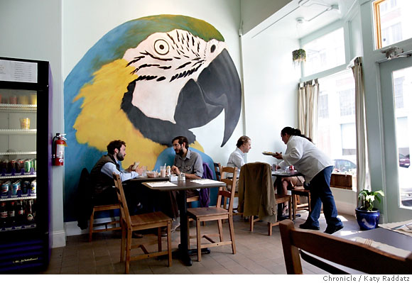
A rooster mural by Lynne Rutter crows cockily at Gilberth's Rotisserie and Grill in San Francisco, CA. The hand-painted oil on copper leaf diptych adds down-home warmth to the industrial-chic interior of the restaurant, which is built in an old cannery in the city's Dogpatch neighborhood. Photo: David Papas
Clem Labine's Traditional Building Magazine is a trade publication which provides resources to architects, designers, and builders involved in preservation and design for public architecture.  It's an honor for me to be interviewed alongside such veteran studios as Canning Studios, EverGreene, and the brilliant muralist Russ Elliot. The article drives home the message that decorative painting is an intrinsic part of a commercial interior that adds to its interaction with the public as well as its overall value.

" ... San Francisco artist Lynne Rutter, who has made murals for restaurants, casinos and hotels, sees her work as art. "People think of decorative painting as being somehow less about expressing oneself and more about decoration, but this is not true of many of us in the field," she says.
The award-winning muralist and colorist is passionate about historic projects. "On the West Coast, there is a lot of creative reuse of our older buildings, so even if the project isn't a 'restoration' per se," she says, "the period detail of a building can be celebrated in its new incarnation, and decorative painting is an excellent way to achieve that sense of history."
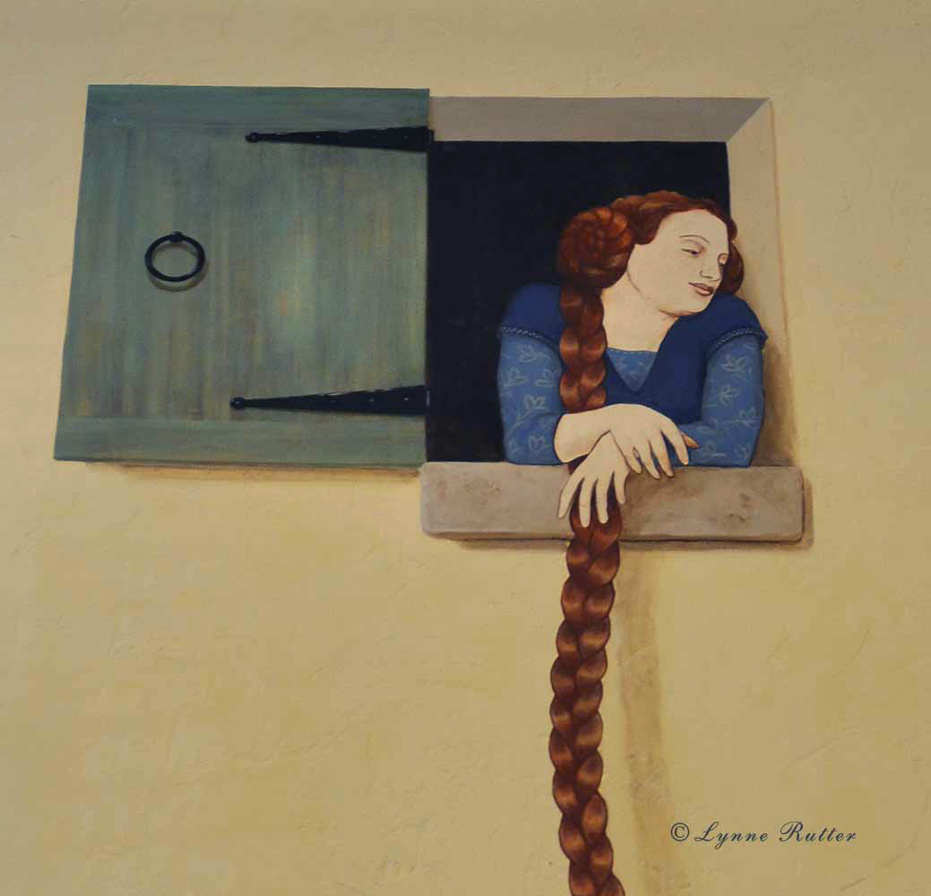
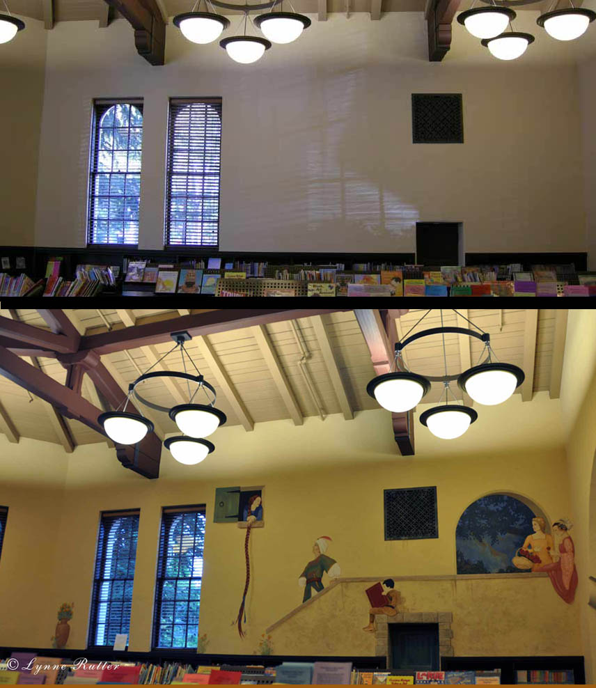
Rutter, who is inspired by the works of masters like Vermeer, Fra Angelico and Max Beckmann, travels extensively, picking up ideas along the way. "I collect images of ornament, or moments of great old murals and beautiful surfaces," she says. "Recently, I submitted a design for a dome based on something I saw in a beautiful place I visited in Bulgaria."
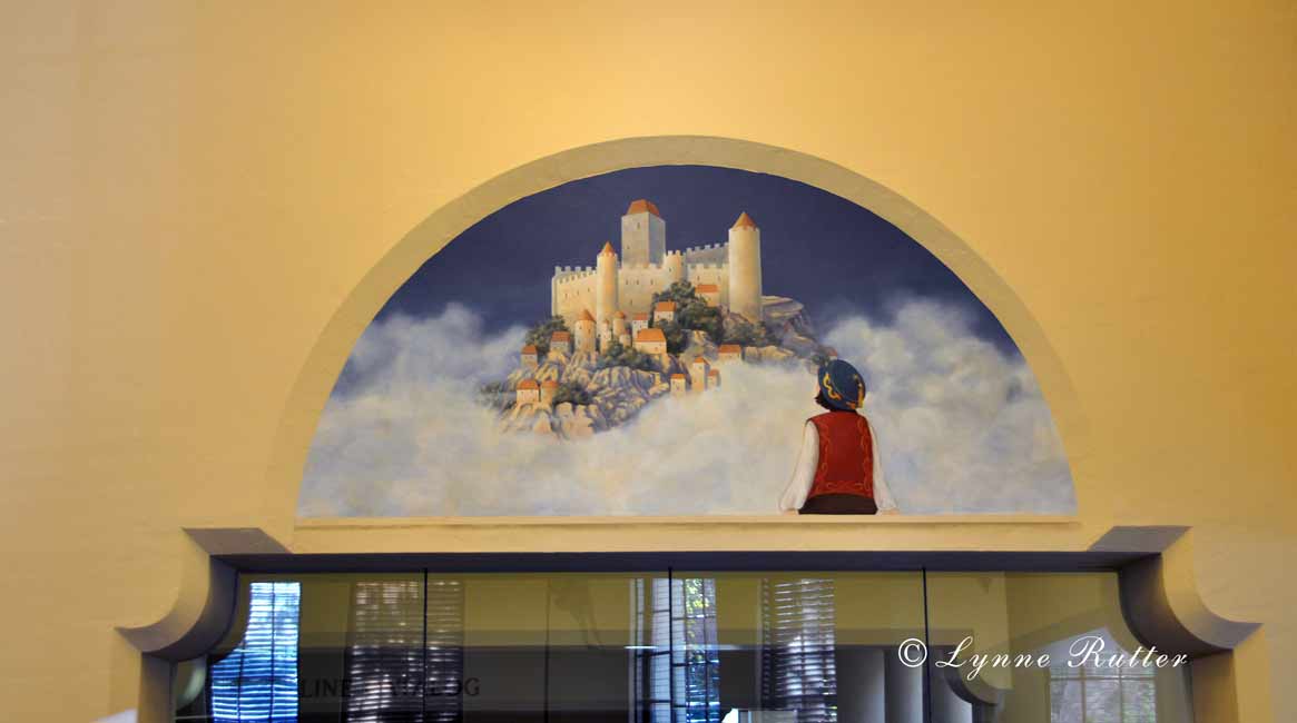
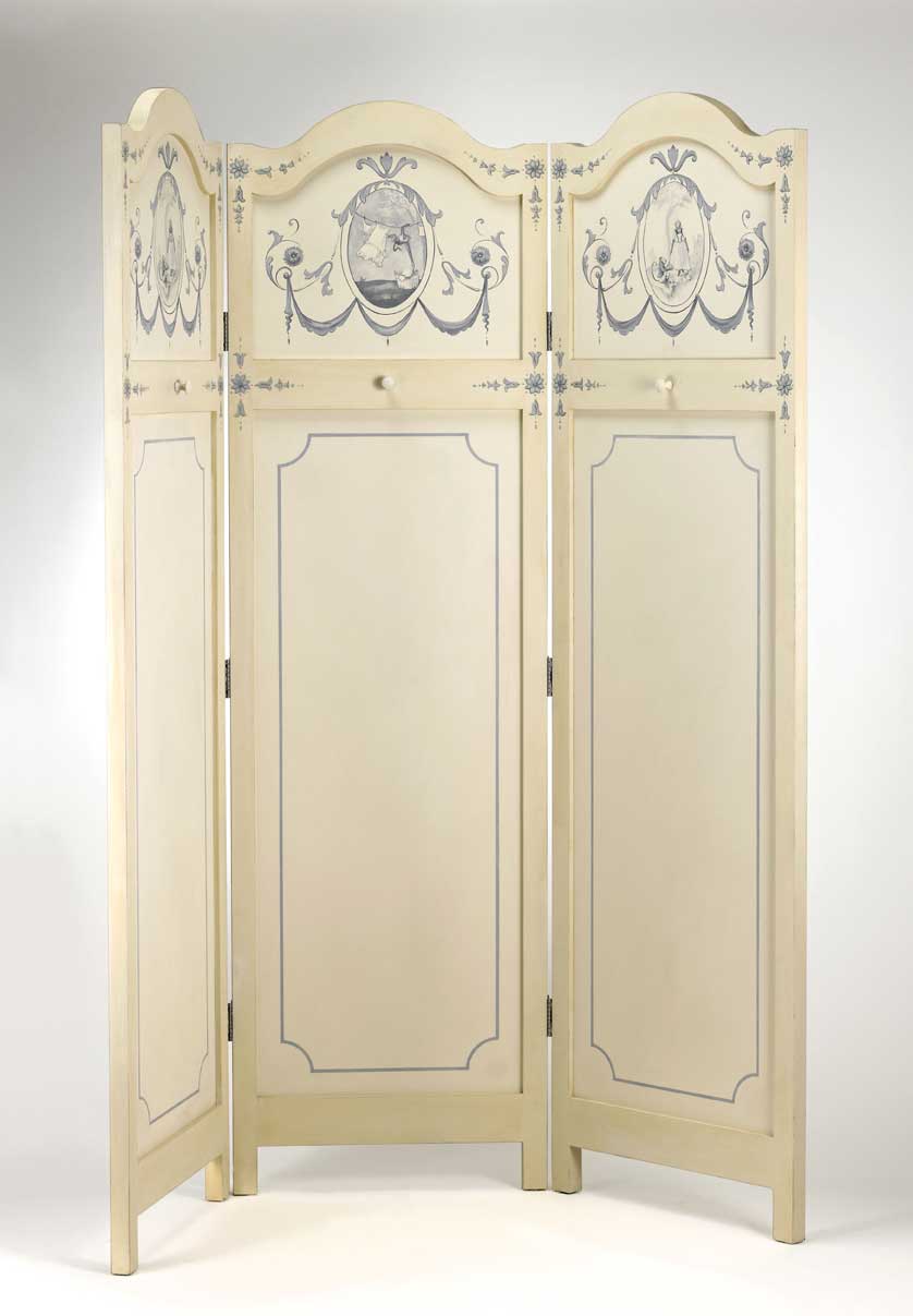
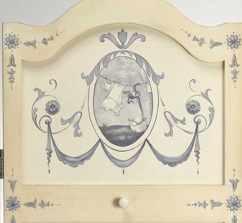
Murals are an ideal medium for Rutter, who studied architecture and design at the University of California at Berkeley before she opened her boutique atelier in 1990. Typically, she paints the murals on canvas in her studio and installs them on site. "This process — marouflage — is an excellent technique for saving valuable time and allows for more detailed work to be done in advance," she says. In some projects, like the 900-sq.ft. ornamental ceiling mural created for the Paris Hotel and Casino in Las Vegas, only the stenciling was done on site "instead of working weeks on site, my team and I were only there for four days."

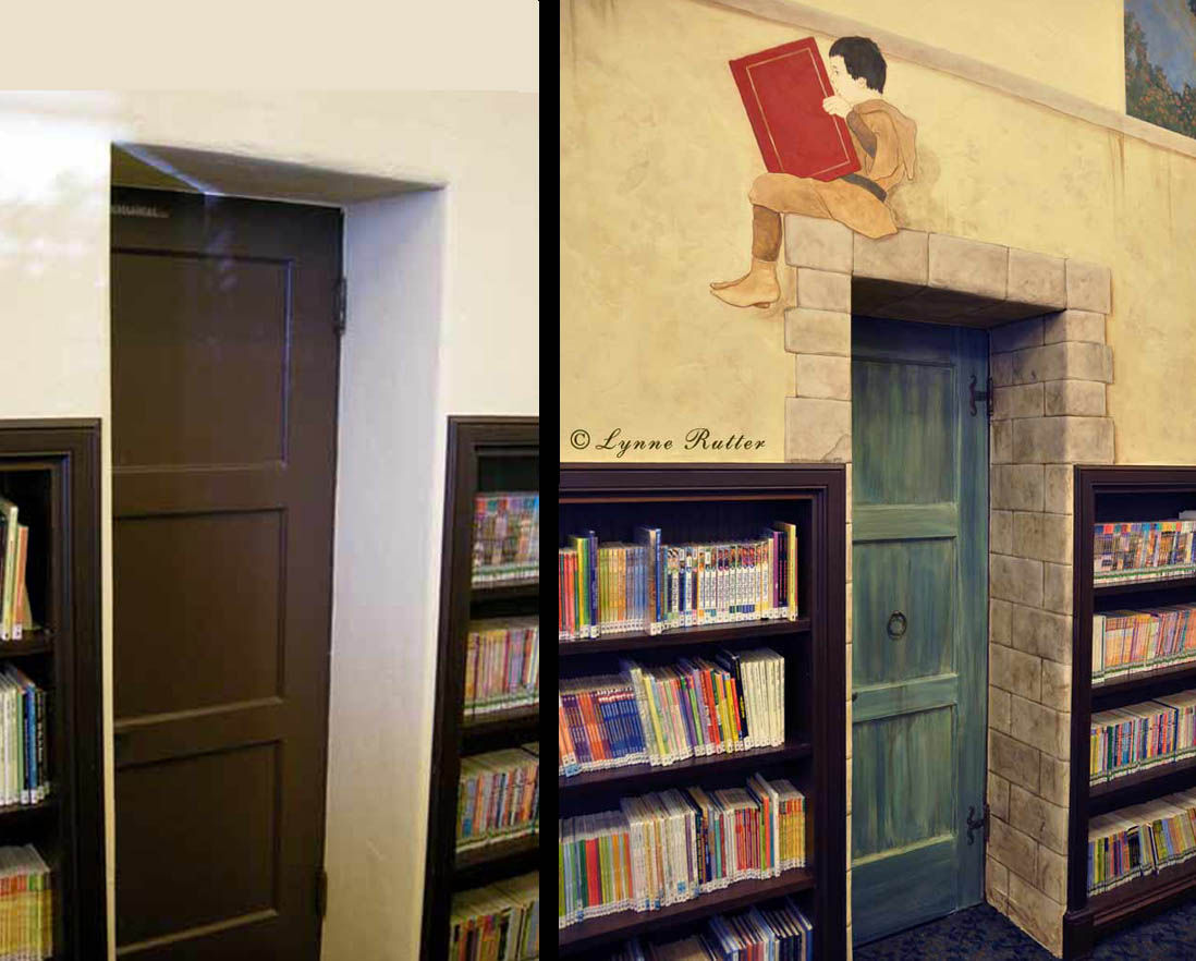
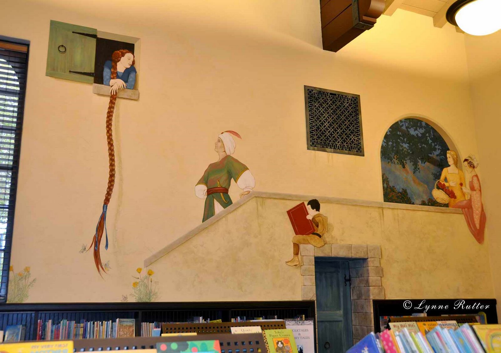
Rutter points out that decorative painting serves no one style, and that's what makes the work interesting to her. "I have been doing this since the mid-1980s and the popularity of decorative painting has gone up and down over the years, but mainly what I see is a change in the design of the work," she says. "The skills and techniques used are similar even as the definition of 'contemporary' changes from year to year.  "


read the full article at Traditional Building Magazine


Portrait of the Artist as an Artist

in my studio on a sunny day
It is an unusual thing for me to talk more about my creative process rather than my business.   So I am truly honored to be featured as Artist of the Month at Sinopia Pigments.   Sinopia is one of those rare and wonderful shops that specializes in pigments and raw materials for artmaking, and is particularly popular with anachronistic painters like myself.   Many other fascinating artist profiles are posted in Sinopia's artist pages. My heartfelt thanks to Alex for including me among such illustrious company.


Sunday

In the Spotlight

You can read the on-line version at sfgate.com 
It's kind of exciting to see one's name in print, spelled correctly and everything.

I'm pretty shy about getting my picture taken but in this case I dosed up on rescue remedy and tried to smile.

Nice interview written by Anh-Minh Le for the Stylemaker Spotlight in this week's Home and Design section of the San Francisco Chronicle.  Anh-Minh is also the Editor-in-Chief of Anthology Magazine.


Several people have asked:  my Belgian linen painter's smock was custom made for me by Kathleen Crowley.


Monday

Arts and Crafts Dining Room Frieze

polychrome frieze and  gilt eucalyptus leaves
A San Francisco dining room designed in the Arts and Crafts style by Debey Zito Fine Furniture and Design,  became a wonderful opportunity for collaboration between several members of my local artisans guild, Artistic License.  This very special group is comprised of local artisans who specialize in period design.  Debey directed a team of local talent to create this room.

detail in cast plaster
A frieze panel of California poppies was hand-carved by Debey's partner, Terry Schmitt. To carve the frieze for the entire room was cost-prohibitive, so ornamental plasterer Lorna Kollmeyer cast them in plaster.
The casting is incredibly sensitive and you can see every pore from the original piece wood as well as every mark in the lovely carving.

I painted the new plaster frieze with a faux bois finish, to match the furniture-quality paneling that Debey and Terry installed the room, and polychromed the poppies with mica powders and pigment.


Terry also sculpted the plaster Eucalyptus leaves which I then gilt with 23k gold leaf. 


plaster painted with faux bois finish
Beautiful Arts and Crafts dining room by Debey Zito Fine Furniture and Design

The room is capped by custom  dragonfly ceiling paper, hand-made in San Francisco by David Bonk.


You can read more about this artisan collaboration which has just been published in the Spring 2011 issue of Arts and Crafts Homes magazine.


Barbra Streisand's Arts and Crafts Library

Barbra Streisand's Greene and Greene inspired Library
A couple of years ago I had the distinct pleasure of working with Barbra Streisand in her Malibu home.   My commission was for a mural in the Greene and Greene-inspired Library, reproducing a frieze of  rose branches painted by Charles Greene in the Thorsen House in Berkeley.
 
 As with the Thorsen original, the frieze is painted in oils on canvas and glued to the walls on site.  Each branch of roses was composed for the exact spot in the room and many details were added on site to achieve a perfect balance with the handcrafted woodwork and the atmospheric lighting.
now available at amazon.com!
Ms. Streisand was utterly involved with every detail of this amazing house, and has just published a book chronicling this work called "My Passion for Design."
There are huge color photos of each room, each decorated in a different historic style, including details, painted finishes, custom wallpaper, antiques, and commentary on the immersive process required to complete her dream home.  The book itself is an incredible document to her passion and tenacity.  
Equally fascinating are the detailed shots of the antique rose varieties blooming in the garden. 
 
Now that the book is published,  I am proud to share my contribution to this unique period-inspired interior.
The soaring ceiling of the library, with frieze mural by Lynne Rutter

In addition to the mural I also painted a set of custom tiles to create the look of volcanic glass mosaic, which were initially meant for the fireplace, but instead became a set of coasters.

<--- one of a set of faux volcanic mosaic tiles painted by Lynne Rutter for Barbra Steisand.

A detailed description of how I painted these tiles is recorded in this previous post.


all photos in this post © by Lynne Rutter   
except book cover image via amazon.com


Friday

Fauxology


Fauxology, the marvelous blog written by  the effervescent Regina Garay,  is today featuring an exposé of yours truly,  with big, color pictures.
And while you are there have a good look around her blog, it's full of great useful information and inspiration from Regina's work, her library, and the other artists she has gathered there.
Thanks Regina, for this flattering entrée into the world of Fauxology!


image:  self-portrait in the Unteres Belvedere: Goldenes Zimmer   Vienna, Austria


Wednesday

Recent Press for Moi

Today I learned my interview with the Faux Finisher Magazine resulted in the cover story for the Spring 2010 issue, including a seven page spread about my "illustrious and varied career"  with lots of color pictures.  PDF of article here.
This is a painting and decorating trade magazine published by the PDRA, for specialists in the decorative painting industry.


Friday

Exterior Color: Noe Valley Victorian


Beautiful Victorian details celebrated with six colors and gold leaf!

Before:  Pink and Cute!
This Victorian in San Francisco's Noe Valley could not help being a bit cute. The Stick-Eastlake Cottage had been painted about 15 years ago using the pink colors from the magnificent hortensia blooming in its front entry.

When it came time to repaint, the owners asked me to design something a bit more grown-up.


Choosing a Color: I ask my clients to drive around town and photograph houses of similar style whose paint schemes appealed to them. Every one they chose was green! So we started with green. The color scheme I devised for this house uses six colors, all from from Benjamin Moore's Historic Color range, with 23 karat gold leaf on the buttons and pediment ornaments.


Managing contrast: This palette is as much about contrast as it is about color. One technique being employed here is the use of what I call a "secondary trim" color, which in this case is about 30% darker in value than the main trim color, and is used to support features like brackets and window columns, and to create a break between the main body color of the house and the more vibrant accent colors of the window sashes and insets.

after- green, gold, and ivory
Know when to say when: The custom garage door was simplified from three colors to one, and painted the same as the body color, so as not to compete for attention from the main part of the facade. The front door, which had been whimsically painted with four different colors, now sports a more European look in a solid glossy teal with polished hardware and gold leaf details, leading the eye right to the entrance.

After: the Victorian cottage as stately home

click on any image to view larger


Expert Painting by San Francisco Local Color Painting
paint:  Benjamin Moore Historic Colors

Color Consulting by Lynne Rutter 415-282-8820


Update!
This project has been featured in the June 2015 issue of Old House Journal.  After nearly  8 years, this is still one of my most talked about color designs.
At this time I can say that the basic colors for this scheme are Louisberg Green and Standish White by Benjamin Moore.  You will notice in the OHJ article several other uses of Louisberg Green and see how very different that color can look depending on the environment, orientation and accent colors.


Sunday

The Silver Kitchen

This gorgeous custom kitchen was recently featured in the Spring 2009 issue of Better Homes and Gardens "Beautiful Kitchens." This room features a silver and ecru color palette and is dressed with rock crystal and stainless steel. I painted a faux limestone finish on the walls and used venetian lime plaster to create the irregular stone-like finish on the range hood.

These warm stone finishes compliment the silver pearlescent cabinets and white calcutta marble counter. Silver is a recurring theme color in this Piedmont, Ca. home, where I contributed color design and well as many other decorative finishes.


photo courtesy Camber Construction, where you can see more of my work in this house.


Lynne Rutter Murals + Decorative Painting

Saturday

Showcase Season

My Powder Room in the 2002 San Francisco Decorator Showcase
Showcase season is upon us again, with exciting spaces being presented by veteran and new designers alike. I have painted in over 25 showcases houses around the Bay Area, and transformed three rooms for the San Francisco Decorator Showcase as a designer. This year, due to my travel schedule, I could not participate in the exhilarating rush of reshaping a room in a scant three months.

I missed it, actually, because it is during this time I get my one chance each year to spend time under the same roof with so many talented colleagues in the business, and there is an atmosphere of camaraderie when a large number of the area's best decorative painters are all working on the same house. Oh of course there can also be a little drama, but for the most part everyone is trying to do their best work and finish before the press arrive, sometimes working late into the night, often running to the next room to beg a roll of tape or ask advice.

Showcases are especially great for ideas. Working without a "client" the designers get a chance to show off what they are interested in, what inspires them, and their best new finds.
A few years ago a nice book came out called "Decorator Showcase Houses" which compiled the best 250 rooms of 50 different showcase houses from all over the country. I recently flipped through this idea-packed book looking for a room I remembered from a previous showcase, and was really struck by how fresh and interesting even 7 year old projects look. This is because these designs are not the "trends" so much as each designer's personal vision, which, if anything, will set the trends for the future.
(look for my work on pages 137, 176, and 186!)


See the 2009 San Francisco Decorator Showcase , through May 25 at 2830 Pacific Avenue.

Sunday

Cover story!


December 2008
- check out this month's California Homes magazine, whose cover story puts the spotlight our favorite new San Francisco designer, Claudia Juestel of Adeeni Design.


The cover article features a historically significant Victorian country house in Diablo, California, to which I have previously contributed a fair amount of work, including restoring and recreating the faux bois for the baseboards and doors in the main parlors and entry, the entry floor, and the ornamental overdoor panels in the living room.


Above: The panels over the windows and doors in the Living Room were painted by Lynne Rutter.
Artistic License associate Brian Kovac created a weathered wood finish for the beams in the newly built wine cellar.


I am so happy to see this work used in Claudia's fresh design, which is an eclectic, worldly mix, and celebration of the Victorian house's original features.


<-- The entry with its painted checkerboard floor and restored faux bois baseboards and casings.


Here is proof positive that you can live,
really live in a period home, with all its "dark" wood and traditional proportions, and still have a joyful, current interior.


click on images to view larger.
images 1 and 2 © California Homes Magazine
image 3 photo by Bernardo Grijalva


Tuesday

Library Children's Room Mural completed!

Sierra as Melisande
We recently completed a sizable  mural for the Children's Room in the Burlingame Public Library. I am so thrilled with the transformation of this space!
The mural was commissioned by the Burlingame Library Foundation to commemorate the centennial celebration of the Library.
My goal was to create a look that appears original to the room, as though it's always been there. Indeed it is hard to imagine the room without the paintings.
the entire room was treated as part of the mural
The North "main" mural wall is about 37 feet wide and the ceilings are 20 feet high. The first 5 feet of the walls are filled with bookcases, so all of the murals had to be painted with perspective from below eye-level.
There is a large metal grate and a little maintenance door in this wall, that I worked into the design, so the architecture became part of the composition of the mural.
small maintenance door transformed into a secret castle entrance
I had a lot of fun re-imagining this little door area, to make it an entrance to a castle, or possibly, another world.
Faraway Castles, approx. 9 feet wide
mice and faeries among the poppies
We added images all around the room, so the room becomes a story, its walls the pages of a favorite book.  Details like tiny faeries, mice, and California poppies become more noticeable when you get up close.
read a book!

Centennial Mural story in San Mateo Times
Bay Area Art Quake review by Phil Gravitt!

My thanks to:
Burlingame Library Foundation for their support and this amazing commission
the Burlingame Librarians for all their research and enthusiasm
interior design consultant Michelle Nelson
I would especially like to acknowledge the contributions of my associates Sierra Helvey and Melka Myers who were instrumental in the design and production of this project.


Monday

Singerie Screen in 7x7

September issue of 7x7 Magazine has included a shot of my singerie screen in their home and design section.
A Delicate Matter - Care for your bare necessities with these pretty picks for your laundry room. by Leilani Labong


Friday

Diego's big close-up

"Diego" giant blue and gold Macaw parrot, painted by Lynne Rutter for the New Spot, San Francisco. 10 x 13' acrylic on canvas.


While visiting the Urban Farmer this afternoon, I noticed a giant parrot on the cover of the 96 Hours weekend insert of the San Francisco Chronicle.

A nice review of the New Spot, for whom I painted this mural, is featured, along with some other good pictures.

Sunday

How to attract paparazzi...

1. show up late
2. wear a turban
(also handy to cover that sweaty "i just worked all day" hair)
3. pick up flute of champagne on the way in, completely ignoring the bank of photographers that are by now following you
4. hook arms with the tallest, best looking guy you can find: in this case, Rob Delameter of Lost Art Salon

Here is my exceedingly rare appearance on the society page
"signature look" translation = "we don't get it"


circa 1920 Chinese robe from Torso Vintages
turban by Kathleen Crowley

Photo by Drew Altizer\


Tuesday

Vintage Laundry

Lynne Rutter's Vintage Laundry, at the  SF Decorator Showcase


I've recently designed a room for the 2007 San Francisco Decorator Showcase, which is being held in the spectacular house at 2901 Broadway, a 1927 neoclassical mansion in near- original state.
A wonderful example of passive preservation, the house's original laundry room had never been painted, or really cleaned, as far as I could tell. The walls are raw plaster and the giant double enamel sinks are in perfect condition.

So I designed the room as a sort of a valentine, to what this house used to be, and to the era in which it was built. It could almost be 19th century Europe, except with reliable electricity, and prohibition.

My assistants and I hand-washed 80 years worth of filth off of the walls and ceiling, exposing a lovely lime plaster finish with a natural patina. We stripped the old wax off the concrete floor, cleaned it, and painted a matte faux marbre finish; we also restored the dark painted finish of the 12 foot long solid redwood work table.
The opaque window glass was changed out to clear, revealing an amazing view of the bay. An ugly water heater heater was disguised with a folding screen, custom built by Chris Yerke, and painted with neoclassical motifs and singerie painted by Lynne Rutter with help from Adrian Card.  All we needed now was a period sewing machine and a hand-made low-tech wooden drying rack from Amish Home Place.

The fun part of course is the laundry itself- lots of vintage 1920's lingerie, all in ivory silk and lace,  with the styling help of Erika von Petrin; and a collection of period linens, many of which belonged to my grandmother, Jane Coley Kittredge, whose bright coral wedding ensemble is also peeking out of the mending basket.

The showcase is open to the public through May 28, 2007.

mentions:
Remodelista
sfgate.com
7x7
Erling Wold: The Laundry Room
SF Chronicle "Swells"
Yelp
LuxLife
7x7 Home and Design

photo by David Papas.

Saturday

Dramaticaly Inclined

Lynne Rutter's murals "The Pearl Earring"  featured in House Beautiful "Beautiful Baths"


This mural is 10 x 13 feet and painted on canvas. It covers a wall which once had a view-less window and makes a focal point of what would otherwise be visual dead end.
I painted this mural for Ellen Broadhurst's master bathroom a few years ago, and though it uses the image from Vermeer's famous masterpiece, it is painted at a surreal scale- 600% of the original size using a completely different painting techniques- lot of layers of acrylic paint, and highlights applied by dry brushing.
She finally got some press from House Beautiful.
Beautiful Baths special issue, August 2006, pages 84-91
available at amazon.com


Sunday

Pow-Wow Network interviews Lynne


I've met so many wonderful women in the design business, through San Francisco's Pow-Wow Network.
In March 2006, they published this interview of me, with pictures, and intimate details....

click on image to read article at full size.


Tuesday

"Grand Illusions"

February, 2006
I am featured in Silicon Valley Home magazine in the article
"Grand Illusions: Custom-Painted Murals" by Tiffany Carboni

Sunday

Nursery Room Mural in SF Chronicle

July 31, 2005
San Francisco Chronicle Magazine
This wonderful children's room mural, commissioned by Sharmin and Brian Bock, is featured in the article "Room to Grow: Decorating, kid style" by Jane Meredith Adams.
The mural transformed a tiny, dark space into a cheery, open meadow, and features a portrait of Sharmin's horse painted onto the closet door as part of a trompe l'oeil "stable."
More than 8 years after it was painted, this room is still used as a playroom for the family's two children.