Showing posts with label interior design. Show all posts

Saturday

A visit to the Musée des Arts Décoratifs, Paris

a breathtaking monumental "papier peint panoramique" by Desfossé, 1855
One of my favorite places to visit in Paris is the spectacular Musée des Arts Décoratifs, a comprehensive collection of the best of French design:  objects, architectural and applied arts from the middle ages to the present day. Generally uncrowded and serene, the museum is housed in the western wing of the Louvre, the beautiful Pavillon de Marsan, designed by architect Gaston Redon in 1905.
The lovely interior court of the Musée des Arts Decoratifs (image via MAD)
Like the Victorian and Albert in London,  the MAK (Museum fur Angewandte Kunst) in Vienna,  and the Legion of Honor in San Francisco, les Arts Décoratifs celebrates the finest work in applied arts,  but this museum is decidedly French, and notable for the depth and breadth of its collection.

Seemingly every possible decorative technique, material, or type of object can be found in the vast Arts Décoratifs inventories: tapestry, escritoire, eglomisé, shagreen, scenic wallpaper, jewelry, stained glass, wood, lacquer, plastic, and gold… but far from mind-boggling the collections are carefully edited and displayed chronologically, to encourage understanding of both the techniques used and the application of them. Meanwhile there are thousands of beautiful inspiring moments in each room.
Here are some highlights from my visit in October 2011.

"Cabinet des Fables" from the hôtel Dangé, Paris 1755 (repainted 1855)
Two adjoining rooms of boiserie taken from the hôtel Dangé on the Place Vendome, are displayed as one room here (you can see the gilt room in the mirror)- these really were meant to be small, intimate painted spaces.

a display of chinoiserie furnishings dating from the 17th century
A small gilt "cabinet" room from l’hôtel de Rochegude à Avignon, 1720. Oui.
Photography in the museum is allowed without a flash, but many of the rooms are kept very dim to protect the fabrics and delicate surfaces.  Despair not,  the MAD has an excellent database of images of its collection on its website.   Not only that, but the MAD bookshop at 107 Rue de Rivoli  is outrageous.  It is filled with fabulous books on your favorite subjects, all of them loaded with great pictures. Hard as you might try, you won’t be able to carry all the books out with you. Make note of the ISBN# so you can search for the books when you get home. 

wood doors decorated with gilt grotesque ornament, from the 15th century
Salon de l’hôtel Talairac, circa 1790
One of the many period roomsets on display at the MAD, the Salon de l’hôtel Talairac, circa 1790, is an early example of Egyptian theme interior design, which eventually became an all-out fad in the early 19th century.
detail from a Renaissance-Revival bedchamber, circa 1840
The boiserie decoration from the Renaissance-Revival bedchamber of Baron Hope is not typical for the Louis-Phillipe-era France. To me it seems more English Victorian. Have a look at the rest of the room here.

detail of a verre églomisé mirror frame.  Gasp! 

Detail of an entire wall of embossed leather, silver-gilt and amber-varnished to look like gold. circa 1600

detail of a splendid marquetry cabinet, made in 1670. I could stare at this all day.

One of the most fabulous room sets in this museum is the private apartment of Jeanne Lanvin. Designed by Armand Albert Rateau and built in 1925, it’s the ultimate feminine Art Deco interior.

The famous gilt and lacquered screen from Jeanne Lanvin's dining room is nearly 11 feet high, and was designed by Armand Albert Rateau, circa 1921 

Bedroom of Jeanne Lanvin, designed by Armand-Albert Rateau  (image via MAD)
The fabric in the private apartments of Jeanne Lanvin, a custom blue silk embroidered with cotton and copper thread,  is newly recreated and was all done by hand.

*
When you go:
Be sure to visit the Art Nouveau and Art Deco rooms, as well as the very interesting mid and late 20th century design rooms in the attic spaces of the pavillion.
*
Other tips:
The Mode et Textile Museum is just next door.
*
The Rue du Rivoli can be crowded and dirty.  It’s so much more stylish to arrive via the Carrousel entrance.  And be sure to dress fabulously, so you can have a bite at the Saut de Loup, the chic cafe on the terrace facing the Carrousel Gardens.
*


all images in this post by Lynne Rutter unless otherwise noted. Click on images to view larger.

Monday

The Dream of the Apothecary

Antique apothecary staged in the shop window of Luca,  Florence.

One of the many inspiring artisan shops in the Oltrarno district of Florence is the unique and fascinating design atelier of  Luca  (via de Serragli 16r.)   I snapped these shots last May when the front of the shop was filled with the above fantastic scene from an apothecary's dream.  Any time you get to Florence, please go visit Luca and see what wonderful moody stories are being played out among the furniture creations, art, and vintage treasures.


matching containers filled with magic
Yes, I stared at this vitrine every time I passed; during those weeks we were staying just across the street; yes, 12 times a day I would estimate, silently calculating the cost of shipping this entire thing home,  visualizing my ebonized  wunderkammer kitchen - or is it my workshop?-  with carrara counters, brass pulls, matching canisters.  Oh, yes.  

Florence, as you might know, is full of wonderous speziale, historic shops specializing in remedies, spices, herbs and teas, and other ingredients like catechu or borax, medicinal elixirs, fragrances, pigments, or other esoteric powders and potions, often displayed in ancient glass-fronted cabinets. 
The oldest of these, Officina Profumo Farmaceutica Santa Maria Novella which has medieval roots, and  Farmacia SS Annunziata  founded in 1561, now create gorgeous herbal and fragrant products.  AquaFlor is a lovely fragrance shop built on this legacy and of course the amazing D'Alessandro Bizzarri truly carries on the speziale tradition with everything from tea and dried fruits to raw pigments and photography chemicals, to poisons and explosives (see my previous post about this shop.)

How would you set up your apothecary?  Would you fill it with reagent bottles, tins, or perhaps colorful maiolica jars?


Wednesday

Choosing Paint Colors

Peter B's inspiring collection of paint samples
Visiting Peter B's home-in-progress, I found this gorgeous display of samples he had collected prior to meeting with me.  This vignette told me so much about his preferences --by what was there as well as what was not there - it made the color consultation for his house much easier.   The people I work with are often so inspiring!

Choosing colors can be frustrating and subjective (how do you know when you have it "right?") because colors can affect us emotionally.  Don't feel bad if you need help navigating this!  There is a science to creating a pleasing palette that works in architecture; just as in designing a palette for a mural or a work of art;  the skills involved are very similar.


Color Consulting by Lynne Rutter  415-282-8820


Sunday

Paris en Grisaille


"Les Monuments de Paris" mural by Lynne Rutter, photo by David Papas
Recently I got the opportunity to return to a client's home to photograph the mural I painted for them. How exciting to see this room finished!   The magnificent Saarinen table is surrounded with chairs upholstered in the most fantastic blue velvet,  and crowned with a vintage Italian chandelier in crystal and rose brass. The floors have a black cerused oak finish.
The interior design of this gorgeous room is the work of Gary Spain.  The shot was styled by Damian Alvarado and photographed by David Papas.  Of course I assisted in the shoot, mainly by looking through the camera now and then and saying "wow, you guys!"

The mural is painted en grisaille using dozens of shades of warm gray, and is patterned after  Les Monuments de Paris by Josef Dufour. It is painstakingly hand-painted in the style of the early 19th century block-printed scenic wallpapers, or papiers peints panoramiques. Unlike the original paper this mural is painted on canvas, and is quite durable, a necessity in a home with young children. I also added a few Paris monuments not found in the original paper and freely (re)arranged the design to best suit the room.

  
More about the creation of this mural here.
click on image to view larger


Tuesday

Inspiring Powder Rooms

Whistler: Symphony in Flesh Colour and Pink
This week at the wonderful blog, Fauxology, written by the always effervescent Regina Garay, it's all about Powder Rooms.
I am honored to be featured in the first post in the series, all about designing for these special, small spaces.

Read how a formerly white on white bath was transformed with decorative painting and just a bit of gold leaf, and how  this painting by James McNeill Whistler inspired the design of the entire room.


Japonesque bathroom mural, faux marble floor, and 12k white gold accents by Lynne Rutter

Thanks again to Regina for featuring my work in her lovely blog! 

Interior Design: Ashley Roi Jenkins
photo by Lynne Rutter


Monday

Arts and Crafts Dining Room Frieze

polychrome frieze and  gilt eucalyptus leaves
A San Francisco dining room designed in the Arts and Crafts style by Debey Zito Fine Furniture and Design,  became a wonderful opportunity for collaboration between several members of my local artisans guild, Artistic License.  This very special group is comprised of local artisans who specialize in period design.  Debey directed a team of local talent to create this room.

detail in cast plaster
A frieze panel of California poppies was hand-carved by Debey's partner, Terry Schmitt. To carve the frieze for the entire room was cost-prohibitive, so ornamental plasterer Lorna Kollmeyer cast them in plaster.
The casting is incredibly sensitive and you can see every pore from the original piece wood as well as every mark in the lovely carving.

I painted the new plaster frieze with a faux bois finish, to match the furniture-quality paneling that Debey and Terry installed the room, and polychromed the poppies with mica powders and pigment.


Terry also sculpted the plaster Eucalyptus leaves which I then gilt with 23k gold leaf. 


plaster painted with faux bois finish
Beautiful Arts and Crafts dining room by Debey Zito Fine Furniture and Design

The room is capped by custom  dragonfly ceiling paper, hand-made in San Francisco by David Bonk.


You can read more about this artisan collaboration which has just been published in the Spring 2011 issue of Arts and Crafts Homes magazine.


Tuesday

Pascal Amblard: Demeures Peintes

Detail of the classical mural in the Salon aux Pins, by Pascal Amblard

Internationally renowned muralist Pascal Amblard  has for the last 20 years been painting  murals and ornament in hotels, palaces, and elegant homes for an appreciative clientele across Europe and North America.   A graceful and intuitive painter whose exuberant work blurs the line between fine and decorative art, Pascal is   equally fluid as a generous and patient teacher of his craft, a true painter's painter. He spent many years teaching at  IPEDEC in Paris,  and is a popular instructor of mural workshops in France, Italy, Sweden, and the U.S.  Pascal plans to develop a mural program in his own atelier  soon, and we can't wait!
Pascal Amblard
I had been following the career  of  Pascal Amblard for some years when I finally got a chance to meet him at the Decorative Painters Salon of 2008, at which time I was  (some might say) uncharacteristically tongue-tied as I watched him joyfully fling red paint all over a collaborative mural.  For reasons I cannot quite  explain it took several meetings over a period of years before I could speak with Pascal as the fellow ornamentalist I knew he must be.  Creative, fearless, and inspired, yes, but is he really the humble  genius everyone tells me he is?

At last it is my great pleasure to present this interview,  in which I tried very hard not to ask any questions that might be  too embarrassing, to either of us. 

Demeures Peintes:  the Book
When news reached our shores that Pascal Amblard was writing his first book,  it was anticipated that it would be a technical manual of sorts, for the many decorative painters who look to him for inspiration and support.   Or, perhaps it would be a lovely catalogue of his past work.   However, to my surprise and delight, the book, Demeures Peintes, Painted Homes,  is a lavishly illustrated coffee table book,  a spectacular collection of site-specific work created expressly for this publication in some breathtaking architectural spaces.    Each project is presented with an analysis of the space, concept sketches, and detailed photographs of the rooms,  transformed in unexpected ways. One might favorably compare it to some great trend-setting books of the past: Roomscapes by Renzo Mongiardino, or The Painted House by Graham Rust,  but Demeures Peintes is an entirely original examination of the process of designing for the room. 
A peek inside Pascal Amblard's glossy new book, showing the decorated "Library" of a 17th century castle near Lyon.   I don't have a coffee table, and I drink tea, but you get the idea.
Why did you write the book in this way?
There are many books out there that tell you how to paint a mural but, as far as I know, no one has taken real examples in order to show you what happens before you grab your palette and your brushes.  How do you create a mural, how do you adapt to a place, how do you find ideas, keep them or question them, how a projects evolves and lives, how do you adapt your technique in relation with your design and with the specifics of the place... all these aspects are fundamental but hardly referred to in mural painting books.  
I also wanted to do a book that would please the eye as well as the mind.
Ceiling in the Villa Claudinon by Pascal Amblard

How do you think of murals as part of interior design?
Ideally, the space is designed with the plan of having a mural.   But more often, the mural comes as a problem solving option and this is more exciting because it forces you to manipulate more elaborate concepts and acquire a deeper understanding of what you do.  Besides that, murals have undoubtedly a very particular charm. They are different from a painting because they are bigger than you, just like a film seen in a movie theater is more commanding than the same one seen on your TV.
Painted ornament has the same type of quality.  It transforms a room strongly, very efficiently.  It can create an atmosphere just by itself, compensate for a lack of balance or a lack of space in an interior, bring light into a dark spot,  greenery in an urban environment, originality in a room devoid of personality.

What do you look for in a room when designing something for it?
Each room has a proper soul. I know nothing about feng shui but if you are open you will feel things in a room. Once you sense the logic of the space and understand the taste of its owners you can let ideas come up and make choices. I think you usually have two options to consider, either harmony or contrast.
For the ceiling in the Villa Claudinon, I was into harmony; I just wanted to produce a nice piece of painted decoration that would fit into the room.


mural in the Salon of Hôtel du Maréchal de Tingry 
When I designed a 7 ft high Hand for the salon of Hôtel de Tingry,  I was into contrast; I broke with the convention of the cozy bourgeois interieur and I came up with torn papers glued upon one another showing out of proportions elements.

Which of the projects in this book was your favorite to paint?
My favorite is the Salon aux Pins. I think it resembles me.
I like a mix of classical and innovative, loose and tight.  I have some sort of passion for Italian pines; I think these trees are obviously intelligent. Other trees are pretty smart,  too,  but I think they cannot be so beautiful without having some kind of strong vegetal awareness. I have always loved painting them and for the first time I could devote a whole room to them. I also appreciate architecture and I think that classical or traditional architecture shows a beautiful sensitivity to natural elements.
Nature is a temple in which living pillars 
 Sometimes give voice to confused words;
 Man passes there through forests of symbols
  Which look at him with understanding eyes.
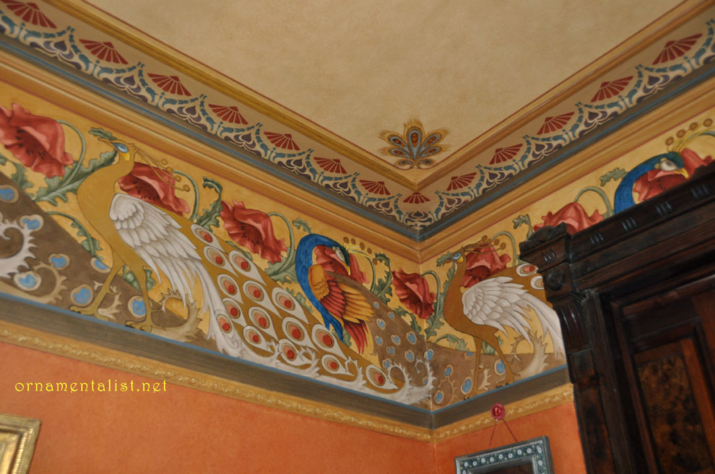
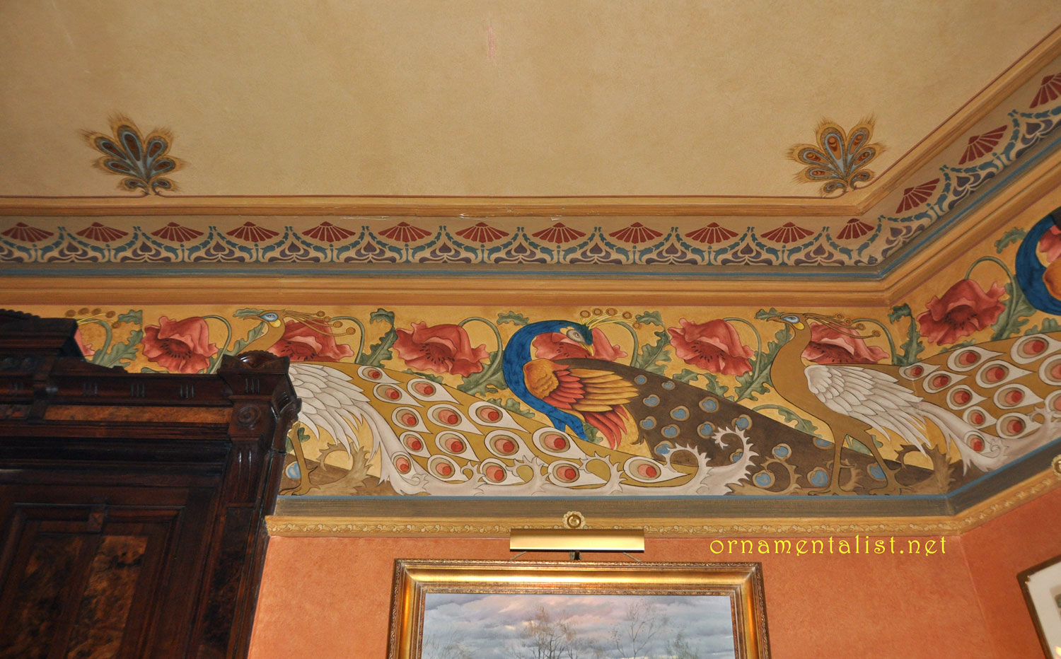
Salon aux Pins, room mural by Pascal Amblard
Salon aux Pins, detail: old paper visible through the paint
 
I also love painting quickly in order to avoid the trap of cleanliness that would have frozen the whole thing into formal classicism. I guess it looks like old wallpaper  from a distance but when you come close it is quite rough.  The idea of letting the underlying wallpaper show through means  decoration is not contrary to creativity. There is often more density and depth in objects or decorative pieces than in so-called "Art."

Which space presented the greatest challenge?
The "Library" (in a 17th century castle on the Lyonnais Slopes) It was a difficult to understand room because of the awkward restoration that had taken place in the last century. There was definitely a Renaissance style to it,  but it had been watered down. It was really like playing on a piano that is out of tune, and having to invent new chords to make it sound right.  On top of that I did the job during a freezing, snowy winter and there was no heating at all in the old castle. 
Thank God the farmers who still live on the estate are welcoming and have good liquor!

What has been your greatest breakthrough in doing this work?
During this whole process, I have seen myself instinctively solve problems and make choices that eventually proved to be inspired.  I think I am understanding what the word "experience" means even if I do not feel it as my own experience but rather like a capacity to let years of work and practice produce their results through me.  
Do you have a  favorite or most inspiring mural, or place?
Villa Valmarana ai Nani, near Vicenza, where Tiepolo and his son Giandomenico painted many rooms.  The rooms are relatively small and it is really impressive to be so close to such marvelous pieces. 
When you stand in front of one of these walls you know that, in this very spot, Tiepolo was physically present. I guess that conceivably some atoms of his body are still in the air and that you can inhale them. 
This is a fantastic feeling, some kind of compassionate and loving artistic anthropophagy.

A Tiepolo-inspired painting by Pascal Amblard
[Lynne's comment: I agree about the Tiepolos:  nothing quite prepares you for being surrounded by this work in its original setting. It's a transforming experience. "anthropophagy" - nice $50 word, btw. ]
  
What would be the ultimate project for you to paint? 
All right, let us dream:  I would like to meet a client with a pretty big space, walls and ceiling, who would ask me to use a classical language in order to illustrate elaborate contemporary concepts like the ones quantum physics has created  and relate them with the intuition that mystics have had for centuries.
This would be big enough so that I could invite all my friends to collaborate. And of course, this client would would love me so much that he would pay all of us very well for the weeks and months this project would take to prepare.
....  After that I would be really famous and I could keep pretending I am humble.
 [busted!! oh, and don't forget you will need a tall redhead on this dream job!]

Detail of Pascal Amblard's display at Maison et Object, 2010
Bonus pictures!  In recent years Pascal Amblard’s work has been exhibited at the fabulous Maison et Objet show in Paris.  Much of his newer work has been ornamental in style, panels mixing media, scale, periods, and styles, to great effect. 
 
This recently completed ornamental paneling for a designer showroom in Paris was inspired by the Salon Doré.   Gilding by Malek Moussouni.
 
You can see more of Pascal Amblard's work at his website .
Demeures Peintes by Pascal Amblard, (in French and English)  published by Editions Vial.


unless otherwise noted, all photos in this post by and © Pascal Amblard and photographer Yves Inchierman, used with permission


Sunday

The Silver Kitchen

This gorgeous custom kitchen was recently featured in the Spring 2009 issue of Better Homes and Gardens "Beautiful Kitchens." This room features a silver and ecru color palette and is dressed with rock crystal and stainless steel. I painted a faux limestone finish on the walls and used venetian lime plaster to create the irregular stone-like finish on the range hood.

These warm stone finishes compliment the silver pearlescent cabinets and white calcutta marble counter. Silver is a recurring theme color in this Piedmont, Ca. home, where I contributed color design and well as many other decorative finishes.


photo courtesy Camber Construction, where you can see more of my work in this house.


Lynne Rutter Murals + Decorative Painting

Saturday

Showcase Season

My Powder Room in the 2002 San Francisco Decorator Showcase
Showcase season is upon us again, with exciting spaces being presented by veteran and new designers alike. I have painted in over 25 showcases houses around the Bay Area, and transformed three rooms for the San Francisco Decorator Showcase as a designer. This year, due to my travel schedule, I could not participate in the exhilarating rush of reshaping a room in a scant three months.

I missed it, actually, because it is during this time I get my one chance each year to spend time under the same roof with so many talented colleagues in the business, and there is an atmosphere of camaraderie when a large number of the area's best decorative painters are all working on the same house. Oh of course there can also be a little drama, but for the most part everyone is trying to do their best work and finish before the press arrive, sometimes working late into the night, often running to the next room to beg a roll of tape or ask advice.

Showcases are especially great for ideas. Working without a "client" the designers get a chance to show off what they are interested in, what inspires them, and their best new finds.
A few years ago a nice book came out called "Decorator Showcase Houses" which compiled the best 250 rooms of 50 different showcase houses from all over the country. I recently flipped through this idea-packed book looking for a room I remembered from a previous showcase, and was really struck by how fresh and interesting even 7 year old projects look. This is because these designs are not the "trends" so much as each designer's personal vision, which, if anything, will set the trends for the future.
(look for my work on pages 137, 176, and 186!)


See the 2009 San Francisco Decorator Showcase , through May 25 at 2830 Pacific Avenue.

Tuesday

Joy Prevails Over Apathy


Every year some team of experts decides what the "color of the year" is going to be, and for 2009, it's a certain color of yellow. I had already been working on this panel of chinoiserie using a bright Imperial Yellow field when I heard this "news."
Interesting how these "fashions" in wallpaper, trends in paint, styles and colors, come and go, and come back again. The myth here is that anything is ever really all that new.

My painting above has a trompe l'oeil illusion, of brightly colored chinoiserie paper being torn up from its predecessor, the monochromatic neoclassical stencil pattern. Don't get me wrong, I love neoclassical design, but these days I feel a need for color. I find myself attracted not to just one color, but the combination of them, and I come back to this bright yellow every so often because it makes me happy. I felt, every moment I worked on this painting, basking in yellow, the sensation of pure joy!

So to me this painting is about the triumph of joy. The joy of color dominating the innocuous, monochromatic style; the joy of vision over nostalgia; of radiating rather than retreating.


Sunday

The Fabulous Peacock Parlor of Mr. Clem Labine

During our recent visit to New York, the maestro and I made a trip out to Brooklyn, to visit Mr. Clem Labine at his historic Park Slope brownstone.

Portrait of the Publisher as a Young Aesthete.
Mr. Labine is the notorious founder and former editor and publisher of the Old House Journal, Traditional Building, and Period Homes magazines, all of which sprang from his passion for preserving and improving older buildings, starting with his own spectacular manse. It's no surprise that his home boasts outstanding original as well as restored features and is decorated in high Victoriana, complete with koi pond and neoclassical statues. Clem is also a longtime Friend of Artistic License.
Clem Labine in his spectacular parlor
My favorite room is the Peacock Parlor, the formal sitting room on the grand main floor of the house, with its massive original casings and doors, high ceilings, coral walls, and crammed with art and statues. On the day we visited, an indoor bocce court (non-regulation) had been constructed on the spacious peacock feather patterned carpet. But the real story for The Ornamentalist here is the custom-painted frieze.

The hand-painted peacock frieze in Clem Labine's home in Brooklyn, NY
Unusually large at about two and a half feet high, the Peacock Frieze was designed and painted ~ 30 years ago by Austrian-trained Helmut Bucherl, ably assisted by Howard ("Howie the Grainer") Zucker, the son of a German-born decorative painter. Both artisans spent most of their professional life working for Rambusch Painting Studios of New York. The inspiration for the design was found in an old Dover Edition and embellished by Mr. Bucherl, whose Austrian roots show in the Secessionist-style elements. The ceiling has a very cool anthemion detail of stylized peacock feathers. These borders were painted using a combination of stencils, pounces, hand-shading, and gold leaf, and the entire room, including the ceiling, has been glazed. While the color are rather intense, in the intimate light of this room, they look perfectly balanced.
painted peacock and antler rosette
The peacock motif was adapted to create a four by eight foot ceiling rosette with a fabulous antler-branch spiral border and gold leaf accents which glitter above the electrified gas chandelier.

As you can see a gorgeous decorative painting job endures, like great architecture.

click on any image to view larger
anthemion is in the glossary!

Visit Clem Labine's new blog, The Preservationist

Lynne Rutter Murals + Decorative Painting

Cover story!


December 2008
- check out this month's California Homes magazine, whose cover story puts the spotlight our favorite new San Francisco designer, Claudia Juestel of Adeeni Design.


The cover article features a historically significant Victorian country house in Diablo, California, to which I have previously contributed a fair amount of work, including restoring and recreating the faux bois for the baseboards and doors in the main parlors and entry, the entry floor, and the ornamental overdoor panels in the living room.


Above: The panels over the windows and doors in the Living Room were painted by Lynne Rutter.
Artistic License associate Brian Kovac created a weathered wood finish for the beams in the newly built wine cellar.


I am so happy to see this work used in Claudia's fresh design, which is an eclectic, worldly mix, and celebration of the Victorian house's original features.


<-- The entry with its painted checkerboard floor and restored faux bois baseboards and casings.


Here is proof positive that you can live,
really live in a period home, with all its "dark" wood and traditional proportions, and still have a joyful, current interior.


click on images to view larger.
images 1 and 2 © California Homes Magazine
image 3 photo by Bernardo Grijalva


Monday

Trompe l'oeil faux travertine casings

Trompe l'oeil to the rescue!
In our current project, the huge windows of the two-story living room have somewhat undersized casings.

So we enlarged them, with a faux travertine finish and some trompe l'oeil egg and dart mouldings.

<------ Samples of the faux finishes

The stone finish makes the casings feel more substantial, and the additional border helps balance the size of the large windows.


To create the travertine finish, a coat of glaze (raw umber + white) is painted over an off-white eggshell finish paint.
A piece of pleated tissue paper is laid on the wet glaze, then smoothed over with a tooth spalter, and quickly removed.
This is repeated with a lighter coloured glaze on top.
This technique gives a fairly convincing textured effect similar to a foro romano travertine limestone.


The egg-and-dart moulding is created using a stencil to block in the "shadow" areas. Additional details are painted in by hand. in this way we can make each one slightly different so they don't look too new or machine-made
Warm white highlights are added as well as some shadows on the wall around the new "casings."
Subtle trompe l'oeil "joints" in the casings help make them look more convincingly assembled from carved stone.


The finished windows have more support for their size
and lend some classic Italian atmosphere to the room.

click on any image to view larger


Lynne Rutter Murals & Decorative Painting