30 July 2009

The long lost sketchbook of Jeanne Magnin

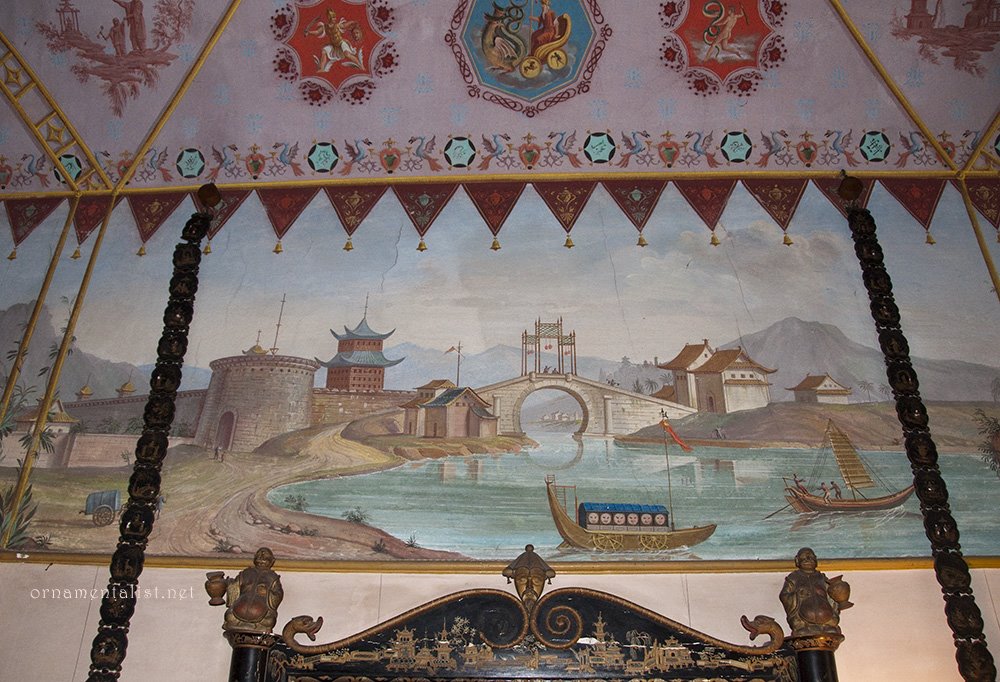
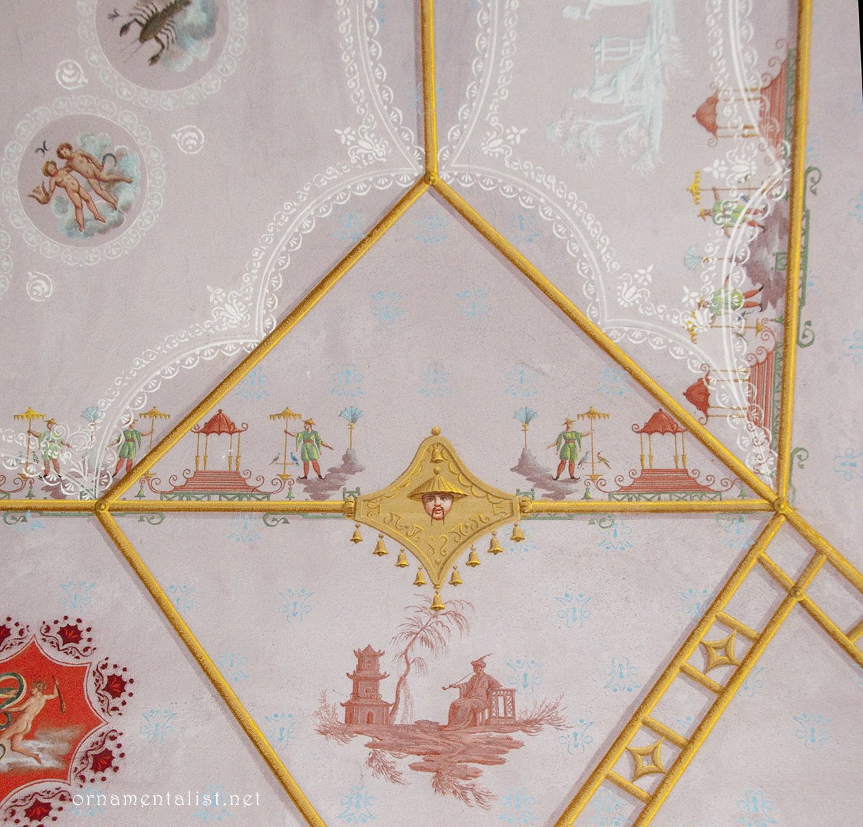
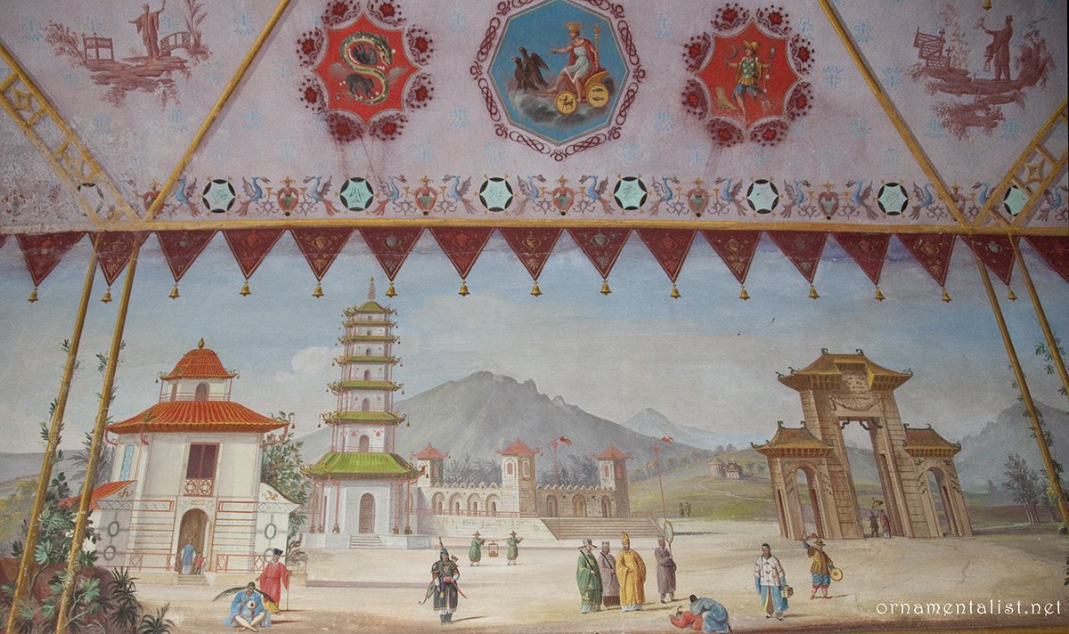
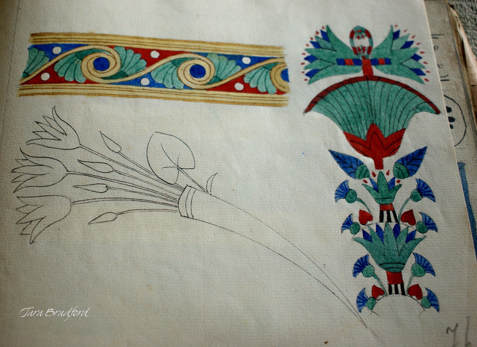
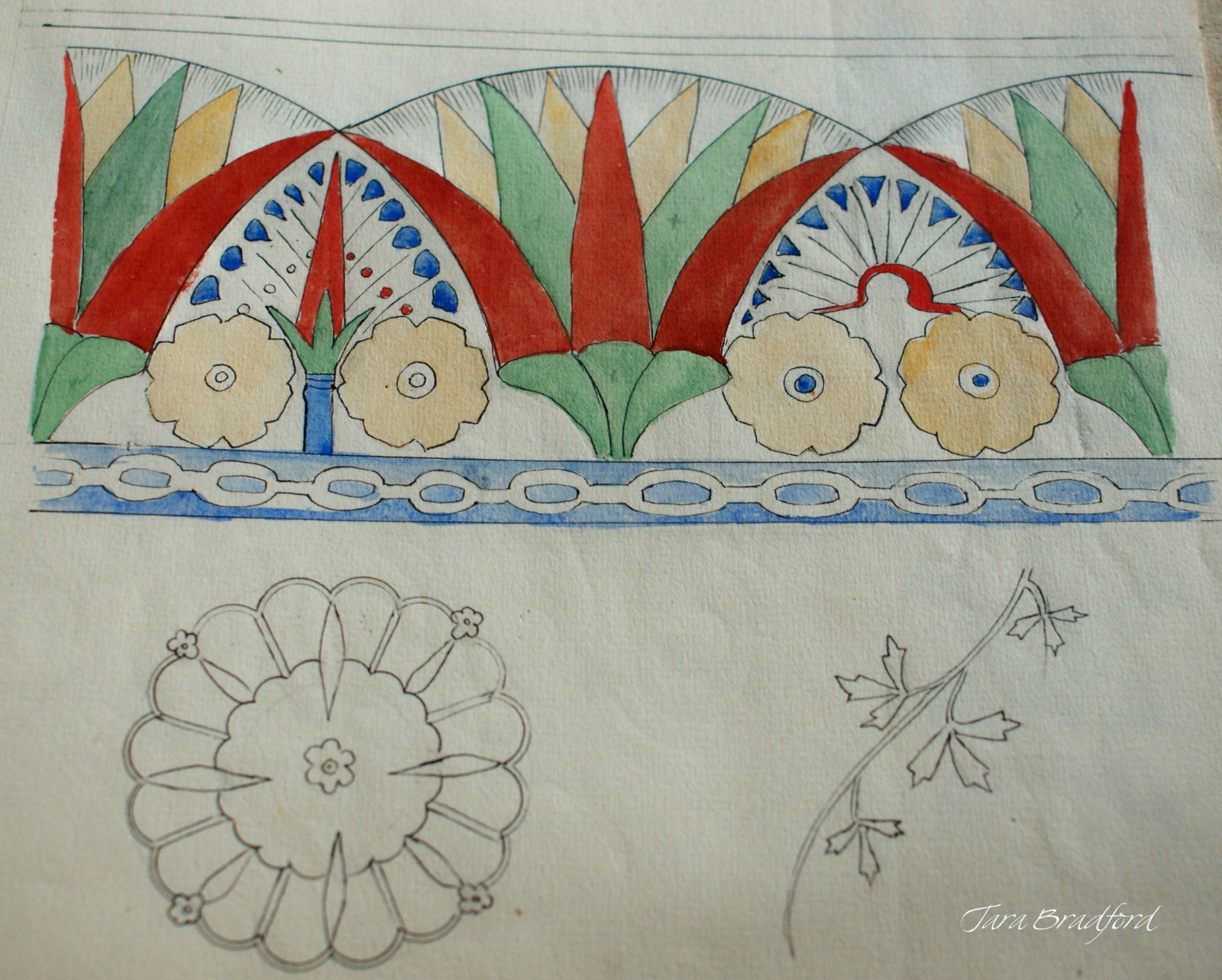
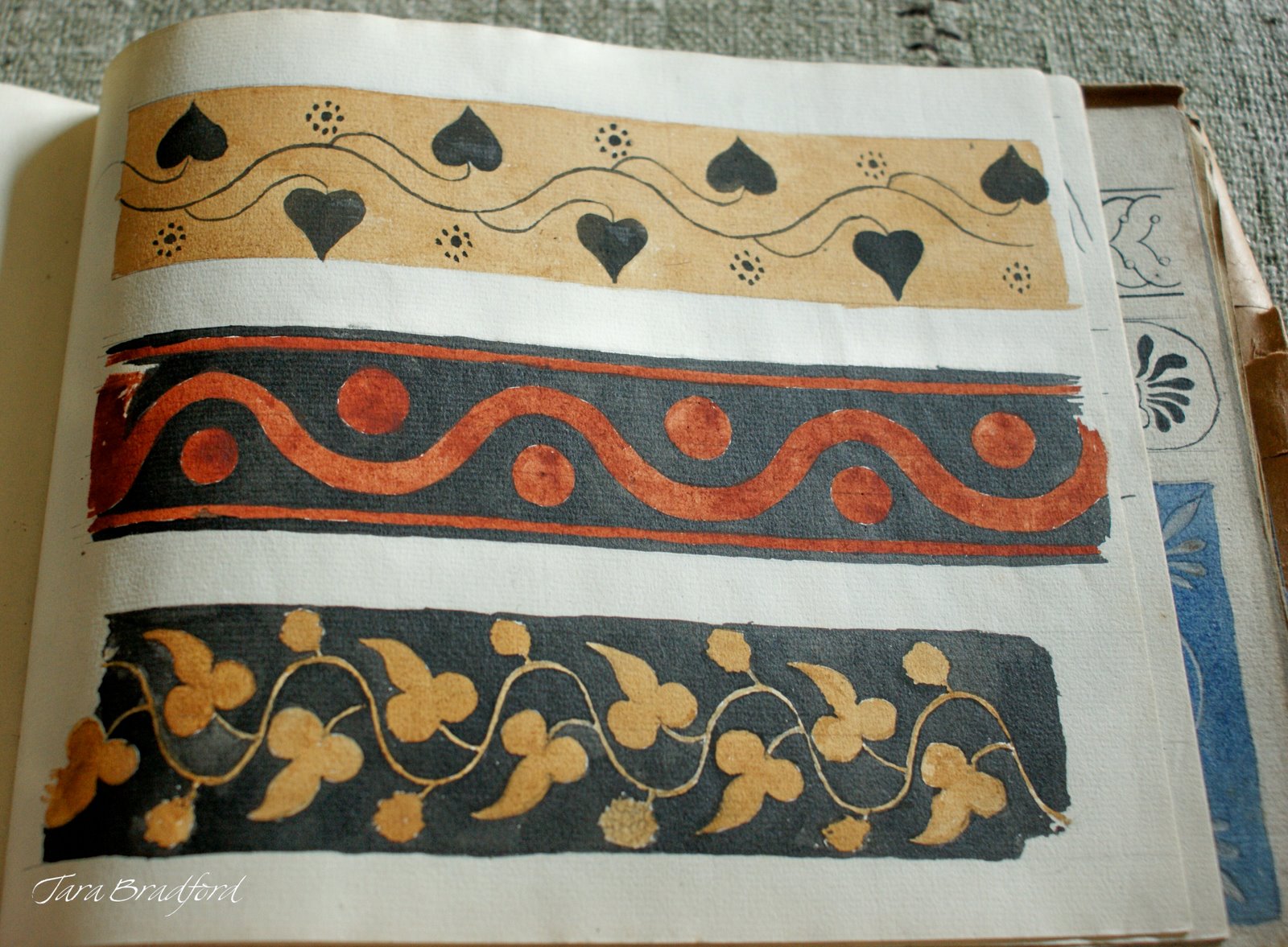
In true ornamentalist fashion, Jeanne Magnin collected borders and motifs from her travels, and documented them in beautifully drawn and composed pages.

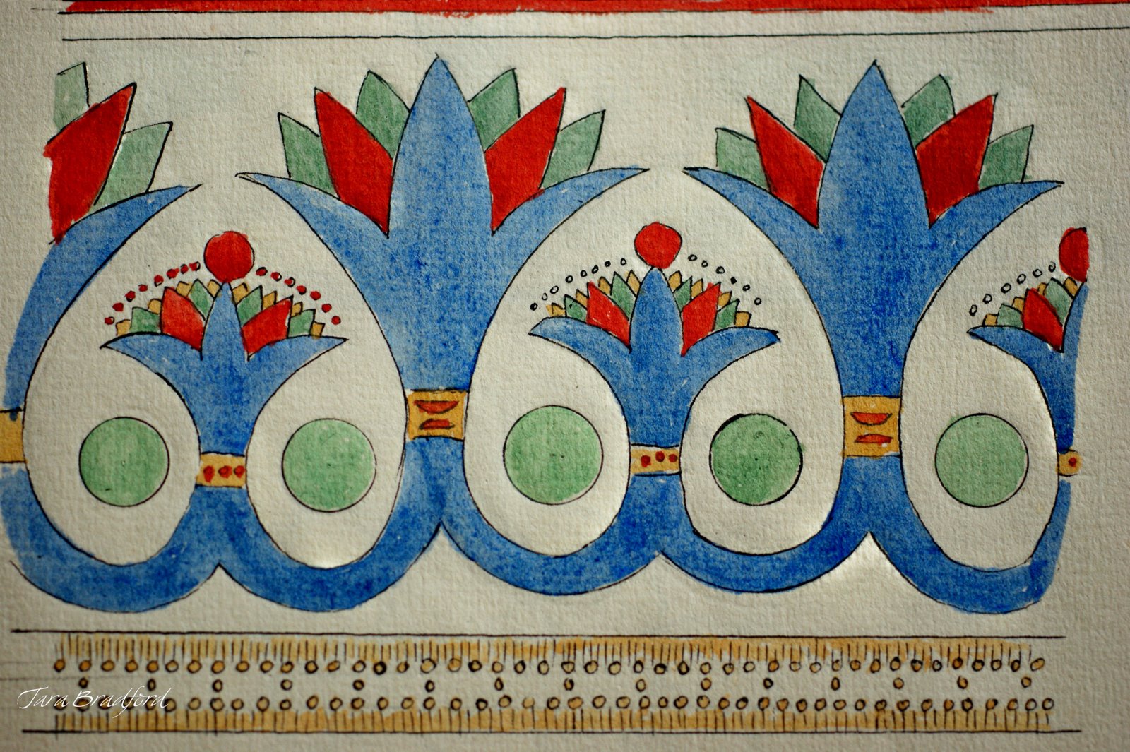
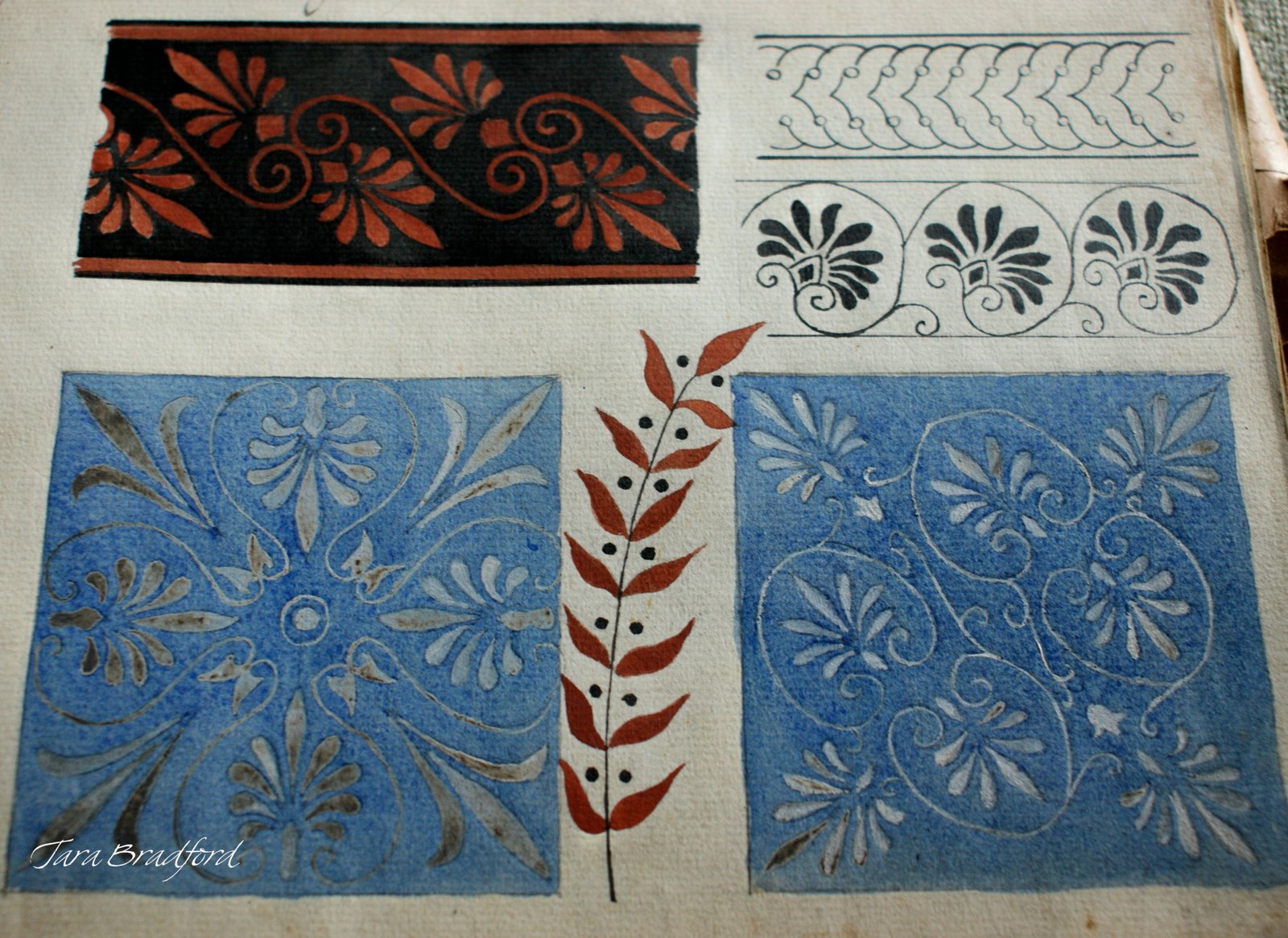
Egyptian border, from Jeanne Magnin's Documente de Style 1916 - 1917
Tara Bradford, the creative force behind one of my favorite blogs, Paris Parfait, found a little plain brown paper bundle at a brocante, which turned out to be a sketchbook full of gorgeous designs of Egyptian, Roman, and Greek styles, collected in 1916-1917 by the French painter, collector, and art critic Jeanne Magnin.


Egyptian ornament, from Jeanne Magnin's Documente de Style 1916 - 1917


Tara was generous enough to photograph each page of her amazing find and post them to her blog, at very high resolution. With her permission I have re-posted some of them here.


Roman-style rinceau and bucrane borders, sketches by Jeanne Magnin

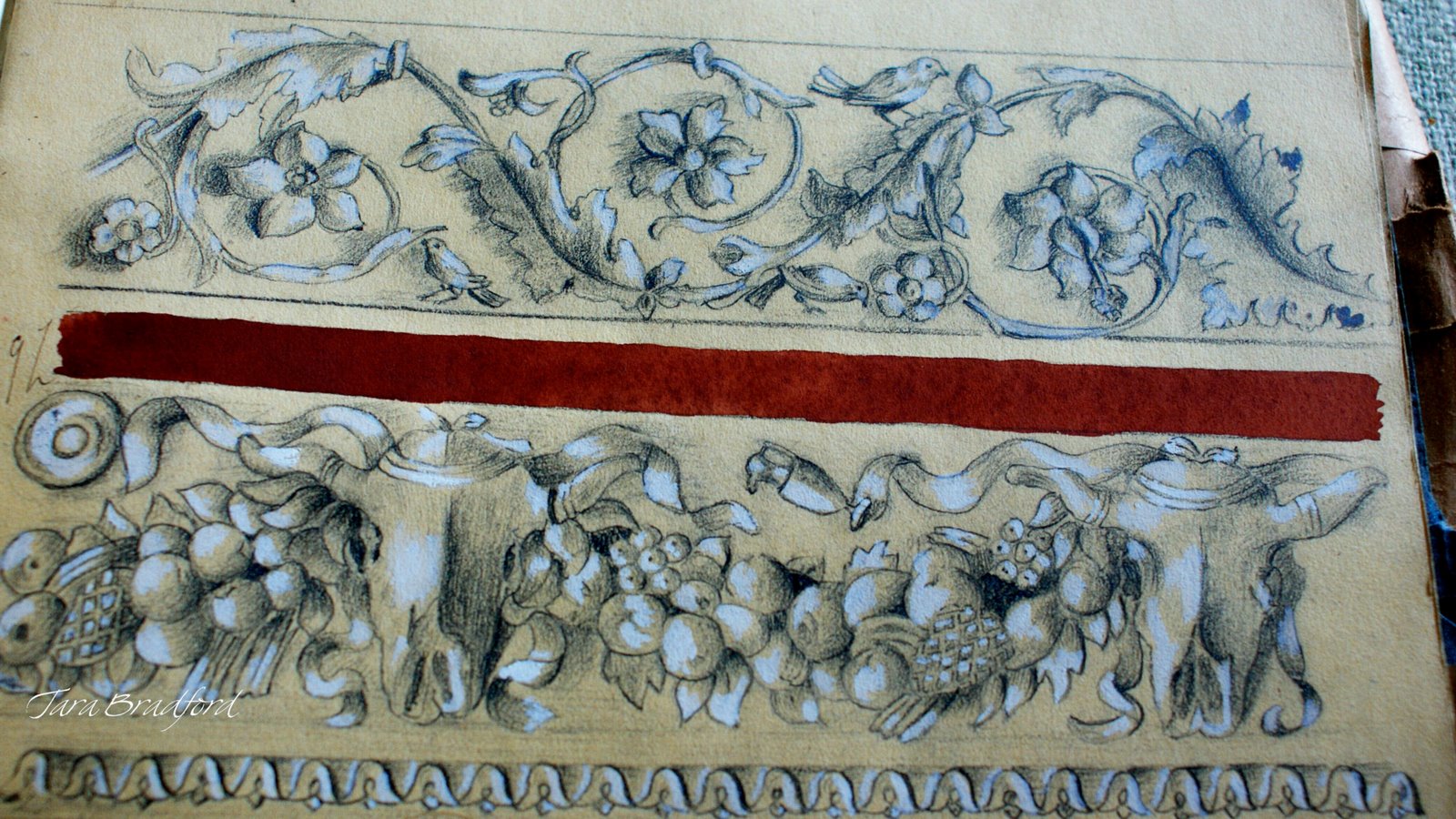
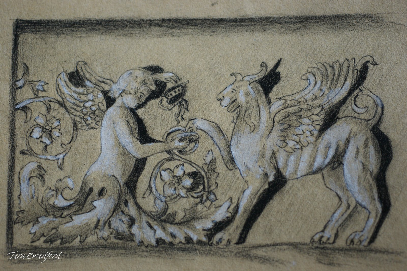
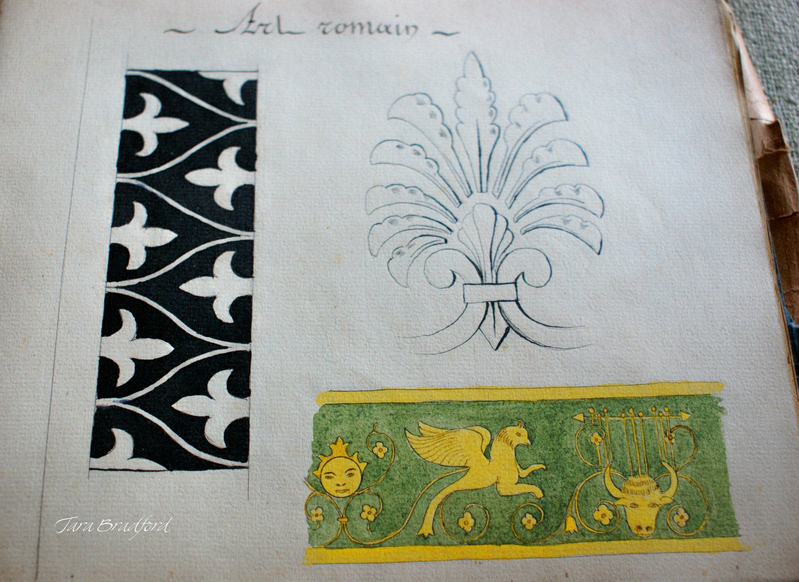
In true ornamentalist fashion, Magnin collected borders and motifs from her travels, and documented them in beautifully drawn and composed pages.


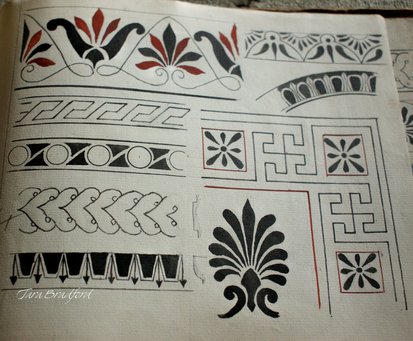
Greek ornament: a page of palmettes
Greek borders


 Each page is like traveling to another time and place.
Greek motifs, Jeanne Magnin's Documente de Style 1916 - 1917


Magnin was the author of Le paysage français, published in 1928 and Un cabinet d'amateur parisien en 1922. You can learn more about Jeanne Magnin by visiting Le Musee Magnin in Dijon, France.
All photos in this post by Tara Bradford- click on images to view larger.


28 July 2009

simple design = big change!

sketch for silhouette mural: run spot run!

I recently completed a deceptively simple silhouette mural, for a veterinary ophthalmology practice in San Francisco. This mural is designed for an angled, and very long hallway wall, with a bumpy uneven surface.

the hallway before (L) , and with its new base color of blue

For an assignment like this the two most important things are a good drawing, and the right color.   The wall "before" was stark white, in an uneven 36 foot long sloping hallway.   Just painting the wall a nice color of warm blue had a tremendous impact on this space.

bulldog and horse see eye to eye!

The client asked that the design feature a variety of animals, emphasize the importance of sight, as well as show interaction between the animals and their human companions.
Here are some more details:


Kathy explaining derivatives to her hound
the great butterfly hunt!
Finished mural as seen from the reception area


Both the reception area and the hall now have a nice view!

You can see this mural in person at the office of Veterinary Vision in San Francisco.


22 July 2009

Exterior Color: Contrast and Simplicity

10th Avenue Edwardian with its elegant new paint job
When less is more.... Once in a great while I find myself needing to use less color to reach the goal. For this circa 1915 stucco Edwardian house in San Francisco, the homeowners asked me to help create a more sophisticated, period look.
The previous paint job called out every detail in a mauve and white palette, with accents of forest green and dark rose. This gave the facade a somewhat whimsical, more Victorian appearance, which somehow de-emphasized the architecture by separating each element with a deep color; many features seemed to float unsupported.
10th Ave Edwardian, before and after
Houses of this era were originally far simpler, often covered in wood shingles, or with unpainted, natural stucco. To create an appearance more in keeping with the home's true period style, I recommended we give it back some of its architectural stability by simplifying the scheme to emphasize the form of the house, and started with a color similar to the stucco material itself.

Using a limited palette and strong contrast, my scheme features charcoal green stucco, with dark ivory woodwork. All of the structural woodwork is painted the same color: brackets and beams are now connected and supporting the roof! Roof tiles that had been painted red were replaced with natural brown tile, to relate better with the dark foundation brick. A touch of a warm light green in the eaves reflects some light behind the beams.

This house now has an impressive presence from the street; the architecture is doing all the talking.


Color Consulting from Lynne Rutter 415.282.8820

07 July 2009

Chinoiserie, Italian Style

Sala Cinese, Palazzo Moroni, Bergamo
Chinoiserie is still one of my favorite styles of decoration. All the rage in Europe in the late 17th and 18th centuries, it endures as a classic style of "theme" room, a fantastic mix of exotic Asian motifs and European techniques and sensibilities. One of the most charming examples I have ever seen is this room in the Palazzo Moroni, in Bergamo.
The ceiling appears to be a colorful pink tent, with a lace "cap" at the top, the signs of the zodiac at its center.
detail from the Sala Cinese, Palazzo Moroni
Excellent landscape murals surround the "frieze" level of this room. Note the perspective in the paintings, which are all viewed from below.

Detail of the ceiling: I just adore that lace edging, and the border of little pavilions.

These fantasy buildings remind me of San Francisco's Chinatown, whose architecture was designed in 1906, to reflect the western impression of ancient Chinese buildings. Obviously not a new thing.

I visited the Palazzo Moroni during the International Decorative Painting Salon which was held in Bergamo earlier this year. Our gracious host for this event was Lucretia Moroni,  scion of the Moroni family, and herself a world-renown decorative artist. As you can imagine the group of painters visiting this palazzo were very appreciative of its historic murals and terribly grateful to be allowed to take pictures.


photos by Lynne Rutter, April 2009
click on images to view larger