Sunday

Victorian Woodgraining

This splendid Victorian entry door set with leaded glass windows
was finished with a faux bois effect by Lynne Rutter.
In San Francisco Victorians, it's fairly common that the dark woodwork so commonly found in their interiors is actually redwood, that has been painted with a faux bois finish to look like something richer and more expensive. This style of woodgraining usually emulated mahogany, and was often nothing more than a layer of deep tinted glaze pulled over a painted surface, then varnished. This simplified faux bois technique is a remarkably effective treatment. 
In older American cities like New York or Chicago, the faux bois used in Victorian homes could be a more complicated process resulting in a realistic imitation of wood, but in boomtown San Francisco, there were few skilled painters available in the rapidly growing city, so most made do with a very simple graining job; and then it was off to the next house!  Of course these days we can improve these old finishes if desired, but one of my specialties as a restoration painter is rehabilitating and recreating these period finishes, which requires careful matching of color and mimicking the style of the original painter.
repaired areas of missing moulding were matched to the original  wood-grained finish
In this Mission District Italiante mansion, removal of a 20th century dropped ceiling in the dining room revealed the original mouldings, damaged but well worth saving! Missing areas were re-created by a carpenter, and then we painted them with a woodgrain effect to match the original finish. We also created a typical faux bois finish for the baseboards, doors, and casings, to restore the room's period look.

My associate Melka Myers,  creating a burl effect in the insets of some reproduction Victorian doors
The parlor in this house had an interesting paneled ceiling that had been painted over many times. I designed a color palette and finishes for this room to create a more Victorian period atmosphere. As you can see the finish starts with a bright, apricot colored base.
San Francisco Victorian-  the paneled ceiling being painted with a simple faux bois effect
My good friend Tani Seabock gave me a hand to work some magic on this ceiling, using a formula I designed that requires only one layer of glaze to skillfully fashion a convincing faux bois finish. This was done not only to preserve the budget but  to emulate  the original graining style used elsewhere in the house.
a faux bois ceiling  by Lynne Rutter Studio,    a simple finish with an outstanding effect
The effect is stunning, so much so that it's hard to believe anyone would want to paint it white. It's worth the extra effort to finish these surfaces as they were intended; you get so much more out of the architecture.


click on any image to view larger

The Fabulous Peacock Parlor of Mr. Clem Labine

During our recent visit to New York, the maestro and I made a trip out to Brooklyn, to visit Mr. Clem Labine at his historic Park Slope brownstone.

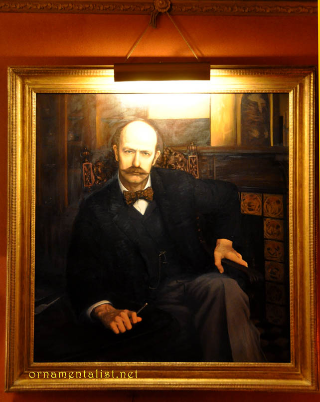
Portrait of the Publisher as a Young Aesthete.
Mr. Labine is the notorious founder and former editor and publisher of the Old House Journal, Traditional Building, and Period Homes magazines, all of which sprang from his passion for preserving and improving older buildings, starting with his own spectacular manse. It's no surprise that his home boasts outstanding original as well as restored features and is decorated in high Victoriana, complete with koi pond and neoclassical statues. Clem is also a longtime Friend of Artistic License.
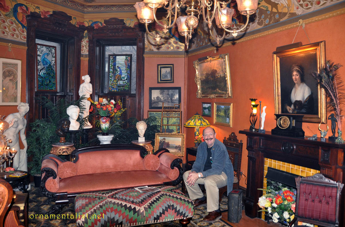
Clem Labine in his spectacular parlor
My favorite room is the Peacock Parlor, the formal sitting room on the grand main floor of the house, with its massive original casings and doors, high ceilings, coral walls, and crammed with art and statues. On the day we visited, an indoor bocce court (non-regulation) had been constructed on the spacious peacock feather patterned carpet. But the real story for The Ornamentalist here is the custom-painted frieze.

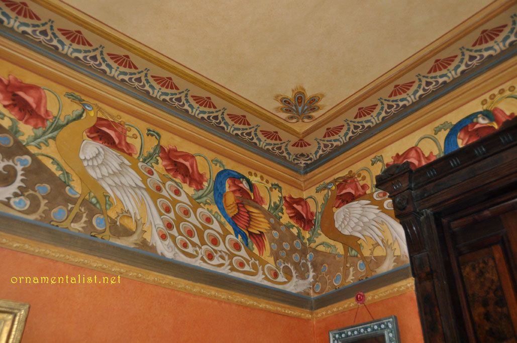
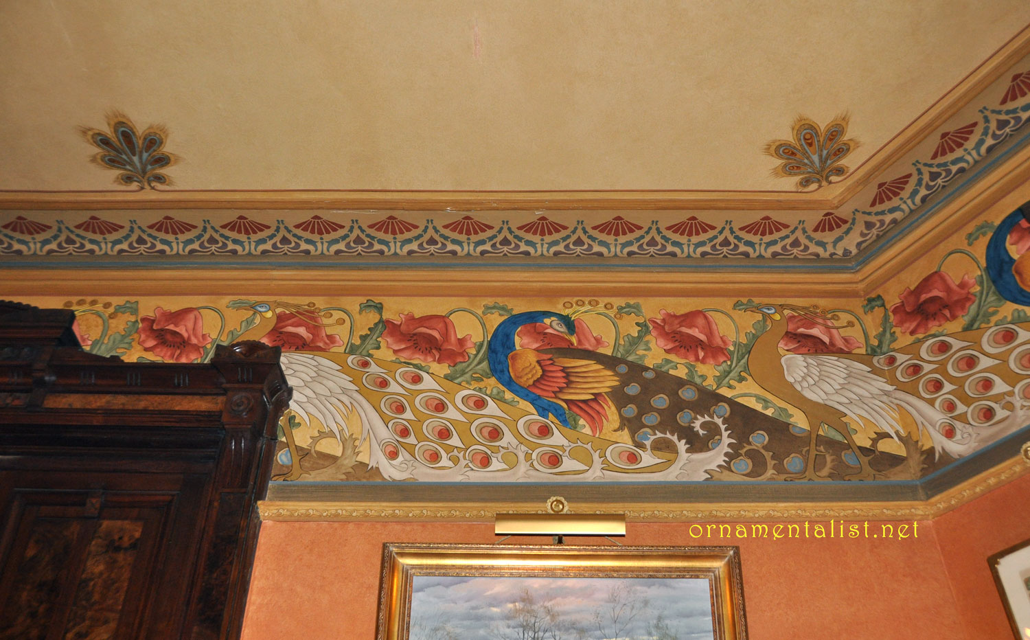
The hand-painted peacock frieze in Clem Labine's home in Brooklyn, NY
Unusually large at about two and a half feet high, the Peacock Frieze was designed and painted ~ 30 years ago by Austrian-trained Helmut Bucherl, ably assisted by Howard ("Howie the Grainer") Zucker, the son of a German-born decorative painter. Both artisans spent most of their professional life working for Rambusch Painting Studios of New York. The inspiration for the design was found in an old Dover Edition and embellished by Mr. Bucherl, whose Austrian roots show in the Secessionist-style elements. The ceiling has a very cool anthemion detail of stylized peacock feathers. These borders were painted using a combination of stencils, pounces, hand-shading, and gold leaf, and the entire room, including the ceiling, has been glazed. While the color are rather intense, in the intimate light of this room, they look perfectly balanced.
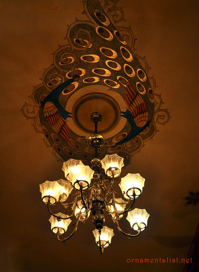
painted peacock and antler rosette
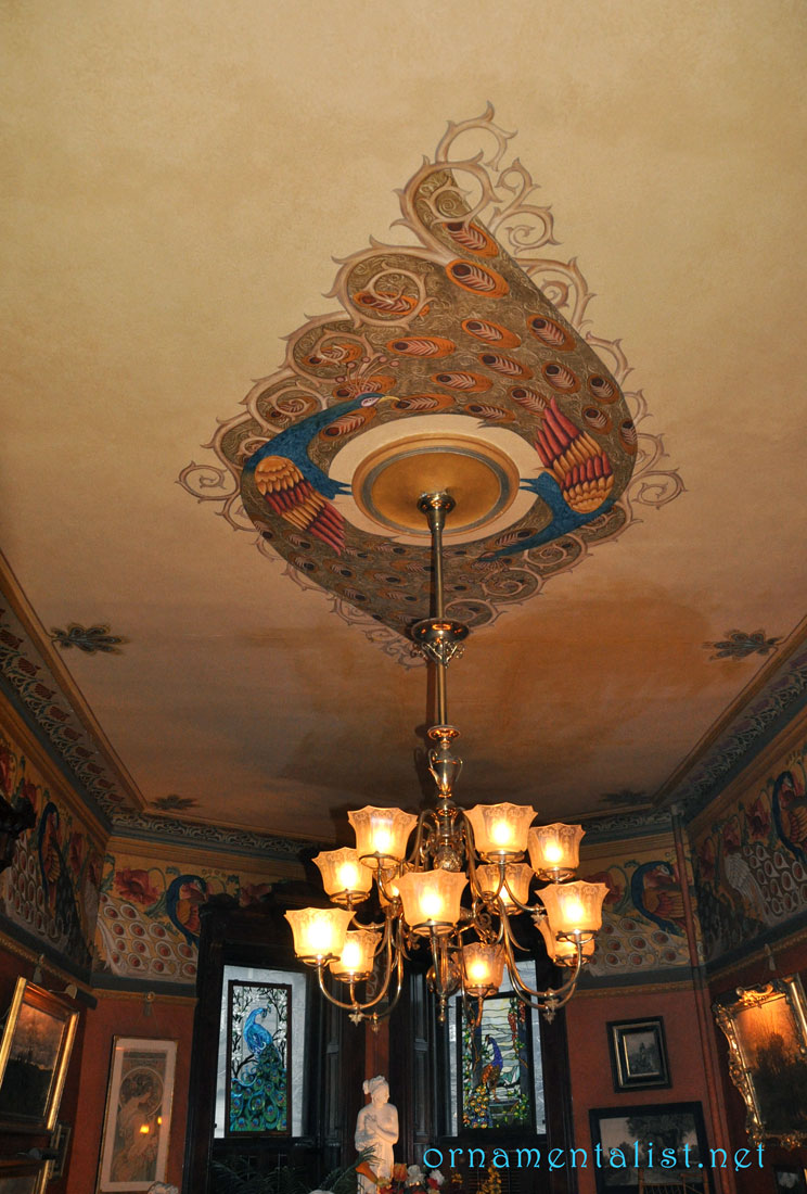
The peacock motif was adapted to create a four by eight foot ceiling rosette with a fabulous antler-branch spiral border and gold leaf accents which glitter above the electrified gas chandelier.

As you can see a gorgeous decorative painting job endures, like great architecture.

click on any image to view larger
anthemion is in the glossary!

Visit Clem Labine's new blog, The Preservationist

Lynne Rutter Murals + Decorative Painting

Monday

Faux Volcanic Glass Mosaic Tiles

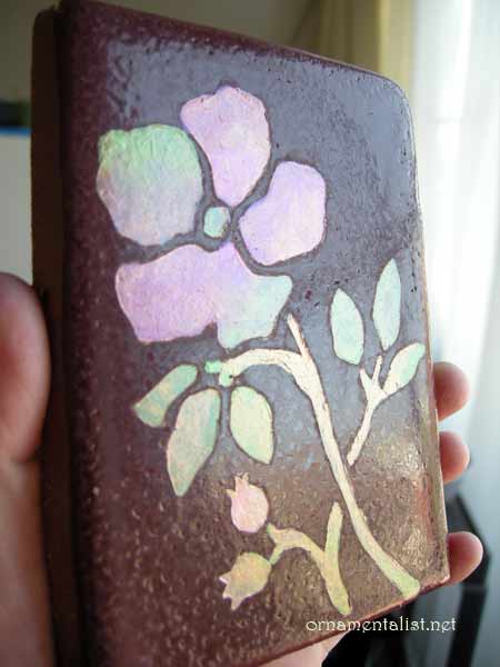
faux mosaic glass tile painted by Lynne Rutter
I had a commission earlier in the year to paint some hand-made tiles to look inlaid with volcanic glass mosaic, for an Arts and Crafts period effect. So many people asked me how this was done I recorded the process for this "How-To" post!

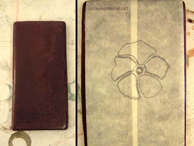
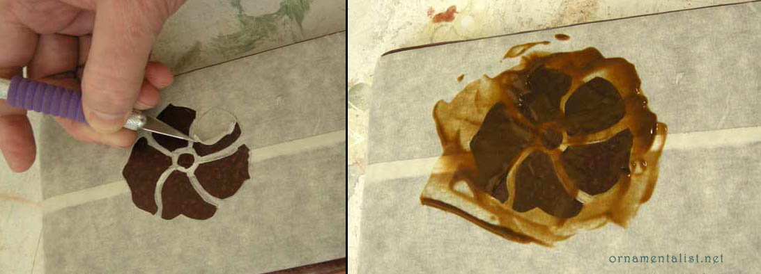
masking tape "stencil"
The plain tiles are hand-formed, with a rough burgundy colored glaze on top. The surface is uneven and not very smooth, which makes it difficult to paint. So to get paint to stick to this surface, I decided to etch it. For the initial sample, the "stencil" is just masking tape.
cutting out the tape stencil and etching the design
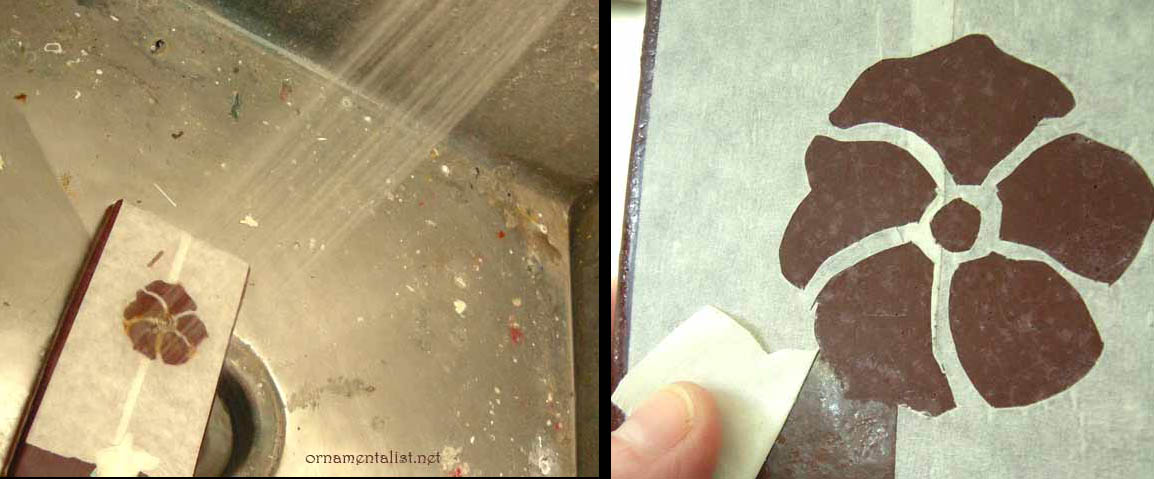
After cutting the design out, I applied Etch-All creme over the design, waited 15 minutes, then rinsed thoroughly with water. NB- nasty stuff- wear gloves and a respirator.
rinse off the Etch-All thoroughly, allow tile to dry overnight
After rinsing I checked to see if the etching had any effect... and it sure did! In fact, I think it would be cool to etch designs into tiles like this and not paint them! Before painting, I let this dry overnight.
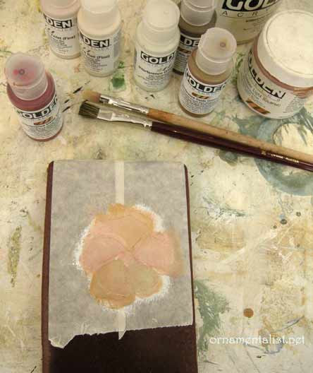
first layers of paint
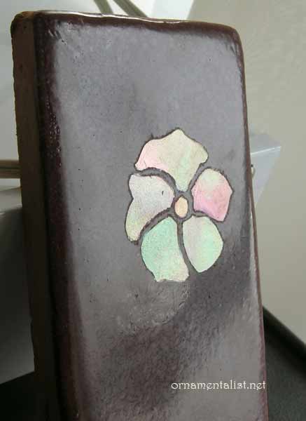
finished sample
For the painting, I started with a layer of acrylic gesso tinted to a peach color with burnt sienna acrylic. Over that I added some layers of copper and gold metallic acrylic and a selection of interference paints. To keep the surface smooth I use a soft blending brush to soften out the paint.
It's hard to get good coverage with such transparent colors, so many layers are needed and you have to be careful not to let brushstrokes build up.

To get that volcanic glass look, I apply the interference colors in a bit of rainbow- each "piece" has several colors changing from red to green to oxide, etc
When the sample was finished, as you can see if you look very closely, the tape bled a bit during the etching process. So in the next round I used a solvent-resistant masking film from an auto-body shop.

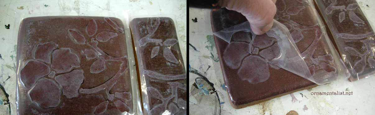
Because the tiles are dark it was a challenge to transfer the design onto a clear film. I ended up transferring the design to the tile with bright red saral paper, then sticking the mask on them, and then cutting the design out. This whole process took only about 1 hour.

Following the steps above, the tiles were then etched.

project using hand-cut solvent-resistant film

As the tiles are not flat and the glaze has a lot of bubbles and texture, getting the masking film to stick perfectly was not possible. But on a smooth flat machine made tile, this would work like a dream. One bonus about this film- once the water dries off it, it can be re-adhered.

Now for the fun part!

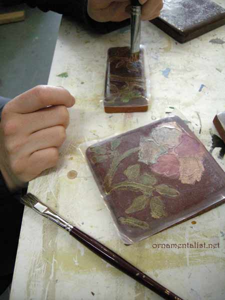
Here is Melka, painting the design with interference colors
Layers of interference and metallic acrylics blended together and softened with a black sable fitch. Important: let the paint cure hard (4 - 12 hours) and bray the edges down to break the acrylic paint film, before lifting the masking film.

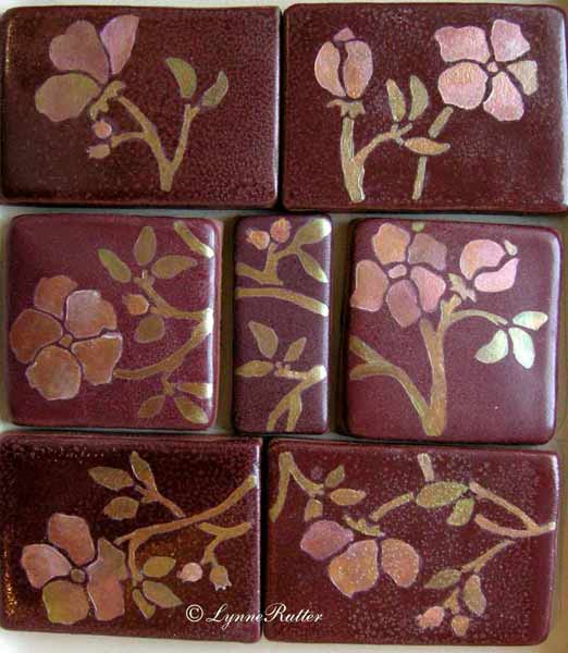
the finished project!

A finished set of tiles: pretty, water-resistant, and unique.
This process can also be used for tiles that are already installed.


Sunday

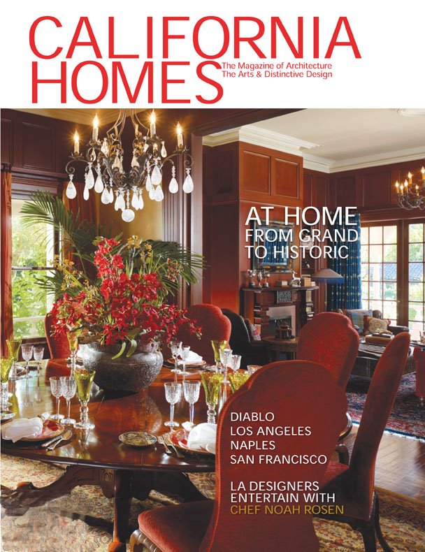
Cover story!


December 2008
- check out this month's California Homes magazine, whose cover story puts the spotlight our favorite new San Francisco designer, Claudia Juestel of Adeeni Design.


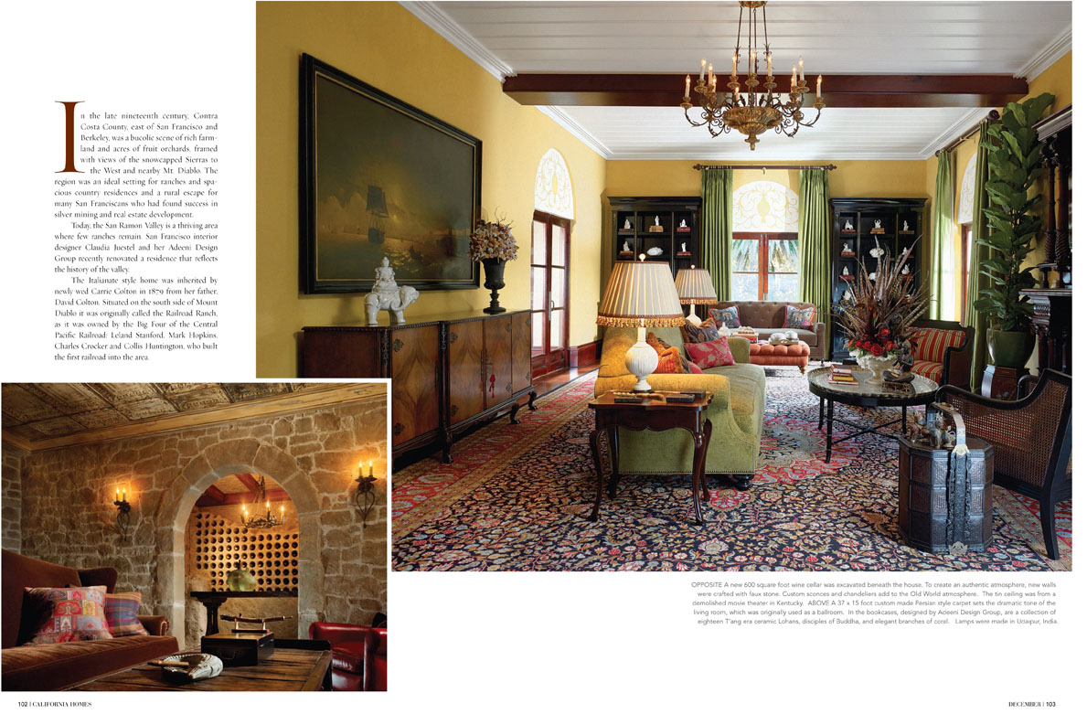
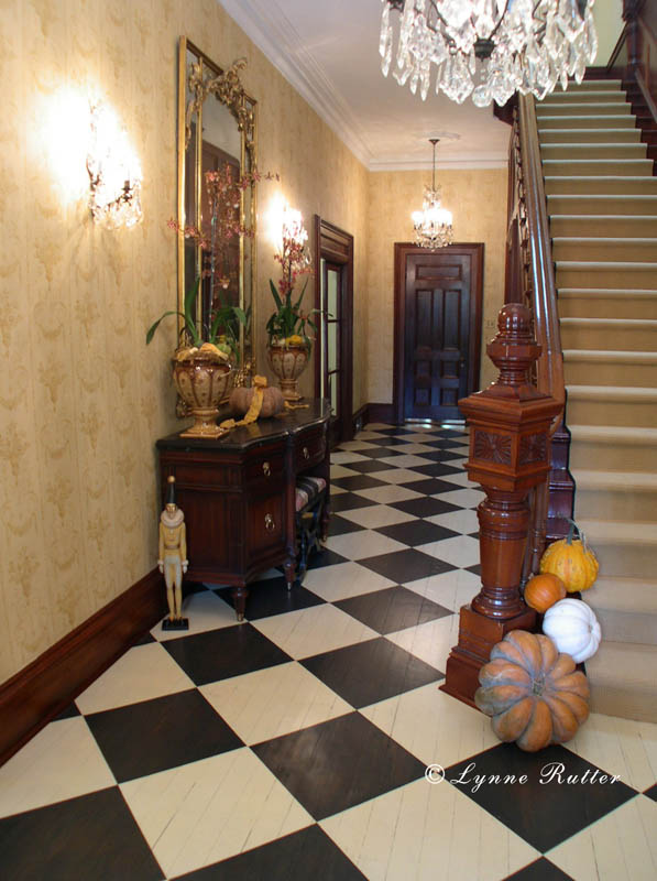
The cover article features a historically significant Victorian country house in Diablo, California, to which I have previously contributed a fair amount of work, including restoring and recreating the faux bois for the baseboards and doors in the main parlors and entry, the entry floor, and the ornamental overdoor panels in the living room.


Above: The panels over the windows and doors in the Living Room were painted by Lynne Rutter.
Artistic License associate Brian Kovac created a weathered wood finish for the beams in the newly built wine cellar.


I am so happy to see this work used in Claudia's fresh design, which is an eclectic, worldly mix, and celebration of the Victorian house's original features.


<-- The entry with its painted checkerboard floor and restored faux bois baseboards and casings.


Here is proof positive that you can live,
really live in a period home, with all its "dark" wood and traditional proportions, and still have a joyful, current interior.


click on images to view larger.
images 1 and 2 © California Homes Magazine
image 3 photo by Bernardo Grijalva


Monday

Language of Cloth Textile Show and Sale

Attention fashionistas and fans of color and fabric!
It's time once again for the Language of Cloth textile sale.

Fridays, Saturdays, and Sundays
from November 28 - December 21, 2008
650-B Guerrero St San Francisco
415-431-7761

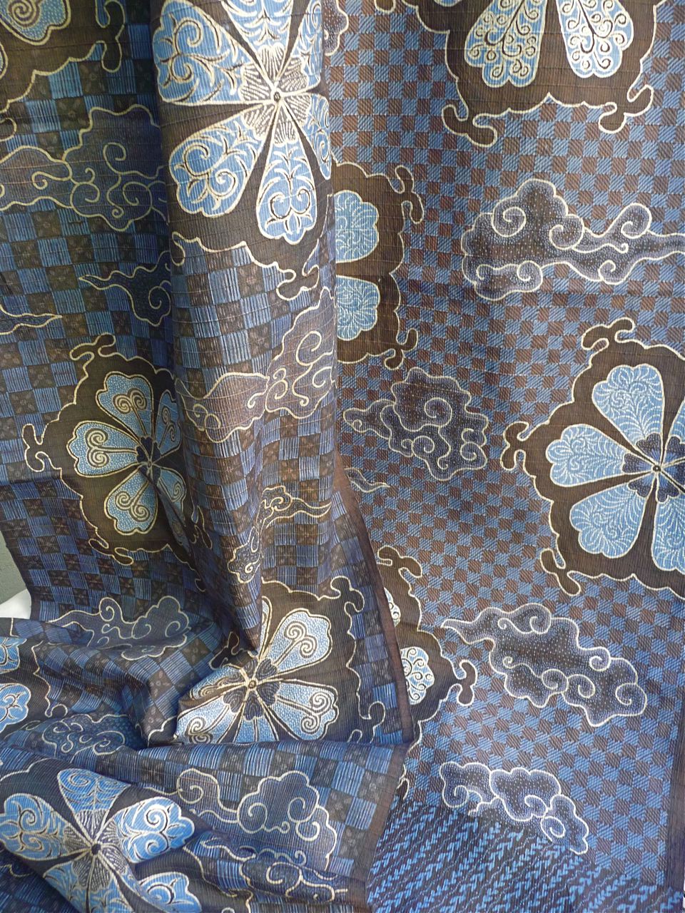
the blue: hand woven silk with a kotak-kotak pattern (grid) The issen-issen (batik filler patterns) fill in areas defined by the textured pattern of the weave. This design was inspired by an antique obi.

Every year my good friend Daniel Gundlach brings home a fabulous collection of handmade textiles of cotton and silk from Indonesia, Laos, Vietnam, Cambodia, and Thailand. Unusual one of a kind pieces blending traditional techniques with modern eclectic style. Wonderful for wearing, for decor, and with many affordable choices for gifts.


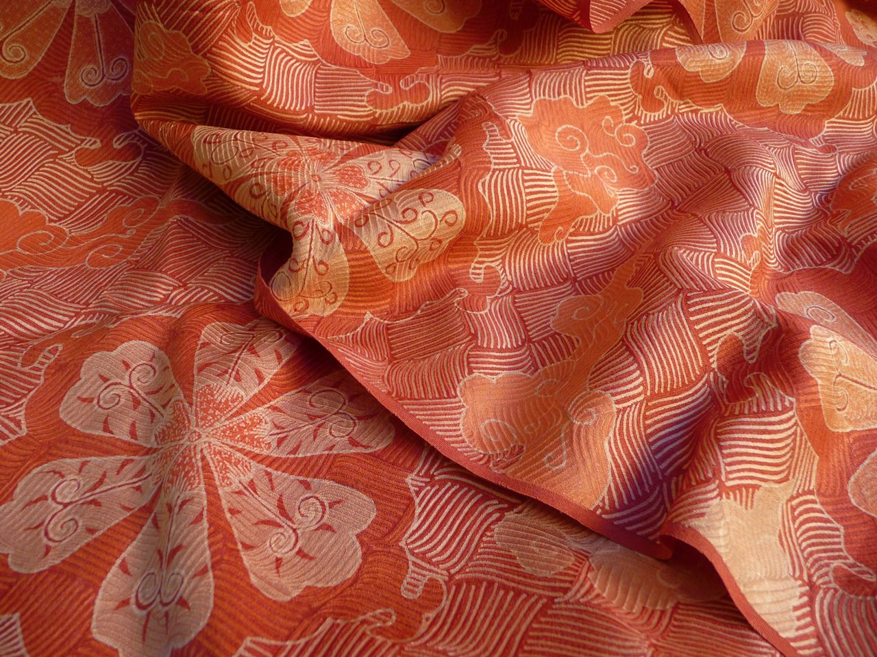
the orange:
hand -drawn batik tulis on Korean silk jacquard, in a flowing basket weave. The batik follows the pattern of the weave in some areas.


Each piece is unique, hand-made using a very labor intensive process, and the sale of this work supports the artists, and the communities in which they were created.