Wednesday

Re-thinking Batik: The Language of Cloth

Now touring the US is a wonderful show called "A Lady Found a Culture in its Cloth: Barack Obama’s Mother and Indonesian Batiks" featuring some fine examples from the extensive batik textile collection of Ann Dunham. The show opens June 18 in San Francisco at the California College of the Arts and runs through June 21.

What a way to whet my appetite for pattern, as my friend Dan is just back from Indonesia and will be having a trunk show June 26-28 with all his latest textile wonders!

Through his business The Language of Cloth, Daniel brings together different styles and materials to create new batik designs. Hand-woven silks from Cambodia, Laos, and Thailand; jacquard silk from Korea, and flax-silk from Indonesia are decorated with elements from Japanese kimono patterns, Ainu motifs, European embroidery patterns, as well as traditional Javanese batik motifs. The show will also include reproductions of antique batik cloths from collectors, some reinterpreted in new colors, others reproduced exactly.

"Carbon Emissions" trucks spewing smokey mega mendung

My personal favorites are the contemporary twists added to the traditional batik patterns, like my prized Cluster Bomb sarung. A new piece this year, "Carbon Emissions" is a mega mendung "cloud" motif, with the addition of trucks and cars, in smokey colors.

I am also quite smitten with some of theses Ainu-inspired scarves:
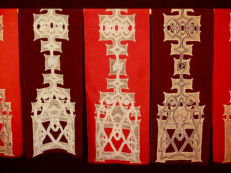
Ainu pattern interpreted as batik ornament: batik tulis on hand-woven Thai silk, with design adapted from applique patterns on Ainu attush robes from Hokkaido, Japan

The Language of Cloth Summer Trunk Show takes place
June 26, 27, 28 11 to 6pm
650-B Guerrero St., San Francisco
415.613.9693 www.languageofcloth.com


Sunday

Miniature Portraits

Recently I have been spending some time cleaning and getting to know the miniature portraits collected by my great-grandmother. Many in her collection were acquired from a sale at the Metropolitan Museum in New York, and most of those were portraits of Marie Antoinette.
I will be posting the entire collection in sections here as I have time.

Portrait of Marie Antoinette with a rose, signed "A.T." gouache on ivory backed with white kid leather, in gilt wood frame.    
Oval portrait of a dark-haired lady dressed in the Italian fashion, watercolor on ivory, unsigned.
 
Portrait of Marie Antoinette in a green dress, gouache on ivory, signed “Chatain.” Backed with white kid leather and set in a simple ornamental oval frame with watch-crystal type pillowed/beveled glass. Very likely painted as a copy of another painting, as a souvenir.

 Portrait of Marie Antoinette in an apricot dress, unsigned watercolor on ivory. This painting is much smaller and older than its elaborate frame, which dates from the late 1870's.

Very fine and pretty portrait of a young girl, gouache on bone ivory, signed "Gericault 1812" backed with white kid leather, in its original simple brass frame.

Want to know more about miniatures?
Read here about my obsession with Miniature Eye Portraits

Elle Shushan in Philadelphia has a fine business collecting and selling miniatures.

Check out this huge on line gallery of a number of collections on this extremely informative site: "Artists and Ancestors"


Lynne Rutter Studio


Monday

Geek Color

Can these new iPhone applications save me lugging around giant paint color fan decks? We shall see!


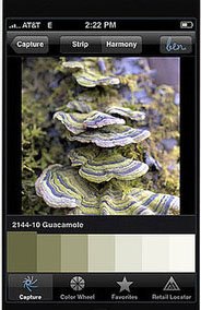
This week the internet is all abuzz with news of a new iPhone application ben® Color Capture™ - developed for "ben" by Benjamin Moore, that allows you to snap a picture of whatever inspiring beauty you see, then match moments in that photo to the more than 3,300 colors in Benjamin Moore’s range. The application will be available for free download beginning June 1.

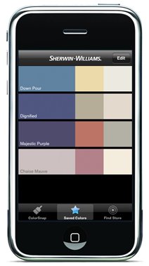
Fans of SuperPaint will rejoice that Sherwin-Williams has its own interactive iPhone app called ColorSnap™ which is available for free download now. It identifies colors in your images, and suggests palette colors surrounding them, and will even give you the RGB code of each color for web use.

For you advanced color players there are even more options - beyond paint!

Color Expert,
from Code Line Communications, uses an interactive color wheel displays color sets in various schemes including monochromatic, complementary, analogous, split complementary and triadic, which update as you drag a finger across it. You can also view a variety of color palettes, find hex codes for RGB values, look up HTML named colors, Web-safe palettes, etc., and then email your designer friends with your inspired finds! This one is $9.99

Palettes, by Ricky Maddy, can analyze a photo, web URL, or any other image, and offer a breakdown of its colors into a pleasing looking palette. $9.99 for this app, or free for the "lite" version.

For me these applications are not quite sensitive or accurate enough for picking colors but they are interesting for working out palette decisions. Looks like I will be eye-matching my paint for a while to come.

Images courtesy Benjamin Moore and Sherwin-Williams


Lynne Rutter Murals & Decorative Painting

Tuesday

Exterior Color: using paint to emphasize architecture

Here is another case study on the placement of paint color, and how to get the most from your Victorian facade.
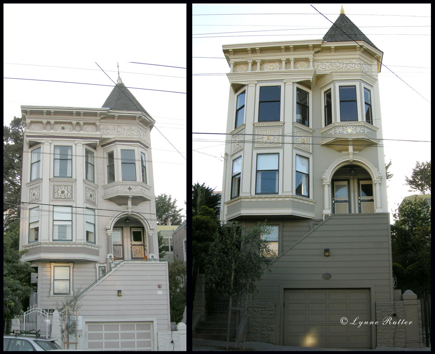
This Laguna Street Queen Anne Victorian had some common issues- raised to add a garage, the house looked so high off the ground that the nice parts of the facade were hard to find; you could see the garage door but not the front entrance.
My clients asked me to give this Grand San Francisco Lady the refined look she deserves. I started by talking to them about not just the colors, but where we put them, and the difference between emphasizing details vs emphasizing architecture.
You see, it isn't just the colors you choose, but where you put them that makes all the difference!
Laguna St. Queen Anne before and after: color design by Lynne Rutter. Click on image to view larger
In the previous paint job, every detail was painted differently. Despite a complicated scheme of 5 colors, the house looked a bit flat; the placement of colors emphasized individual features, but without honoring the role they play in the architecture.
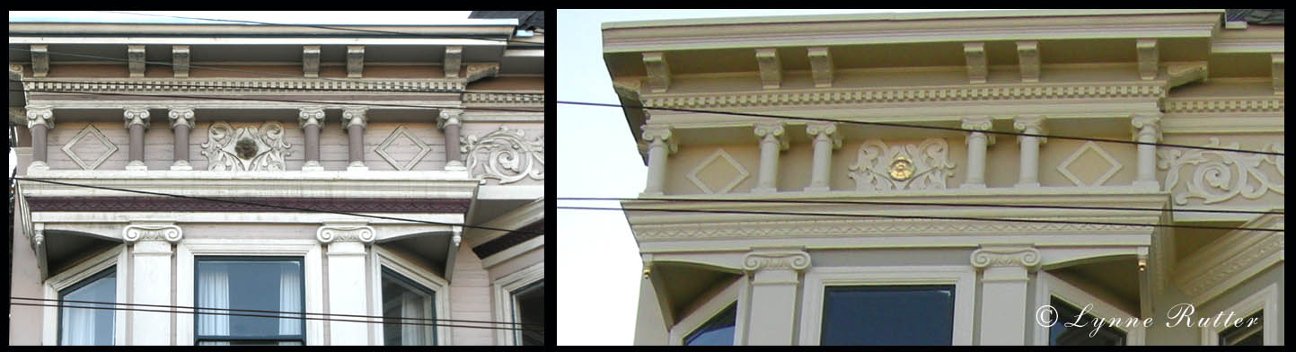
Columns in the entablature as well as in the entry arch, were painted dusty rose while the areas behind them were much lighter, so rather than stand out, these columns receded into the background, and everything above them, crown moulding and brackets, "floated" unsupported. Fancy rosettes had dark "holes" of burgundy, and the lovely egg and dart feature in the crown moulding had been painted out like a dark ribbon, slicing an otherwise substantial crown into three skinny horizontal stripes.
Laguna St. entablature before and after: click on image to view larger
So, in addition to a new palette, we needed a new "map" of where to put the colors to best bring out the shape of the architecture, and help this house stand up straight!
The first thing I did was de-emphasize the garage, creating a "foundation" for the house by painting everything below the entry the same deep neutral gray, a color very similar to the stone covered foundations of neighboring houses.
"Structural trim" that is, everything supportive, or the "bones" of the house - columns, cornices, crowns, capitols, etc. - are painted a warm ivory, so that they are connected and supported by each other. Carved elements like the egg and dart in the crown, now show up as sculptural relief, with shadows and highlights adding detail. From there, shades of green, bamboo, gold, and ivory, are arranged to focus attention on the beauty of the structure. In all, seven colors of paint are in use here, with some choice decorative features highlighted in 23 karat gold leaf.
255 Laguna with its new balustrade

Update:  at my suggestion the owners have renovated their porch with a balustrate, which I think greatly improves the look of this facade.


All colors on this project were specified using C2 paints.

Carpentry: Bay Area Metro Builders
Painting: Alex Corona


Bring out the best in your historic building, whether it be inside or outside. Color Consultation by Lynne Rutter  415-282-8820

Entablature is in the glossary!


Saturday

Showcase Season

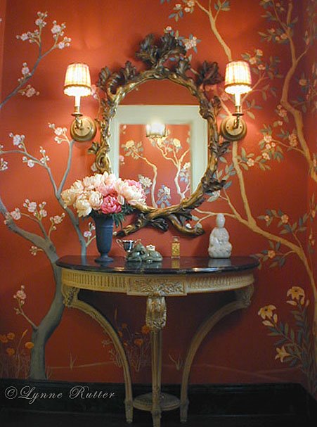
My Powder Room in the 2002 San Francisco Decorator Showcase
Showcase season is upon us again, with exciting spaces being presented by veteran and new designers alike. I have painted in over 25 showcases houses around the Bay Area, and transformed three rooms for the San Francisco Decorator Showcase as a designer. This year, due to my travel schedule, I could not participate in the exhilarating rush of reshaping a room in a scant three months.

I missed it, actually, because it is during this time I get my one chance each year to spend time under the same roof with so many talented colleagues in the business, and there is an atmosphere of camaraderie when a large number of the area's best decorative painters are all working on the same house. Oh of course there can also be a little drama, but for the most part everyone is trying to do their best work and finish before the press arrive, sometimes working late into the night, often running to the next room to beg a roll of tape or ask advice.

Showcases are especially great for ideas. Working without a "client" the designers get a chance to show off what they are interested in, what inspires them, and their best new finds.
A few years ago a nice book came out called "Decorator Showcase Houses" which compiled the best 250 rooms of 50 different showcase houses from all over the country. I recently flipped through this idea-packed book looking for a room I remembered from a previous showcase, and was really struck by how fresh and interesting even 7 year old projects look. This is because these designs are not the "trends" so much as each designer's personal vision, which, if anything, will set the trends for the future.
(look for my work on pages 137, 176, and 186!)


See the 2009 San Francisco Decorator Showcase , through May 25 at 2830 Pacific Avenue.