
Here is another case study on the placement of paint color, and how to get the most from your Victorian facade.
This Laguna Street Queen Anne Victorian had some common issues- raised to add a garage, the house looked so high off the ground that the nice parts of the facade were hard to find; you could see the garage door but not the front entrance.
My clients asked me to give this Grand San Francisco Lady the refined look she deserves. I started by talking to them about not just the colors, but where we put them, and the difference between emphasizing details vs emphasizing architecture.
You see, it isn't just the colors you choose, but where you put them that makes all the difference!
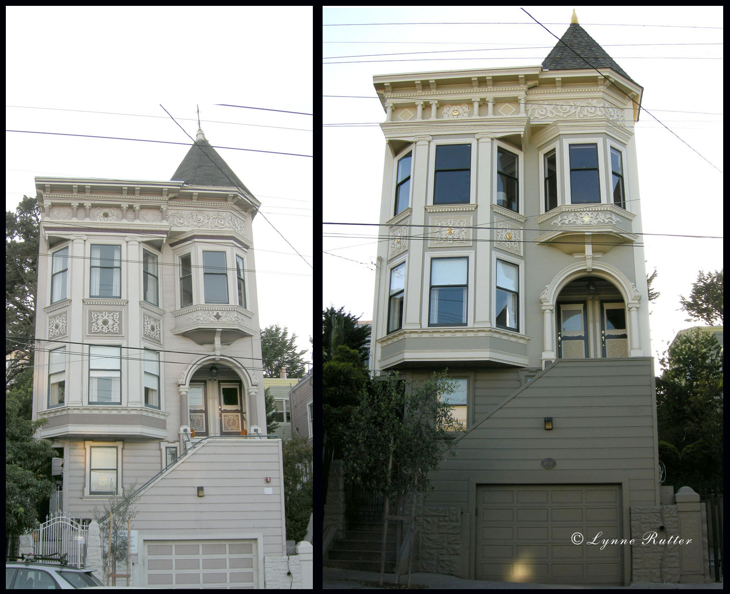 |
Laguna St. Queen Anne before and after: color design by Lynne Rutter. Click on image to view larger |
Columns in the entablature as well as in the entry arch, were painted dusty rose while the areas behind them were much lighter, so rather than stand out, these columns receded into the background, and everything above them, crown moulding and brackets, "floated" unsupported. Fancy rosettes had dark "holes" of burgundy, and the lovely egg and dart feature in the crown moulding had been painted out like a dark ribbon, slicing an otherwise substantial crown into three skinny horizontal stripes.
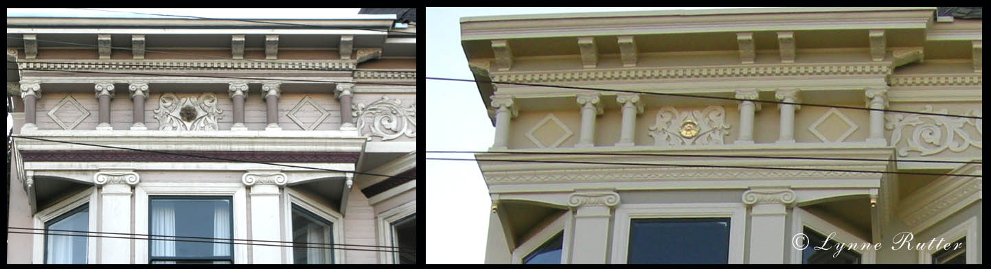 |
| Laguna St. entablature before and after: click on image to view larger |
The first thing I did was de-emphasize the garage, creating a "foundation" for the house by painting everything below the entry the same deep neutral gray, a color very similar to the stone covered foundations of neighboring houses.
"Structural trim" that is, everything supportive, or the "bones" of the house - columns, cornices, crowns, capitols, etc. - are painted a warm ivory, so that they are connected and supported by each other. Carved elements like the egg and dart in the crown, now show up as sculptural relief, with shadows and highlights adding detail. From there, shades of green, bamboo, gold, and ivory, are arranged to focus attention on the beauty of the structure. In all, seven colors of paint are in use here, with some choice decorative features highlighted in 23 karat gold leaf.
 |
| 255 Laguna with its new balustrade |
Update: at my suggestion the owners have renovated their porch with a balustrate, which I think greatly improves the look of this facade.
All colors on this project were specified using C2 paints.
Carpentry: Bay Area Metro Builders
Painting: Alex Corona
Bring out the best in your historic building, whether it be inside or outside. Color Consultation by Lynne Rutter 415-282-8820
Entablature is in the glossary!
exquisite!
ReplyDeleteGreat job, nice to live where you can work on such interesting homes!
ReplyDeleteExceptional job, foresight, and perfect selection of colors.
ReplyDeleteBeautiful work, Lynne. And your explanation of why it works is excellent.
ReplyDeleteVictorians can be challenging, of course, because they typically have so many colors. But the colors you chose are appropriate and elegant - and escape what often can be wacky or girlish. You're the best colorist I know, and I hope to hire you again in the future.
ReplyDeletethanks, j! how very nice of you to day. glad you are happy with the results!!
ReplyDeleteA fabulous example of "the whole being greater than the sum of its parts."
ReplyDeleteThis comment has been removed by a blog administrator.
ReplyDelete