
 |
| 10th Avenue Edwardian with its elegant new paint job |
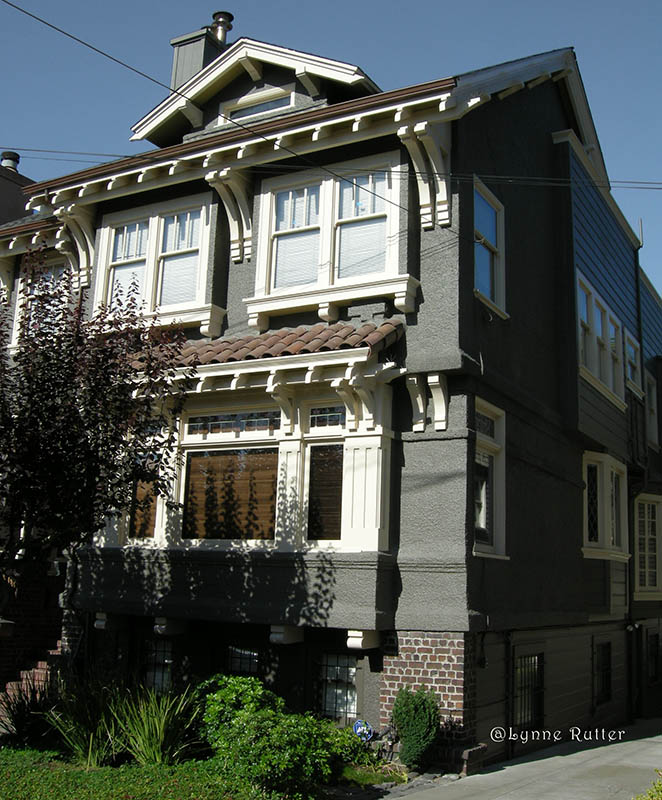
When less is more.... Once in a great while I find myself needing to use less color to reach the goal. For this circa 1915 stucco Edwardian house in San Francisco, the homeowners asked me to help create a more sophisticated, period look.
The previous paint job called out every detail in a mauve and white palette, with accents of forest green and dark rose. This gave the facade a somewhat whimsical, more Victorian appearance, which somehow de-emphasized the architecture by separating each element with a deep color; many features seemed to float unsupported.
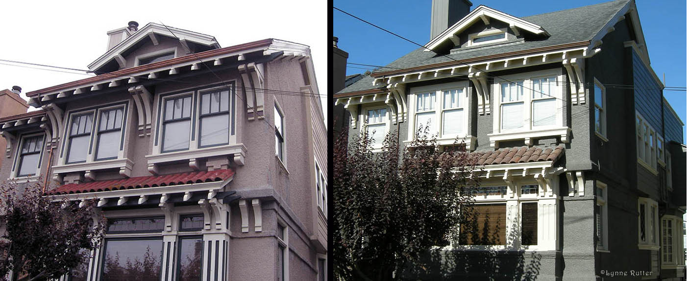 |
| 10th Ave Edwardian, before and after |
Houses of this era were originally far simpler, often covered in wood shingles, or with unpainted, natural stucco. To create an appearance more in keeping with the home's true period style, I recommended we give it back some of its architectural stability by simplifying the scheme to emphasize the form of the house, and started with a color similar to the stucco material itself.
Using a limited palette and strong contrast, my scheme features charcoal green stucco, with dark ivory woodwork. All of the structural woodwork is painted the same color: brackets and beams are now connected and supporting the roof! Roof tiles that had been painted red were replaced with natural brown tile, to relate better with the dark foundation brick. A touch of a warm light green in the eaves reflects some light behind the beams.
This house now has an impressive presence from the street; the architecture is doing all the talking.
Color Consulting from Lynne Rutter 415.282.8820
No comments:
Post a Comment
What do you think? Join the conversation!