
Every year some team of experts decides what the "color of the year" is going to be, and for 2009, it's a certain color of yellow. I had already been working on this panel of chinoiserie using a bright Imperial Yellow field when I heard this "news."
Interesting how these "fashions" in wallpaper, trends in paint, styles and colors, come and go, and come back again. The myth here is that anything is ever really all that new.
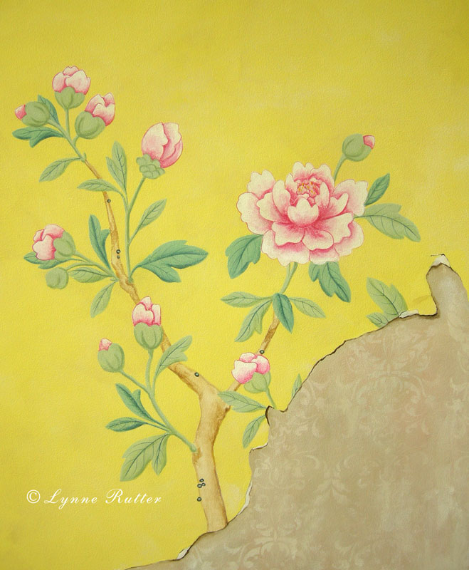
My painting above has a trompe l'oeil illusion, of brightly colored chinoiserie paper being torn up from its predecessor, the monochromatic neoclassical stencil pattern. Don't get me wrong, I love neoclassical design, but these days I feel a need for color. I find myself attracted not to just one color, but the combination of them, and I come back to this bright yellow every so often because it makes me happy. I felt, every moment I worked on this painting, basking in yellow, the sensation of pure joy!
So to me this painting is about the triumph of joy. The joy of color dominating the innocuous, monochromatic style; the joy of vision over nostalgia; of radiating rather than retreating.
This is lovely! I love color also. The color and texture of my decorative painting days now inform my jewelry making. Have to get that "fix" somewhere.
ReplyDeleteEnjoyed your other recent posts also - that Peacock Room was incredible.
Happy to find you from TheArtFusion.
Maria
www.mariaparay.com
Ah, color! I Love color..... and I keep hoping the design world will return to brilliant color! The pure and rich pigments have such vibrancy and yes..... yellow sings of sunshine and joy!
ReplyDelete