Showing posts with label art. Show all posts

Saturday

Pseudo-Kufic: A Secret Ornamental Language

Giotto Madonna and Child (detail) 1320 National Gallery, Washington DC
Have you ever noticed decorative borders in certain Byzantine or Renaissance paintings that don't seem to make any sense? Beautiful, calligraphic, gibberish... ?

Unknown Spanish Artist, The Resurrection,  1420, Legion of Honor, San Francisco
G. dal Ponte: Madonna and Child with Angels, 1430


Last week I was visiting the Legion of Honor with my good friend and fellow decorative artist, Bruce Thalman, and I was studying some embossed, gilt halos in Medieval and Early Renaissance paintings, as I am wont to do, when I noticed something in the border of a cloak worn by the figure of Jesus in an anonymous panel from the 15th century.   "Pseudo-Kufic"  I said.
"Gesundheit" Bruce replied.

A great number of paintings of the late Byzantine and Early Renaissance era used a similar design device: arabesque lettering, painted as the embroidered decoration in the hems of garments or edges of carpets. Sometimes it was copied from artifacts, and sometimes it was wholly invented. This script is referred to as Pseudo-Kufic.

Giovanni dal Ponte: Madonna and Child with Angels (detail) 1430 Legion of Honor, San Francisco
Influenced by exotic artifacts brought back from the Middle East through both conflict and trade with the Ottoman Empire,   Early Renaissance painters embellished their work with complicated patterns and eastern-style scripts in an effort to create an "oriental" atmosphere, especially with regard to persons or scenes from the Holy Land.   Eastern Kufic script was a particularly ornamental style of calligraphy dating from the 11th century, whose design lent itself well to borders.

Fragment of a 13th Century Qur'an in Persian Naskh and Eastern Kufi scripts, Library of Congress
Giotto Madonna and Child, 1320 National Gallery, Washington DC
There are many famous examples by Giotto, Massaccio, Gentile di Fabriano, and others who used Psuedo-Kufic, faux  or mis-copied Arabic, Phags-pa Mongol script, and even Hebrew-ish lettering in gold, to emphasize the rich, exotic impression of the Eastern world. (I find it this an extremely attractive era in art history.)  It may have been a statement about the cultural universality of the Christian faith; a reverence for history in general; or possibly the ambitions of the church at that time.    

Gentile da Fabriano:  Adoration of the Magi (detail) 1423 Uffizi Gallery, Florence. Arabic style lettering and Mamluk patterns in the halo of the Virgin
I recall an afternoon at the Accademia in Florence where I spent a long afternoon discussing this decorative lettering with Erling, who has an interest in languages as well as cyphers. It's not like I can read Arabic or Hebrew myself, but I was trying to figure out if there was a pattern, which parts are copied or invented, wondering if Giotto had invented his own alphabet, or whether each artist had a code worked into their own singular version of this calligraphy.  And if so, could I decipher it?  The following day, several hours in Hall 2 of the Uffizi, turned this into a minor obsession.
I still notice it all over the place.

Paolo Veneziano:  Virgin and Child (detail) 1354, Louvre Museum. Psuedo-Kufic hem embellishes a rich, oriental fabric.
Lorenzo di Niccolo: St Paul (detail) c. 1400 Legion of Honor, San Francisco  : decorative Pseudo-Kufic script on the sleeve of the Apostle
 
By the 16th century, orientalism in religious artwork had all but disappeared, as the Italian churches wanted to emphasize a more Roman context to their history.


more about:
Pseudo-Kufic  at Wikipedia
and at  Res Obscura


Friday

"Diverging paths of Mannerism"

Pontormo Visitation 1516 (restored 2014) Pieve di San Michele Arcangelo, Carmignano.
During my recent sabbatical in Firenze this winter, posters for the exhibit “Pontormo and Rosso Fiorentino, diverging paths of Mannerism" began appearing in every street; the glorious image of Pontormo's Visitation (newly restored!) brightening up damp stone walls all over the old city.
In March the show opened in the Palazzo Strozzi, I ran over to see it, and it is one of the most thrilling exhibitions I have seen in a long time.  If you are in Florence anytime between now and 20 July, go see this show! 
Beautifully curated by Carlo Falciani and Antonio Nataliell- the show has a clear purpose, to illustrate the real differences between two painters normally lumped together under the label of "Mannerism."   This may seem, from afar, like a bit of hair splitting, but the exhibit carefully illustrates the routes each artist took to arrive at their own unique styles.  I have to say it was very exciting for me to get to know these painters better; the work is fantastic and the presentation is enlightening.

Rosso Fiorentino, Spedalingo Altarpiece 1518 (unfinished)  Galleria degli Uffizi
Nurture vs Nature
Jacopo Carucci, called Pontormo and Giovanni Battista di Jacopo , called Rosso Fiorentino were both born in the same year, 1494, and received early training together in the studio of Andrea del Sarto.  Pontormo found favor with the Medici and developed a luxe, exaggerated, and colorful style of painting, producing highly stylized and finished work, much of it in Florence.  Rosso had difficulty securing patronage there, owing to his political leanings, and painted a lot of hurried, unfinished pieces, moved to Rome, experimented (and found success) with printmaking, eventually moving to France where he became one of the leading artists the first School of Fontainebleau.
The exhibit starts with a room full of the stunning work Sarto's atelier, and goes on to feature some of the most famous and the weirdest examples of Rosso Fiorentino's earlier work, contrasting this with the colorful paintings Pontormo was producing at the same time.  

Andrea del Sarto Madonna of the Harpies 1517,  Galleria degli Uffizi, Florence.   Watch and learn, people.
The show did feel a bit like a competition between Rosso and Pontormo, which I felt a bit unfair.  The choices of work on display certainly make Rosso's work look a bit weird, with many examples chosen, from what is available in Florence, being simply unfinished paintings.  Rosso's work is often called anachronistic and indeed his portraits of unidentified patrons look old-fashioned, but as an artist he took some great risks with his work, and he went on to become a superb designer. 

Rosso Fiorentino, Portrait of a Man oil on panel 1522, Galleria Palatina (Palazzo Pitti) Florence.
This modestly dressed and now-unknown man was obviously not a Medici supporter.  
Without patronage and a secure, supportive environment it is really difficult to produce such masterpieces as Pontormo was able to do.   Everything in Pontormo's work from the subject to the choice of (expensive) pigments points to large budgets and generous, supportive patrons. 

Pontormo  Deposition, oil on panel 1528, Capella Capponi, Santa Felicita, Florence:   Painted site-specific for this chapel - those colors nearly glow in the dark.  [photo: Lynne Rutter]
Three Muralists Commented:
I went to see the show a further three times, twice with fellow mural artists, Steve Shriver from Los Angeles, and Pascal Amblard from France.  We painters all mentioned this one issue: an artist designing an altarpiece or other large panel is generally doing so site-specific... so the setting is a part of the design.  When I look at a larger painting I immediately think of the problems the artist had to solve and the decisions that needed to be made: how high off the ground will this be, from what angle or distance will the viewer see it, how  much light is in the space and how strong do facial features need to be to communicate given these variables?  Take those altarpieces down and put them in a gallery with a spotlight on them and you are basically removing those variables and possibly judging the work in an unfair light.

Fortunately  in Florence, you can see a lot of wonderful work in situ, from all three of these artists; the most marvelous example I can point to is the Capponi chapel in Santa Felicita, for which Pontormo painted the stunning Deposition as well as the glowing and ethereal Annunciation.  

Pontormo  Annunciation  fresco, Cappella Capponi, Santa Felicita, Florence.  Yes, there is a large thing separating the figures.  And that's awesome.  [photo: Lynne Rutter]
I came away from this exhibit with a much better appreciation of Rosso Fiorentino's work, in particular his work in the newfangled field of printmaking, but also as a daring and skilled decorative artist.  Pontormo comes off as an especially fantastic draughtsman, a great painter with an exuberant sense of color.  But more than anything, this show renewed my interest in the work of Andrea del Sarto.
So then--- I made the trek out to the Vallombrosan convent of San Salvi to see Sarto's Cenacolo.  This is a splendid mural and well worth the visit.
Andrea del Sarto Last Supper, fresco, 1511-27, San Salvi, Florence  [image via Wikipedia]

Andrea del Sarto Last Supper, detail, fresco, 1511-27, San Salvi, Florence  
[photo by Lynne Rutter]

I spent a good couple of hours with this one.  Just bowled over.

ArtTrav, a fascinating blog written by an art historian living in Florence,  has a nice article on the restoration of the Visitation by Pontormo.  Also, have a look at this post on how to make a nice morning of a visit to the Cenacolo at San Salvi.

I would also suggest a visit to the Basilica della Santissima Annunziata, where there are many site-specific works by Sarto, Pontormo, and Rosso Fiorentino, among others.


"Pontormo and Rosso Fiorentino, diverging paths of Mannerism" at Palazzo Strozzi  through July 20, 2014.  Allow at least one hour to see the show.

The show is accompanied by a gorgeous catalogue, also available at amazon.com


Tip:  Palazzo Strozzi is open until 11 PM on Thursdays for after- dinner art viewing.


 click on any image to view larger.


Monday

Églomisé Cephalopod

églomisé mural (~5 feet high) by Lynne Rutter.  photo by David Papas

Allow me to introduce you to Nolan.
Commissioned for a home in Hawaii, Nolan is a very large octopus,  gilt, etched, and painted on the reverse of a 5 foot high slab of glass using a set of techniques known as verre églomisé
The body of the octopus is gilt  with aluminum leaf arranged in a random broken pattern to create the texture of the cephalopod's skin.  The thickness of this metal allowed me to etch the details  through it using a cross-hatching pattern very much like etching a printing plate. The suckers of the tentacles are gilt with 22 karat gold.

work in progress, Nolan slinking over a cart in the studio

During the process I asked our client if she'd like to give this noble  creature a name, and she immediately wrote back:  "Nolan came blazing through the ether like a shot…I was completely powerless to do anything else.  I believe he's just been waiting for his opportunity to let us know who he is…what else could I do?"   

detail showing the etching and paua shell eye

The surface of the octopus reflects the color of whatever is near it, much like the way the octopus camouflages itself in the water.  A final touch, the eye is a piece of abalone shell from New Zealand.

Nolan was packed into a very large crate last week and is now en route to a beautiful house on Oahu.  We dearly miss him in the studio and wish him well in his new home.


Saturday

Neues Museum, alte Schönheit

Fresken im Ägyptischen Hof von Karl Eduard Biermann  .
 It's  impossible for me to visit Berlin without thinking about how it looked the first time I visited in 1984 as a college student.   My best girlfriend and I stayed in a cheap pensione whose back half had been blown away and was closed off simply by shutting a hallway door, something I found out accidentally at 2 AM while looking for the WC.   
visitor,  Akhenaten with family, architecture
A trip through Checkpoint Charlie led us through a wasteland of bombed out buildings, many of them with trees growing up through them.  I recall thinking that the Communists left the mess as some sort of message.

Through subsequent visits I have seen Berlin knit itself back together, then reinvent itself to become once again a world class city filled with artists of all kinds.

During my most recent visit, I was excited to see the Neues Museum, the original home of the Egyptian Museum, which has recently reopened.
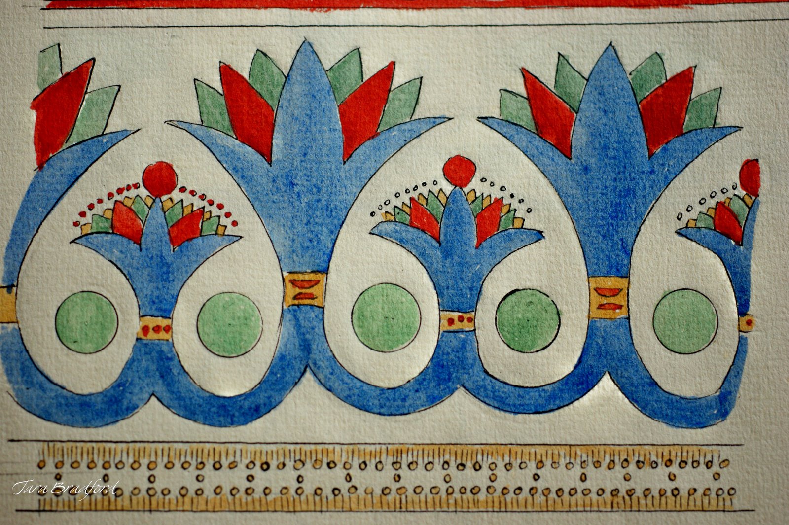
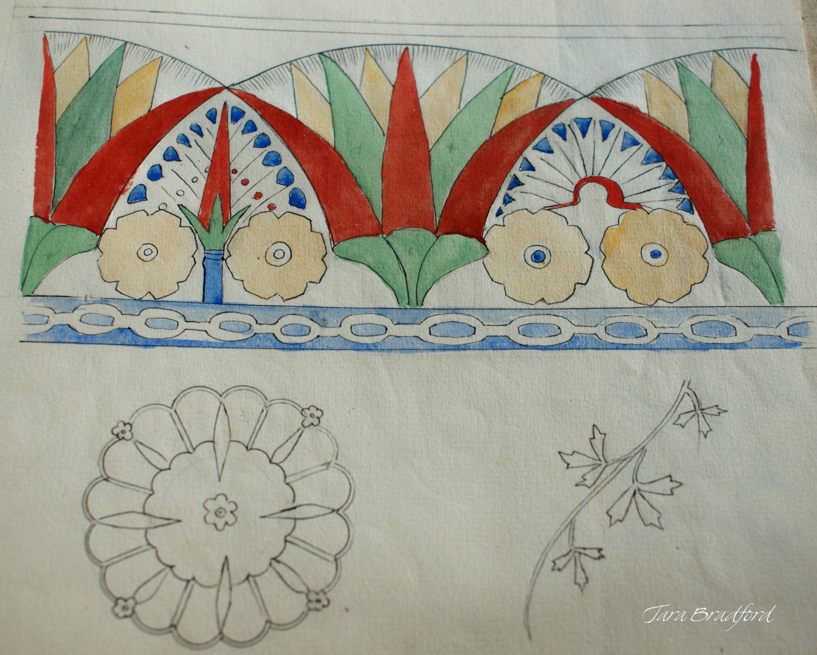
remnants of niche ornament
The Neues Museum, on Berlin's Museum Island, was completed in 1855 by Friedrich August Stüler, and was once Prussia's most important and famous public buildings. It was bombed to smithereens during WWII and left empty and largely exposed to the elements for over 60 years.
Neues Museum Bacchus Room in 2000, note vine marks on walls.  image via Wikipedia
Bacchus Room in 2009 after renovation.  image via Wikipedia

Some aging ornament in a gallery of the Neues Museum
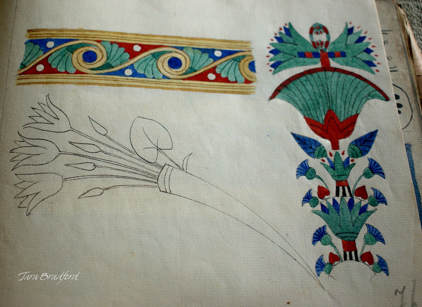
Gallery ornament, detail
Under the splendid design and direction of British architect David Chipperfield, the Neues Museum was rebuilt, as a sort of archeological site itself,  incorporating old and new, displaying its collection and its history in equal measure.

Ornamental painting, bullet holes,  exposed brickwork, and modern finishes all work together to create an historic environment for one of the world's most famous archeological collections.


The modern areas of the building are pure form and space, and are simply breathtaking.
Glimpses of the building's former glory, with its 19th century decorative treatments, are particularly thrilling.
 circa 1855 ceiling borders in the Neues Museum
A fragment of a lost ceiling, Neues Museum
Nefertiti enshrined at the Neues Museum, image via Wikipedia
The centerpiece of the museum's collection is the breathtaking bust of Nefertiti.  She is displayed alone in a lovely domed room with malachite green walls of polished plaster. I cannot describe how inspiring this sensitive and beautiful portrait really is. No photograph can do her justice.
exposed brickwork and original decorative fragments form the backdrop for the Neues Museum displays
Wall ornamentation, Neues Museum, Berlin

For more information and images about this building and its renaissance,  have a look at these sites:

Neues Museum website, virtual architectural tour.

New York Times article about the museum renovation, with many great pictures.

AIA Architect Magazine review and photos of the Neues Museum.

Exterior Views, original plans, and architectural designs, at Wikipedia


Click on images to view larger

photos in this post by Lynne Rutter, March 2011  unless otherwise noted.


Thursday

One night show: Suspended Layers

Sierra Helvey has been a member of my team for some years, and has been lately hard at work on a group of her own fine art pieces.  
Please join us at the studio for a reception and special show (and sale!) of her latest work:

Sierra Helvey:  Suspended Layers
Thursday, December 9, 2010,     5:30 -9:30 PM
Lynne Rutter Studio
2325 Third Street #207, San Francisco

"For the most part my work begins with a study and awareness of realistic form, playing with it on an intuitive level.  I like complexity and distortion that occurs when you simply interpret something into two dimensions.  In this physical translation, there I find is great capacity for experimentation."   - Sierra Helvey

You can see more of Sierra's work on her site:  Suspended Layers


Wednesday

Cards of Christmas Past

2003: " The 7th Angel of the Apocalypse" inspired by a 14th century ceiling fresco in southern Italy; the bombing of Iraq, and the capture of Saddam Hussein; and an obsession with ultramarine blue.
Since about 1971 or so, my parents have encouraged my art career (perhaps unwittingly) by asking me to do the artwork for their Christmas cards. I may post some of those early efforts here someday.
In recent years, Kit and Jet have traveled a fair bit, and it has become the tradition for me to design their Christmas card inspired by their most current trip abroad, be that Italy or Angor Wat. I paint them in gouache on paper, print the card, then frame the original artwork as their gift. I am told by my parents these cards are being collected by their friends.

So in case you are not on their mailing list, here are some selections from the last few years.

2008: I spent Thanksgiving weekend with Jet and Kit in Palm Desert, and sketched this view.


2009: A statue of the Madonna, damaged from fighting on D-Day, painted from a photo taken by my mother in Bayeux, France


2004: I made a too-short trip to Africa with my parents in May. This card was painted from my watercolor sketch of a Himba village in the Kaokoland, Namibia.


2005: Gospa od Škrpjela "Our Lady of the Rocks" painted from a photo taken by Kit in Montenegro


2006: from Kit's excellent photo of a Huli elder in Papua New Guinea.
I took some liberties with this portrait, aging the subject to make him look more wise and fierce.


all artwork in this post © Lynne Rutter
click on images to view larger


Thursday

The long lost sketchbook of Jeanne Magnin

In true ornamentalist fashion, Jeanne Magnin collected borders and motifs from her travels, and documented them in beautifully drawn and composed pages.

Egyptian border, from Jeanne Magnin's Documente de Style 1916 - 1917
Tara Bradford, the creative force behind one of my favorite blogs, Paris Parfait, found a little plain brown paper bundle at a brocante, which turned out to be a sketchbook full of gorgeous designs of Egyptian, Roman, and Greek styles, collected in 1916-1917 by the French painter, collector, and art critic Jeanne Magnin.


Egyptian ornament, from Jeanne Magnin's Documente de Style 1916 - 1917


Tara was generous enough to photograph each page of her amazing find and post them to her blog, at very high resolution. With her permission I have re-posted some of them here.


Roman-style rinceau and bucrane borders, sketches by Jeanne Magnin

In true ornamentalist fashion, Magnin collected borders and motifs from her travels, and documented them in beautifully drawn and composed pages.


Greek ornament: a page of palmettes
Greek borders


 Each page is like traveling to another time and place.
Greek motifs, Jeanne Magnin's Documente de Style 1916 - 1917


Magnin was the author of Le paysage français, published in 1928 and Un cabinet d'amateur parisien en 1922. You can learn more about Jeanne Magnin by visiting Le Musee Magnin in Dijon, France.
All photos in this post by Tara Bradford- click on images to view larger.


Friday

Brush Shopping in Kyoto

Cabinet full of watercolor and calligraphy brushes, porcelain palettes, at Saiundo Fujimoto.
While in Kyoto, I paid a visit to the shop of Saiundo Fujimoto, very well known for hand-made watercolors, and "special materials for Japanese-style painting." This is a lovely little shop, crammed with special brushes, paper, and supplies: glue (nikawa), chalk (gohun), and powdered mineral pigments (iwa-enogu), everything for Nihon-ga and other forms of Japanese painting.

Ms Fujimoto added my card to the guest artist book. The drawers behinds her are full of bamboo handle brushes, and trays of watercolors.

Here is my lovely new set of handmade watercolors, each in its own little ceramic tray. What a gorgeous palette, just as it is.

A display of sumi-e paint brushes at Kyukyodo.
Just up the street from Saiundo Fujimoto is a wonderous store called Kyukyodo. They specialize in calligraphy papers, brushes, incense, and lovely gifts. Trust me it took all of my will not to buy one of these giant sumi brushes.


Next time you are in Kyoto, Visit Saiundo Fujimoto: Anekoji Fuyacho Higashi, Nakagyo-ku, Kyoto.Here is a little map to help you find it (click to enlarge.)
Kyukyodo is only a short block away here (map)