Monday

Geek Color

Can these new iPhone applications save me lugging around giant paint color fan decks? We shall see!


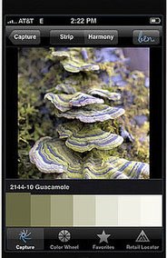
This week the internet is all abuzz with news of a new iPhone application ben® Color Capture™ - developed for "ben" by Benjamin Moore, that allows you to snap a picture of whatever inspiring beauty you see, then match moments in that photo to the more than 3,300 colors in Benjamin Moore’s range. The application will be available for free download beginning June 1.

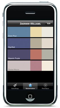
Fans of SuperPaint will rejoice that Sherwin-Williams has its own interactive iPhone app called ColorSnap™ which is available for free download now. It identifies colors in your images, and suggests palette colors surrounding them, and will even give you the RGB code of each color for web use.

For you advanced color players there are even more options - beyond paint!

Color Expert,
from Code Line Communications, uses an interactive color wheel displays color sets in various schemes including monochromatic, complementary, analogous, split complementary and triadic, which update as you drag a finger across it. You can also view a variety of color palettes, find hex codes for RGB values, look up HTML named colors, Web-safe palettes, etc., and then email your designer friends with your inspired finds! This one is $9.99

Palettes, by Ricky Maddy, can analyze a photo, web URL, or any other image, and offer a breakdown of its colors into a pleasing looking palette. $9.99 for this app, or free for the "lite" version.

For me these applications are not quite sensitive or accurate enough for picking colors but they are interesting for working out palette decisions. Looks like I will be eye-matching my paint for a while to come.

Images courtesy Benjamin Moore and Sherwin-Williams


Lynne Rutter Murals & Decorative Painting

Tuesday

Exterior Color: using paint to emphasize architecture

Here is another case study on the placement of paint color, and how to get the most from your Victorian facade.
This Laguna Street Queen Anne Victorian had some common issues- raised to add a garage, the house looked so high off the ground that the nice parts of the facade were hard to find; you could see the garage door but not the front entrance.
My clients asked me to give this Grand San Francisco Lady the refined look she deserves. I started by talking to them about not just the colors, but where we put them, and the difference between emphasizing details vs emphasizing architecture.
You see, it isn't just the colors you choose, but where you put them that makes all the difference!
Laguna St. Queen Anne before and after: color design by Lynne Rutter. Click on image to view larger
In the previous paint job, every detail was painted differently. Despite a complicated scheme of 5 colors, the house looked a bit flat; the placement of colors emphasized individual features, but without honoring the role they play in the architecture.
Columns in the entablature as well as in the entry arch, were painted dusty rose while the areas behind them were much lighter, so rather than stand out, these columns receded into the background, and everything above them, crown moulding and brackets, "floated" unsupported. Fancy rosettes had dark "holes" of burgundy, and the lovely egg and dart feature in the crown moulding had been painted out like a dark ribbon, slicing an otherwise substantial crown into three skinny horizontal stripes.
Laguna St. entablature before and after: click on image to view larger
So, in addition to a new palette, we needed a new "map" of where to put the colors to best bring out the shape of the architecture, and help this house stand up straight!
The first thing I did was de-emphasize the garage, creating a "foundation" for the house by painting everything below the entry the same deep neutral gray, a color very similar to the stone covered foundations of neighboring houses.
"Structural trim" that is, everything supportive, or the "bones" of the house - columns, cornices, crowns, capitols, etc. - are painted a warm ivory, so that they are connected and supported by each other. Carved elements like the egg and dart in the crown, now show up as sculptural relief, with shadows and highlights adding detail. From there, shades of green, bamboo, gold, and ivory, are arranged to focus attention on the beauty of the structure. In all, seven colors of paint are in use here, with some choice decorative features highlighted in 23 karat gold leaf.
255 Laguna with its new balustrade

Update:  at my suggestion the owners have renovated their porch with a balustrate, which I think greatly improves the look of this facade.


All colors on this project were specified using C2 paints.

Carpentry: Bay Area Metro Builders
Painting: Alex Corona


Bring out the best in your historic building, whether it be inside or outside. Color Consultation by Lynne Rutter  415-282-8820

Entablature is in the glossary!


Saturday

Showcase Season

My Powder Room in the 2002 San Francisco Decorator Showcase
Showcase season is upon us again, with exciting spaces being presented by veteran and new designers alike. I have painted in over 25 showcases houses around the Bay Area, and transformed three rooms for the San Francisco Decorator Showcase as a designer. This year, due to my travel schedule, I could not participate in the exhilarating rush of reshaping a room in a scant three months.

I missed it, actually, because it is during this time I get my one chance each year to spend time under the same roof with so many talented colleagues in the business, and there is an atmosphere of camaraderie when a large number of the area's best decorative painters are all working on the same house. Oh of course there can also be a little drama, but for the most part everyone is trying to do their best work and finish before the press arrive, sometimes working late into the night, often running to the next room to beg a roll of tape or ask advice.

Showcases are especially great for ideas. Working without a "client" the designers get a chance to show off what they are interested in, what inspires them, and their best new finds.
A few years ago a nice book came out called "Decorator Showcase Houses" which compiled the best 250 rooms of 50 different showcase houses from all over the country. I recently flipped through this idea-packed book looking for a room I remembered from a previous showcase, and was really struck by how fresh and interesting even 7 year old projects look. This is because these designs are not the "trends" so much as each designer's personal vision, which, if anything, will set the trends for the future.
(look for my work on pages 137, 176, and 186!)


See the 2009 San Francisco Decorator Showcase , through May 25 at 2830 Pacific Avenue.

Monday

Exterior Color: Two Stucco Edwardians

I love working with color, particularly with period homes. Here are a couple of recent transformations which illustrate my motto: do what will make the architecture look its best! Often this involves a bit more than paint colors to get the desired result.
28th Avenue Edwardian, San Francisco: color by Lynne Rutter, painted by SF Local Color
The previous owner of this home in Sea Cliff had "simplified" this house and painted it yellow in an attempt to make it look "Tuscan." My clients wanted to see the house restored to its original style, and look more like a formal City house. Black aluminum windows were replaced with insulated windows using the original Edwardian profile. San Francisco Local Color Painting stripped the paint off the foundation walls revealing the original red bricks, and then painted the entire house using all C2 paints.
The color scheme is a nod to the arts and crafts era. I started with a de-saturated green/grey accented with oxblood-red windows, and a linen-color trim that appears white in contrast to the body color. A fourth color; a warm, lighter green; is added under the eaves and on the stucco cross pieces to show off the more horizontal features and give these details a lift in the areas where it might otherwise get heavy. The result is a calm, period-style facade with elegant detail.

Here is another Edwardian-era stucco and wood house with some similar issues:
Cole Street Edwardian before and after: color design by Lynne Rutter
My clients on Cole Street disliked the whimsical "storybook" look of the house and wished to downplay the decorative half-timbered beams. They wanted the house to be simple and modern. However, previous attempts at "modernizing" this facade- by removing some features and adding others- only served to make it look more convoluted, and the old pink and purple paint job made a really big deal out of the garage door. I convinced the homeowners to restore the facade as much as possible, to give it back its architectural stability, which would go a long way towards creating a more refined entrance to their home. Iron railings were removed, missing brackets replaced, the garage door replaced with something plain and simple.

The color design involves six colors of paint, some of which were custom mixed. The body above the main horizontal beam is painted a warm, tan color, with just a bit of contrast between the stucco and wood. A jazzy cobalt blue front door integrates the blue stained glass surrounding it, and calls attention to the entrance. The base and garage door are painted solid with Benjamin Moore "Hampshire Grey." This deeper color gives the massive facade a grounded base, and makes for a more stately appearance from the sidewalk. Now the overall look of this house is grand, true to its period style, without being cute or nostalgic.


Lynne Rutter Studio

Tuesday

Arabesque

An interior detail of the new Grand Mosque Abu Dhabi, photo by Imran Akram
A plate from "Art arabe : mosquée de Qaouâm el-Dyn: détails du tombeau" (1

My fascination with Arabesque ornament... may have begun in Prague many years ago, when I first saw the Španělské Synagogy "Spanish Synagogue", built in 1868 in the Moorish Revival style. Inside it is completely covered in geometric Arabesque designs. Seeing the architectural ornamentation on such a scale made me want to run home and encrust every surface I could find with pattern.

It's not just that it's pretty, but it resonates with the math geek in me. The division of space, the arrangement of color, the... fractals!

Arabesque art developed in regions where Islam has been dominant; such as Morocco, Moorish Spain, India, Turkey, and the Arab states; and embodies Muslim precepts in its themes, with the focus on patterns rather than on figures. The depiction of the human form is forbidden, considered too close to idolatry, and so the art tends to be decorative and ornamental in style - geometric, floral, calligraphy.
The style has inspired and influenced non-Islamic ornament and architecture in Europe and elsewhere, particularly in the 19th century with the trend towards in Orientalism in design, and romantic "revival" styles of architecture.
Kevin Dean's inlaid marble floor at the magnificent Grand Mosque Abu Dhabi, photo by Imran Akram
The incredible new Grand Mosque Abu Dhabi is a project that I have been watching with interest. It was completed in March, 2008, and I am especially gleeful over the work of British designer Kevin Dean included in the massive courtyard's inlaid marble floors (above) and archways, a fantastic modern take on the floral elements of this style. More gorgeous pictures of this splendid new mosque can be found on the photography site of Imran Akram.

"Islam Ornament" (mosaic ceilings) photographed in Pakistan by Judith Barath
Mosaics can also play a prominent role in the ornamentation of buildings. In addition to the overall appearance of a colorful pattern, the play of light over the surface of thousands of tiles adds another level to the message of this art: this all fits together in an infinite pattern... do you see now, how you too are part of a larger pattern, how you belong?

original painted and gilt arabesque ceiling by Tania Seabock

How envious I am of my friend and colleague Tania Seabock, for this incredible ceiling she created for a client in the arabesque style, which includes tens of thousands of gold faux mosaic tiles!

I have a room set aside for my own spin on arabesque ornament, and look forward to sharing my inspiration and progress.

Some internet resources:

New York Public Library Digital Gallery

Islamic Art photo set by Flickr member Sir Cam

The Columbia Electronic Encyclopedia

IAAO: Islamic Arts and Architecture


Some recommended books on Arabesque ornament: